Adaptive Layout with Compose

Hello, amazing person of the internet! Hope you’re doing well.
In the ever-evolving landscape of mobile and web development, creating visually appealing and user-friendly interfaces across a wide range of devices and screen sizes has become a paramount challenge.
Fortunately, with the advent of Jetpack Compose, developers now have a powerful toolkit at their disposal for crafting adaptive layouts.
Adaptive layout
Adaptive layout refers to the ability of an application to dynamically adjust its visual presentation based on the available screen space.
To achieve that with Compose, we can utilize certain Compose functions.
Box with constraints
Provides measurement constraints that you can use to perform logic based on the available space.
The function has a parameter that knows the max width, allowing you to create different screens based on it.

To achieve that, go to the parent component containing your Card, Column, Row, or any component, and call the BoxWithConstraints() function.
BoxWithConstraints {
    if(maxWidth < 400.dp){
        Image(/* ... */)
        Title(/* ... */)
    } else {
        Row {
            Column {
                Title(/* ... */)
                Description(/* ... */)
            }
            Image(/* ... */)
        }
    }
}
By doing that, you can control how your screen behaves.

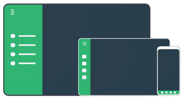
Window size class API
The WindowSizeClass API allows you to determine the width or height of the device screen, enabling you to display different layouts based on this information.
You can determine if the layout is:
- Compact
- Medium
- Expansive
To display different navigation bars for each device size.
In your app module’s build.gradle file, let’s implement Material 3 for window size:
dependencies {
    [...]

    // Material 3
    implementation("androidx.compose.material3:material3-window-size-class")
}
Now you are able to call the calculateWindowSizeClass function and retrieve the screen's configuration:
val windowSize = calculateWindowSizeClass(activity = this)At the time of writing, the Material 3 window size was an experimental API, so you may encounter issues with it. To proceed without any warnings or errors, simply annotate your class with
@OptIn(ExperimentalMaterial3WindowSizeClassApi::class).
Now we just have to determine the height and width sizes and implement the correct navigation bar based on that.
when (windowSize.widthSizeClass) {
    WindowWidthSizeClass.Compact -> {
        BottomNavigation()
    }
    WindowWidthSizeClass.Medium -> {
        NavigationRail()
    }
    WindowWidthSizeClass.Expanded -> {
        PermanentNavigationDrawer()
    }
    else -> {
        BottomNavigation()
    }
}
Conclusion
Creating adaptive layouts is crucial for becoming an Android developer. To achieve this, you simply need to incorporate “ifs” and “elses” into your code.
All the code and exemple it is on this repository.
Happy coding ❤


