Case study: a Wish design system color story
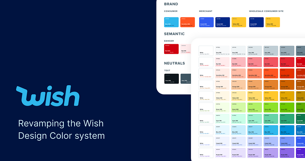
During the winter of 2021, I had the chance to be a Product Design intern at Wish. I remember it being the first day of my internship and I was introduced to the Leader Designer of the Design systems. Needless to say, I was super excited and interested in helping out. I booked a one on one with him for the next day and asked how I could help out. Luckily, he took a chance on me and let me lead Wish’s drive to redesign the color system (Thanks Eugene! You’re the best). This is the story of the Wish Design Color System.
By the end of this process, I was dreaming in hex codes.
What was the problem?
Wish has multiple wonderful teams that focus on unique but related products. For example, we have the core application but also the merchant application, Wish Local and Wish Wholesale. We found that each team was using their own color palette. Our Figma files had hundreds of unlinked colors that were very similar.
How can we consolidate all of the colors in our design system to create a cohesive and consistent system?
Step 1: Auditing
The very first thing we did was audit all of the colors. We went through the Figma files and pulled the colors we were using and put them in one place. I also looked at how different screens used colors. This included ratio of light to dark colors and the number of hues.

Step 2: Design Principles
Before getting started, I came up with 3 design principles to guide my design choices. It was important for us to understand what we were aiming for so we had goals to reach.
Accessibility
Ensure there is a guideline for accessibility and that recommendations for text on these colors follow at least 4.5 contrast, provided by WCAG
Easy Adoption
To make the adoption process as smooth as possible, we want to suggest colors that match closely to what exists today, but with some tweaks
Systematic
We want to create a system for how to use colors that is entirely objective to allow less ambiguity.
Step 3: Finding Similarities
From here, I created a color matrix of these colors to really understand how they differed and how we can create a consistent color scale. It also helped me pick the right hues.
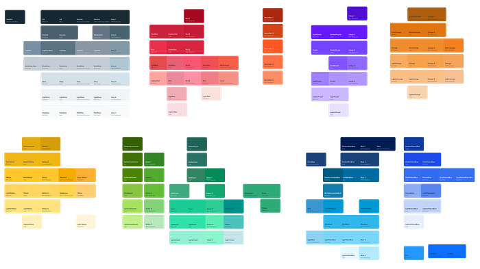

I compared colors from each system to find how they matched up.
For example, Dark Orange in Wish consumer was similar to Orange 4. And Dark Orange in the merchant system was the same as Orange 2. This helped me create a consistent scale that could be used by all of the apps without making colors too different.

Step 4: Naming Conventions
Naming varied across all of the systems. Some of them varied by name and some by number. For example, one system would use Orange 2 and the other would use Dark Orange. We decided that naming the colors with numbers was the best approach because numbers were easier to compare. We created 9 shades that ranged from 100 to 900.

Color System V1

Once we had a V1, it was time to test the colors to make sure they would work. We took existing screens from Figma and applied the new colors for validation.

Step 5: Getting Feedback
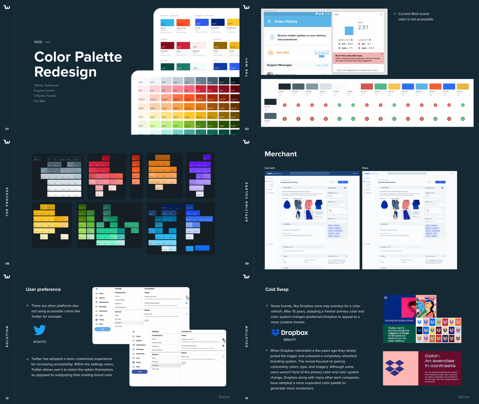
We presented the new colors to the entire design team to get feedback and ask for help in testing them. We also presented colors to engineers for feedback. I created the following slide deck with help from some super awesome team members (Shoutout to Eric & O’Nysha) and presented it to roughly 30 designers.
Over time, designers adopted this new system and provided copious amounts of feedback to improve the usability of the system.
Step 6: Getting more consistent colors
We realized the colors weren’t very consistent. In fact, they were eyeballed and the scale between each step was jarring. We wanted to have a system that wasn’t randomly chosen by one designer because it is easy to dispute and different designers can argue the “goodness” of the colors. We decided instead that it was important to have mathematically generated colors. We used Lyft’s Colorbox color system to generate a more consistent set. It is a tool that mathematically generates color systems by controlling hue, saturation and brightness.
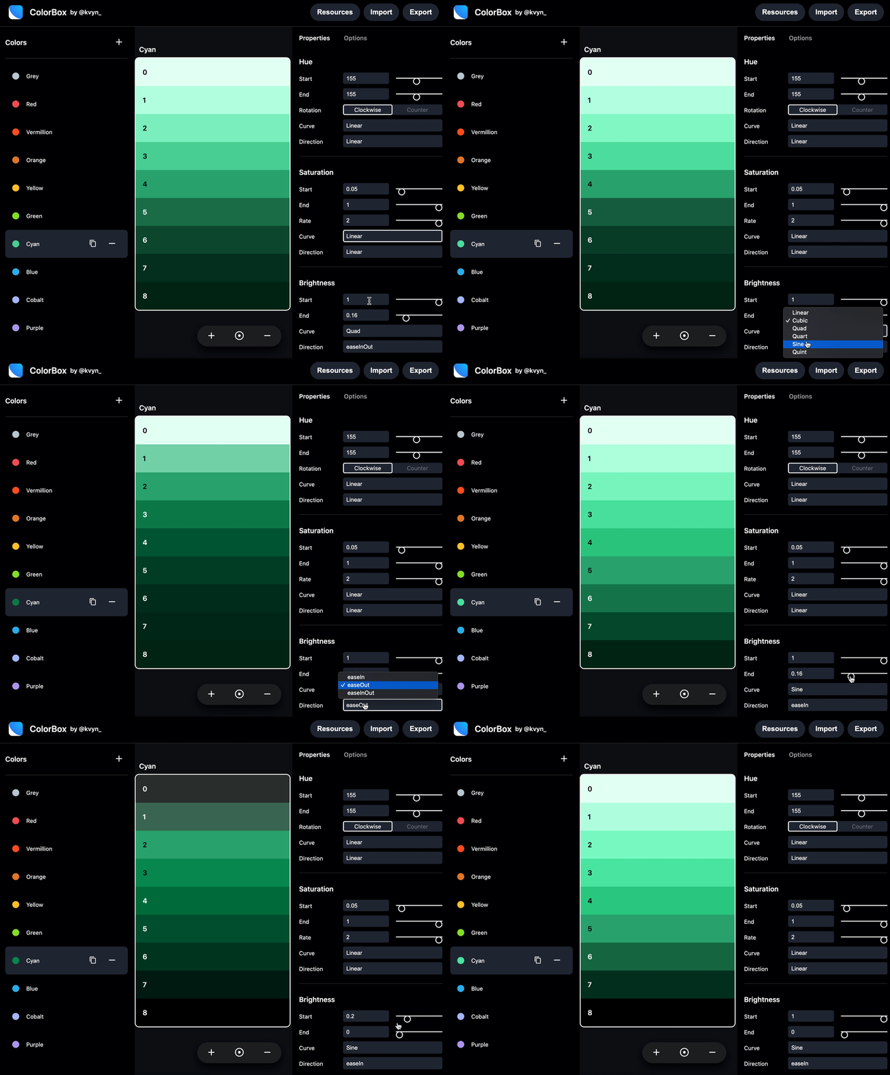
With that, I created the color system version 2.
Step 7: Working with devs
Luckily, I have a software engineering background and was able to work closely with developers to get the new colors into the code bases. Each engineering lead for our web, merchant, iOS and Android teams sent me their color files in Javascript, swift and XML.
I found that while some colors were in variables, there were a lot of free floating hex codes. There were also colors in the code that did not exist in any color system we had looked at. I manually checked all of the colors and updated them to use variables so there would be no free floating hex codes. Then the devs shared staging versions of the apps that I could use to validate the colors for final approval.

The Final Color System
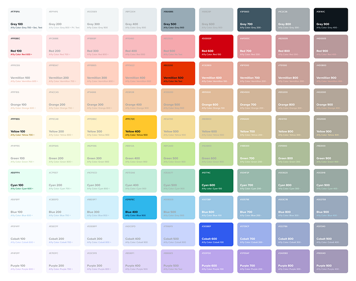
With that, we created the final color system. The following guideline breaks down all 90 shades and their appropriate accessible text color values. I also added the accessible text color on white for reference.

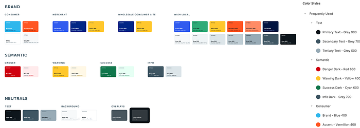
Additionally, all of our core interface and brand colors stem from this system.
Not only did we define these colors in our Figma system, we also created shortcuts for easy of access for everyday colors.
Accessibility & Consistency
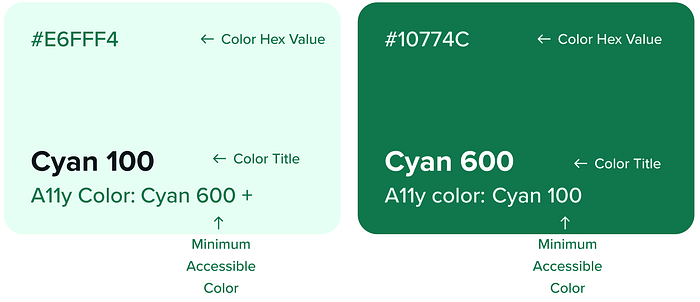
For color on text, all swatches describe the minimum color for that hue that is accessible. For consistency, I tried to make the conversion point of text from dark to light happen at the 600 variation.
Final Remarks
This project was definitely a lot of fun for me. I was able to lead this project from conception to delivery, including writing some code. I learned a lot about design system usability for larger teams.
Every designer will have a different opinion about how the system should work and how components and tokens should look. Although it is important to take feedback from everyone, it is also important to ensure the system remains robust, consistent, easy to use and have conversations about.
Getting fully autonomy for this project was incredibly freeing and I’m super grateful to Eugene and my managers, Shan and Simon for giving me the space and room to explore something in addition to the projects they had in mind for me.

