A visual design handbook
A repository of best practices, checklists, tips, and other information.

Why do you need a visual design handbook?
Firstly as visual designers, our primary directive is to craft products with great aesthetic appeal and usability value, and therefore, it is essential to understand that our role as visual designers is more than decoration and beautification. Furthermore, prudent designers use their keen sense of space and elegance to combine elements, in order to create digital systems that optimize the user experience and drives conversion. Every designer follows a personalized creation process, however, these individualized approaches are derived from a generic formula envisaged by various design foundations around the globe.
The visual design handbook functions as a repository of best practices, checklists, tips, and other information, which will assist a team to create a comprehensive design strategy. In addition, this documentation will help to streamline inter-personnel relations, product building processes, and nurture collaborative customer-focused mindsets. For that reason, when you are unsure how to get started or proceed, this visual design handbook’s expertise comes into play.
1. The onboarding
🌍 Project
Enrolling new resources to a project. The goal is to make sure that all resources involved in the project understand the business objectives, processes, standards, and expected deliverables.
🏢 Logistics
Educate the resources about the communication channels, daily stand-ups, project storage access, folder structure, work period, and the tools used by the team.
🎉 Culture
Every team has its own culture, and it is born through a collation of diverse personalities. Therefore, the new resource should be able to align and adapt to the team’s practice, culture and rituals.
💫 Approach
Aa a team, its members must follow a unified approach to gather requirements, design, review, and delivery. However, this opportunity helps to evaluate the design practice from a new perspective and evolve the same.
🛠 Tools
Inform and train the resources on the tools, software, hardware, and attached systems used by the team for communication, file storage, design, and delivery.
2. Design process
A. New product design or re-design
When a new product or service is required to be designed from a conceptual level. A visual designer comes into the picture after the interaction design phase of the overall design process.

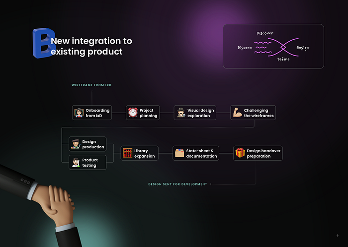
B. New integration to an existing product
When a new service or functionality is required to be integrated into an existing product. Integration can be a new service, section, or technology.
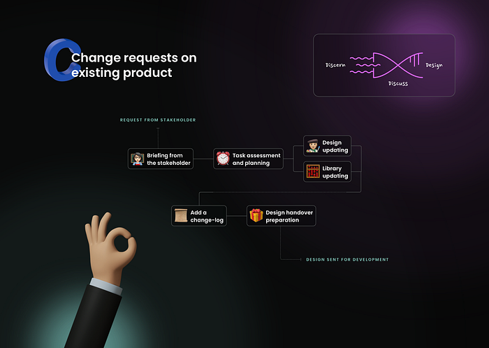
C. Change requests on an existing product
When a section, flow, or use case requires change or updating due to design decision, user testing, development/technology constraints, or business requirement.
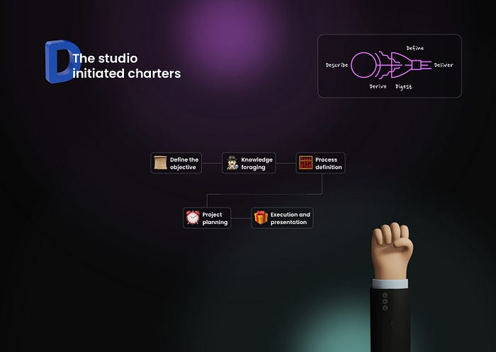
D. The studio initiated charters
When the design studio initiates tasks and projects to improve a product. This involves additional documentation, improvement strategies, and upliftment scopes.
3. Pre-design checklist
📱 Responsiveness checklist
A digital product is accessed through multiple channels and platforms. A user should be able to visit a page on desktop, tablet, or mobile, and have an omnichannel experience.
i. Adaptive design
The designs must be visible and accessible on any device size, channel or platform.
ii. Breakpoints
Discover the breakpoints when the design structure changes, and additionally, diagnose how efficiently the form alters.
iii. Typography
The font size and property variations on different screen size.
iv. Change in the selection area
The selection area refers to the allocated space for a user to mingle with an interactive element. On the one hand, devices that are operator using fingers must consider using large containers for clickable components (such as, button, toggles, or text field). On the other hand, desktop machines have a mouse that helps to interact with precision and therefore can have smaller click areas.
v. Optimization
Optimise content and module size based on breakpoints. The content on smaller devices can be minimised, while larger devices can house more content with larger elements.
👁 Accessibility checklist
Accessibility must be a mandatory aspect in every design process, and it is important to find the balance between appeal and accessibility. Certainly, accessible products expand the audience range as it works for more users.
i. Device accessibility
Accommodate for the difference in size and the additional accessibility requirements based on the device category.
ii. Interaction
Include visual responses for user interactions, by defining how elements should change when hovered, clicked, or highlighted. Moreover, responses can be a change in colour, change in opacity, change in elevation, micro-animations etc.
iii. Colour
Always verify the contrast ratio and accessible colour range, as visual appeal does not guarantee an efficient digital experience.
iv. Content and design element
Always evaluate whether a component can convey its purpose without colour and text. To illustrate, a combination of text and icon helps to bridge the gap and communicate the idea better.
v. Size and hierarchy
Construct components and modules with the intention to guide the user’s eye and create the desired flow of information. Besides, size helps to establish the significance and the perceived order of the information.
vi. Helpful description
Using the description of what an image looks like, in case the images take time to load.
🎨 Colour
The Colour system stimulates the intangible sensations attached to your brand. It triggers emotions and influences your decision, and a good experience uses colour to constructively influence the users.
i. Colour psychology
Understand how colour can impact how users think, feel, and act. Adhere to conventional mental models, such as using red for a destructive button, green for success iconography, etc. Also, comprehend the cultural differences linked to the meaning attached to specific colours.
ii. Brand values
Incorporate brand-approved colours into the experience, by defining the primary, secondary, and tertiary brand colours.
iii. Elemental states
Define element or component level states using colour variations. To illustrate, a default state of the text field should look different from its error state with the help of red colour or a successful state with green, and so on.
iv. Colour combinations and contrast
Analyse the cohesiveness of the colour palette.
✏️ Typography
Fonts play a big role in setting the tone and influencing the structure of the design elements. Here’s a list of points to keep in mind whilst choosing and defining the typographic guidelines for a digital product.
i. Font combination, size and variations
Measure the compatibility of font combinations. Define a matrix of font combinations using attributes such as font size, line height, colour, font-weight, and casing, to ensure consistency across the digital and physical media.
ii. Text alignment and container length
Define and maintain the text alignment and the average length of textual containers based on the breakpoint. For example, use 45 to 65 characters per line on desktop and 25 to 45 on mobile.
iii. Contrast and style
Verify the contrast ratio of the font colour and the applied font-weight against the background colour it will be used on. The font colour must pass the WCAG AA criteria to be considered as an accessible design.
🌹 Design enhancers
A good product becomes great when its users truly feel that they are cared for. This is an opportunity to push the digital experience to the next level by creating an emotional bond between the product and its users.
i. Visual design states
Define variations at all levels (such as atoms, molecules, organisms, and pages) to cover extensive use case and scenario. Add this practice to the design process and consider the same during project estimation.
ii. Empty states
Enhance the screens that are not yet full of information (significant for new users). This is an opportunity to create meaningful and pleasurable experiences using illustrations and playful writing.
iii. “We have an issue” screens
It is frustrating for the users to see a blank 404 error page or see an ‘app down for maintenance’ notification. We have an opportunity to uproot this frustration by designing a playful, animated, and even interactive notification.
iv. Placeholder avatars
Avatars have become a digital extension of user identities. This also provides designers with an immense opportunity to address issues like gender neutrality, diversity and inclusivity.
v. Loading element
A great loader or spinner can reduce user stress. We can use an engaging micro-interaction, playful animation, interactive micro-games, shimmers with fun facts, and many more.
vi. Dark mode
Such a feature helps to reduce the strain on the user’s eyes, especially in a dark environment. While it is evident that having such functionality is significant, there are several points that must be considered whilst designing the dark mode. These include a brand approved colour variation defined for the dark mode, but at the same time keeping in mind to maintain the brand’s visual tone and style.
4. Design and Delivery
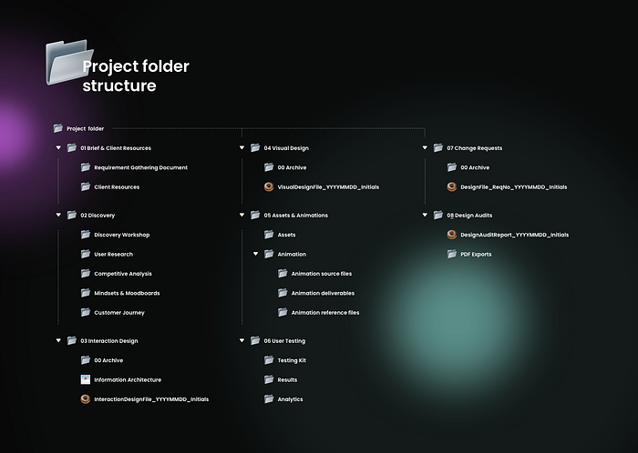
📂 Project folder structure
A good folder structure is a sign of efficient design work. It helps new and old resources to comprehend and navigate the catalogue with much ease and understanding.
🗄 Design file maintenance
Working in a big team with massive design workflows bottlenecks productivity. By employing basic design file maintenance guidelines we can smooth over many of these bottlenecks.
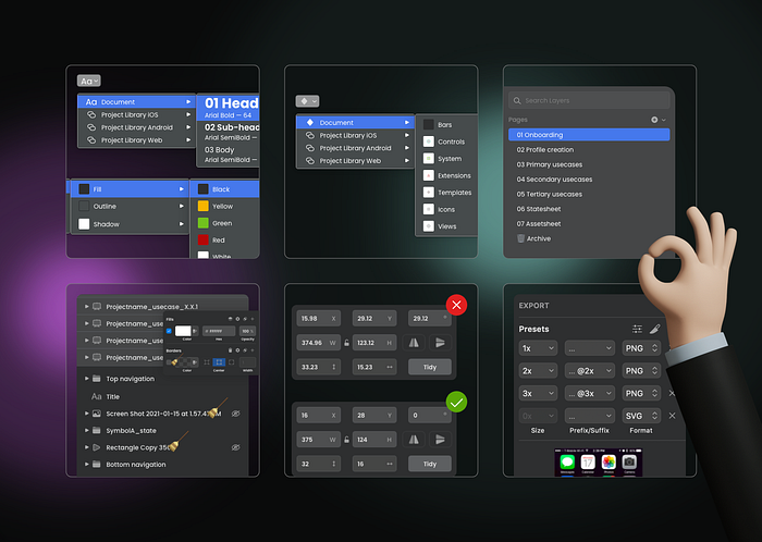
🧳 Design handover
Handover is the final stage of the design workflow. It is the process of sharing the designs, assets, and animations with the development team.
i. Assets and animation
Most handover tools provide the ability to integrate downloadable assets within the screens. This can change depending on our processes. But it usually involves sharing pixel-perfect images or JSON files.
ii. Prototyping
Build a high fidelity prototype using all the unique user flows to cover the primary interactions. Always remember to use a client-approved tool to avoid a data compromising situation.
iii. Onboarding developers
Present the design approach taken by the team to deliver an extensive solution. If required, provide a crash course on how to use and navigate the IT handover tools.
iv. Prepare for change requests
Change is inevitable, either due to requirement enhancements, technical feasibility, or millions of other reasons. Develop a mindset to accept change as a general part of the design life-cycle.
v. Consistent process
Set standard file maintenance, asset management, and handover systems. Having the same approach for every project you work on encourages a seamless movement from design to development to implementation.
🤼 Stakeholder interactions
Review sessions are an integral part of the design process. Always address the concerns put forward by stakeholders. As designers, we must accept and challenge the feedbacks to build efficient and elegant systems.
i. Solution discussions
A designer should have the capability to explain and defend their design solutions. Do not be hard-head, be considerate and evaluate the feedback. It is important to share the impact a specific comment will have on the design.
ii. Note-taking
Most stakeholder interactions and review session are long and tiring. Note-taking is an essential part of such sessions. It helps to maintain a log of all comments, decisions, and open points recorded during the session.
iii. Minutes of the meeting
Minutes of the meeting can be defined as a written record of everything that’s transpired during a meeting. Sharing the meeting minutes via email creates a shared record of all comments, decisions, and open points. A pro tip here will be to request an acknowledgement as an agreement to the points stated in the email.
iv. Internal review and discussion
It is essential to discuss the feedback with the team lead and interaction design team to assimilate their opinions and comments. There may be aspects related to the designs which other team members would know better.
v. Timeline discussion
Estimate the time require to apply the changes and re-submit the design solution. Communicate the same with the project manager, discuss any timeline clashes, and prioritize based on stakeholder decisions.

