Case study: Designing an in-app messaging feature

About Carbon
Carbon formerly known as paylater is a digital bank with a mission to empower all people with the financial access they need to pursue a life of dignity and prosperity. Carbon aims to empower individuals with access to credit, simple payments solutions, high-yield investment opportunities, and easy-to-use tools for personal financial management. Carbon is headquartered in Lagos, Nigeria with operations in Nigeria, England, and the United States.
Problem Statement
I was tasked with the challenge of improving the user experience of the Carbon mobile app, it was daunting, but I decided to take up the challenge to explore and learn more about Carbon as a company, and the African fintech space.
Roles
UX Research, UX Design, UI Design
Scope
In the Carbon app, there are a lot of user flows that allow users to complete tasks such as loan application, profile upgrade, investments, wallet transactions, payment of bills, purchase of airtime, funds transfer, virtual cards transaction, among others. However, for this case study and according to my research. I’m focusing on improving the communication flow between users and customer support.
User Research
To empathize with users, I conducted research to understand the people to design for and their different context of use; To achieve that, I went on Carbon’s Twitter and Instagram pages, scanned through the comment sections. There were a lot of insights into Carbon user’s behavior and motivations, alongside a myriad of complaints needing solutions. I also conducted user interviews with about five users I scouted from Carbon’s social media pages, most of whom stated their overall experience with Carbon is good.
Key Takeaways from the research
- About 70 percent of them use Carbon mainly for loans
- They all have experienced a difficulty or the other while repaying their loans and had to go through the rigorous process of sending emails to receive the support they needed
- They’re generally pleased with the intuitive interface of the app
To further my research and validate my assumptions, I visited the app-store on my iPhone, the reviews Carbon regularly receives there are a no-brainer.
To quote some highly dissatisfied users “I wish I didn’t download the app”, “worst customer care service ever”, someone even said, “ I want to delete my account” and another frustrated user was advising others not to download the app.
Here are some screenshots of the App store review

Key Pain Points
- Users send emails and countless messages on Instagram and Twitter with no response from the Customer success representatives
- Users experience difficulty in upgrading their accounts
- Users go as far as calling Customer representatives, but to no avail
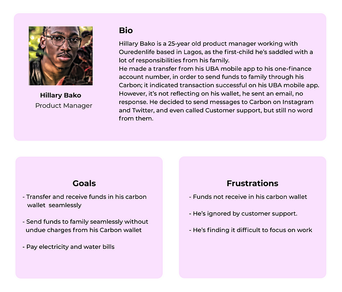
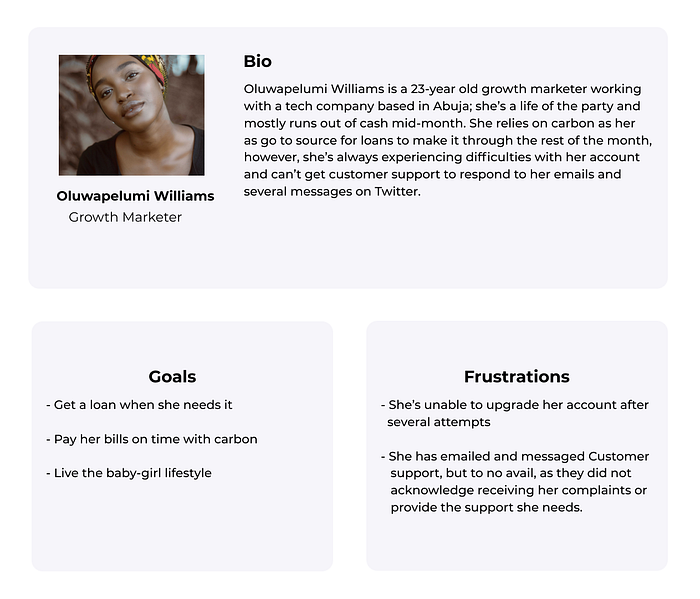
User Personas
Based on the research I conducted, I noticed some patterns and drafted two personas with different frustrations and goals. The personas helped design with the needs, goals, and frustrations of the users in mind.
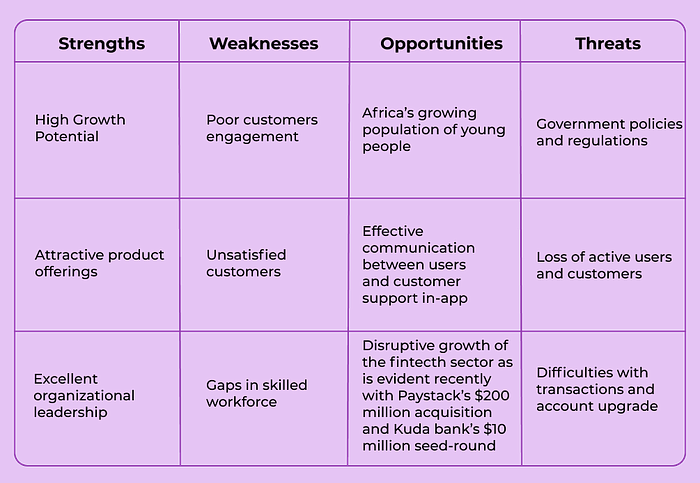
I conducted a SWOT analysis for Carbon to better understand and demonstrate their business competencies, strengths, and weaknesses in the market.
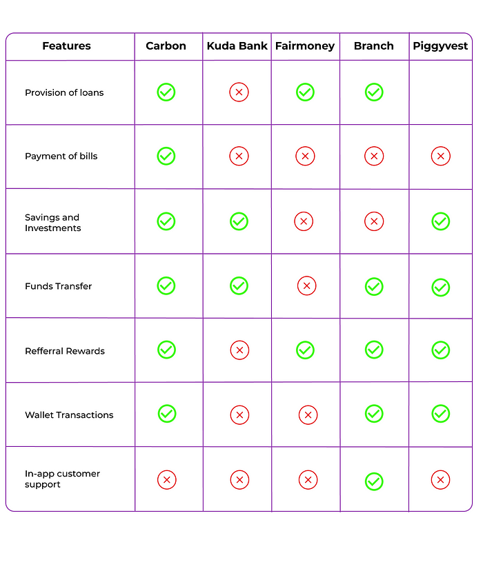
I also conducted a competitor analysis with Piggyvest, Kuda Bank, Fair Money, and Branch to understand and analyze the core features of Carbon with other fintech products, to further strengthen their competitive advantage in the market.
Ideation
How Might We?
I decided to use the HMW framework to solve this pain point
How might we improve the UX of the app by simplifying access to customer support?
How might we help users achieve the task of receiving support faster and seamlessly?
What’s In It For The Business?
- Increase user engagement on the platform
- Increase the rating on App Store and Play Store giving way for more downloads and adoption
- Increase the retention as users get their problems resolved in-app without the hassle of sending unsolicited emails and DMs.
- Reduce churn rate, as users would not be frustrated and decide to delete their accounts when they can receive the support they need in-app.
- Increase user satisfaction, thereby increasing Net Promoters Score leading to more users
What’s In It For The Users?
- Easy access to report their complaints
- Smooth way of resolving their issues without having to vent on App Store or Play store reviews and social media
- Increases their satisfaction with the product and provide a feeling of personal connection with Carbon
- Helps them resolve difficulties in good time and not have to wait three days like a user I interviewed waited before he got his loan repayment issue resolved.
Sketching
I sketched a paper prototype of my solution to validate the sketches and get feedback from users. I got great feedback from some users and proceeded with the design.

Low-Fi Wireframes ( Prototype )
After validating the paper prototype, I went ahead to design the low-fi wireframes on Figma with a focus on the functionality using a grayscale framework.
High-Fi Wireframes ( Prototype )
I then went ahead to design the high fidelity wireframes.
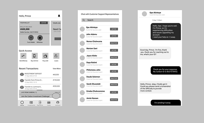
I designed a Chat with Customer support feature to enable users to effectively engage with customer support and relay their problems to them in real-time, in-app.
To solve the problem, I decided to provide a platform for them to do that in lesser time and with lesser complexity. I thought out how I’d make the experience even more pleasant and intuitive for the users by incorporating known elements from the carbon app. For instance: using the ‘active’ button placed at the ’your wallet’ feature as an element to let users determine the availability of the customer support representatives to engage with them, I did that to enable users to recall, rather than learn how the interface works.
Usability Testing
After designing and prototyping my solution, I decided to test out the design with users to validate the solution with them and get a feel of their thoughts on the solution. I considered the feedback obtained from the research and made iterations on the design based on the needs of the users.
Five Second Test
I conducted a 5-second test with some users: I gave them the design to look at for five seconds and asked them questions regarding the interface. The feedback was good as they were able to recall the elements of the app immediately. It felt like an extended feature of the Carbon app.
Impact
The Carbon product’s team after their extensive research and with the qualitative and quantitative data available to them, came to the same conclusion and identified the same real problem. They also, solved the problem by designing and building an in-app support feature, although executed differently than done by myself.
Conclusion
Working on designing this app was highly rewarding and challenging since it’s my first case study ever as a product designer. However, It opened me up to learning a lot about design, the design process, Carbon as a business, and the African fintech space in general. I can confidently say this project broadened my horizon design-wise.
Thank you for reading. Feel free to connect with me on https://linkedin.com/in/princemiracle https://twitter.com/princemirxcle

