Case study: A trail of organic breadcrumbs
A project on how we managed our expectations and defined a process to navigate online grocery shopping.
Why I designed this
During my time here at General Assembly, I was fortunate enough to take part on a case study based on the online grocery market. The project I worked on focused on Vege Trails™ — an array of navigational features to make online shopping more seamless using the CERES Fair Food mobile website.
My main mission was to improve customers’ shopping experience on their mobile platform. Here is the client’s main website: https://www.ceresfairfood.org.au/
Click here to skip to the interactive prototype!

Project Details
- Collaborator: Enza Soubjaki (UX designer/strategist).
- Duration: 14 days.
- Tools: Notion, Google Sheets, Miro, Figma, and a pourover coffee maker.
What I did

- Requirements Gathering
- Project Management
- Market Research
- Customer Interviews
- Task Analysis
- Persona Creation
- Team Design Studio
- Customer Flows
- Site Mapping
- Wireframing
- High-Fidelity Prototyping
- Usability Testing
The Problem

CERES Fair Food is one of many organic grocers which provide online delivery services through their website. As lockdowns ended for Victoria in late 2021, more people are returning on their phones to shop for groceries online. However, per the client’s most recent assessment on Google Analytics, more than 80% of their potential customers were shown to be abandoning their mobile sessions early on.
- Client need: minimise customer drop off particularly between landing and checkout.
- Customer need: to more easily find their desired produce, increasing efficiency.
The Solution
My goal here was to pave a clearer road for future customer journeys through Vege Trails™, a set of navigational signposts and feedbacks targeting the early-to-mid stages of the online experience. This was delivered under three main components:
- Easy and quick groceries finding, by redesigning the hierarchies of the current site and implementing a deeper, more logical mapping,
- Including a breadcrumb for customer awareness of their site location,
- Seamless add-to-cart process where customers will be able to pick and add all subtypes of that specific produce in one simple screen.
My 4-Step Design Process
This was my first UX case experience. I utilised a model based off the British Design Council — Double Diamond framework to approach this case study/adventure.

Step 1: DISCOVER
1.1. Starting Off on a Crisis
At the beginning of the case we started off with three team members, but whittled to two after one resignation. Ultimately we decided to keep on going to mimic real-life situations. Whatever can go wrong, will go wrong.1.2. The Untapped Market
After consolidating on the problem space, I began to take command of the project timeline. In order to get a sense of how the organic players are doing digitally, I initiated secondary research. This included conducting an industry analysis of the online grocery sales in Australia, discovering a bountiful market of $7bn — which mostly went to the major players. If CERES could tap into this just by a 0.1 percent, it would already be a huge potential — considering the market growth potential and CERES’ small size.

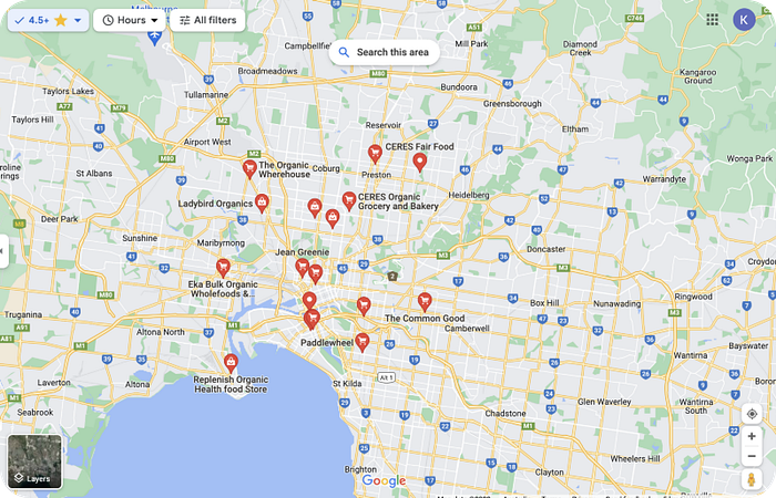
I also realised that after doing a Google search on organic stores, there were over 50 stores just across Melbourne. By filtering based on the reviews that CERES was already categorised by customers into (the 4.5+ stars reviews), I arrived at the top 15 stores and performed competitive analysis of their mobile site features. I chose “pros and cons”, which looked at the overall customer experience and was faster than taking stock of features.
Additionally, I extended this to the online organic industry’s top two best in class — Coles and Woolworths, and found that Woolworths had the best ‘happy path’ for customers to navigate.
1.3. Organic Interviews
Alongside my team member, we ironed the key requirements to gather and prepared a discussion guide. We decided to conduct customer interviews through Zoom and performed deep discussions on our target groups. This was to understand their motivations for buying organic and/or shopping online.
Our target audience included:
- People who purchased fresh produce online (non-organic and organic)
- People who interacted with NFPs ie. farmer’s markets
- People who had values that aligned with CERES

1. Understanding the problem space
- People were generally supportive of the mission of organics such as CERES, which included ‘supporting local business’, ‘ethical’, and ‘caring about health and the environment’.
- Customers were mostly busy, health-conscious females who enjoyed the convenience aspects of online shopping.
2. Pain points
- For our major customer group, busy-ness meant the ordering process should be presented as simple as possible.
- Some people voiced concerns around state of their delivered produce.
- Most people preferred to buy exactly what they have in mind, i.e. to see what they will be receiving. They also felt like consistency and customisability should have been a given in their orders.
1.4. Surveying the Current Site
To get more tangible feedback on the current state of the CERES app, we developed questions based on the phasic analytics data provided, and conducted a task analysis with 5 online shoppers. They attempted to shop using CERES’ mobile site, and compared it to either one of the two industry best practice sites — Coles or Woolworths.

Key takeaways for CERES:
- Shop link was not very visible and landing page was slow to load.
- People generally disliked the signup/login feature when adding to cart.
- Most people asked questions around how to purchase a group of items; whether the seasonal box would satisfy their need or adding each item individually.
- Categories were disorienting — it was done alphabetically across all the items in a particular shelve type.
- Customers felt the produce images were representative of what they would be getting.
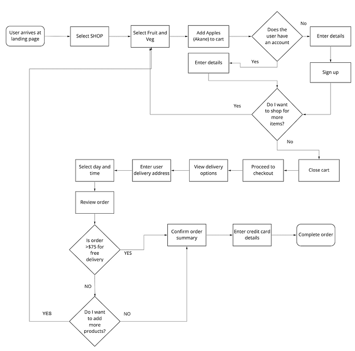
1.5. Potential Customer Flows
By looking at our task analysis and the resulting emotional experience, we decided to imprint those shopping journeys of what customers needed to go through to order on CERES and competitors’ mobile sites. These were created in the form of user flows, per the CERES example below:
Step 2: DEFINE
2.1. Who Are Our Customers?
After further deliberations on our 250+ interview insights and customer flows, we reached a consensus on what our primary and secondary personas were to look like. We based their bio details and scenarios on the most prevalent customer behaviours in our target group (plus most in-line with the brief). Et voila, Nadia the primary persona was born.


2.2. The Main Problem
Nadia expected seamlessness as a given in online shopping (whether organic or not) and left the site if otherwise. In response to this we honed in on one problem statement to align our customer needs and CERES’s business goals:

In other words, the heart of the problem was a lack of convenience.
2.3. Final Check on Analytics
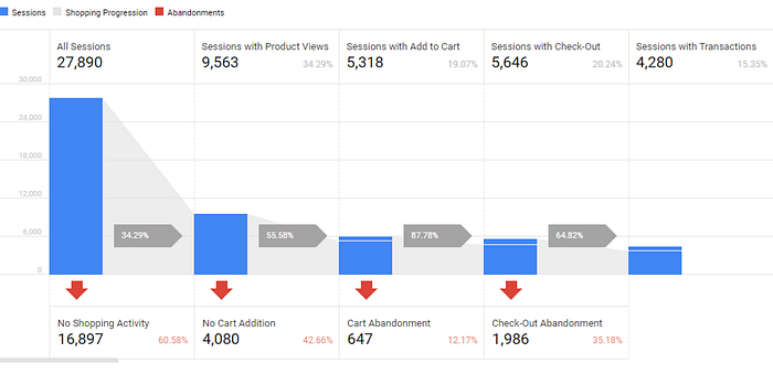
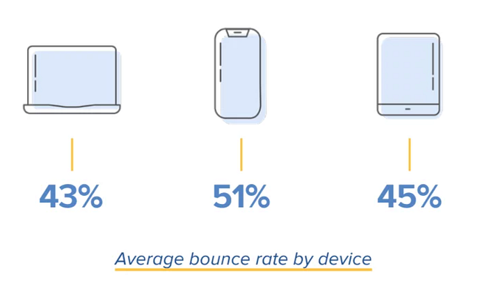
Honing into which phases were key to target along the customers’ shopping experience, I focused between sessions with product views and those at “add-to-cart”. The first stage from landing page has the largest drop of 60.6%, but as I investigated deeper a lot of this was due to the unavoidable bounce rates of around 51% that websites suffer from.
Thus, it was logical to prioritise the second stage. Also depending on our ideation, we felt the other stages could also be partially solved to ensure end-to-end, seamless shopping experience.
Step 3: DESIGN
3.1. How Might We Improve Retention?
To approach the Nadia’s pain points from different perspectives, we created How Might We statements and one statement of focus.

“HMW help Nadia easily find her desired produce online, so that she always gets what she is looking for.”
3.2. Minimum Viable Product Only
Keeping the above in mind we conducted a design studio. The solution sketch was in the form of Crazy Eights, followed by a rating session on our Impact/Effort matrix.
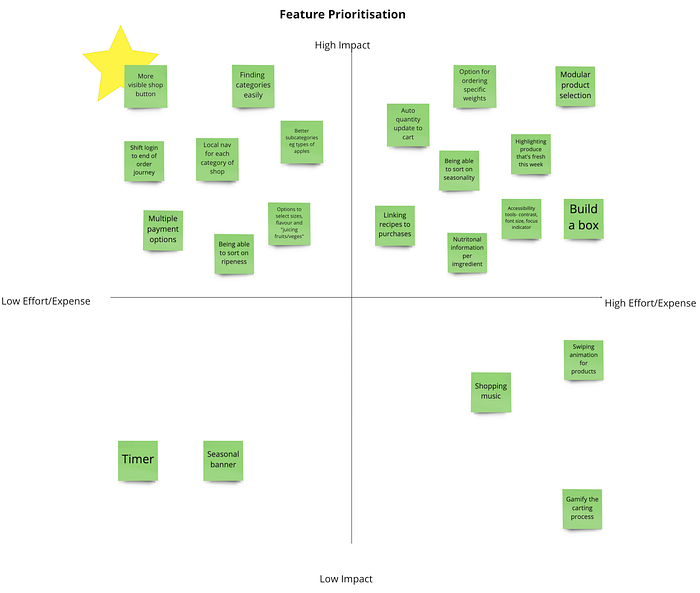
We then produced two solution sketches out of features in the top-left quadrant. This included early ideas of a new landing page, categorisation, and a shift of the login window toward the end of the order journey.
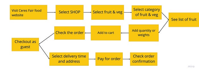
3.3. Task Flow
From the solution sketches we paved a happy path for Nadia from where she would land, select their produce items, check the order, and checkout/pay.
3.4. Call Me a Cartographer!
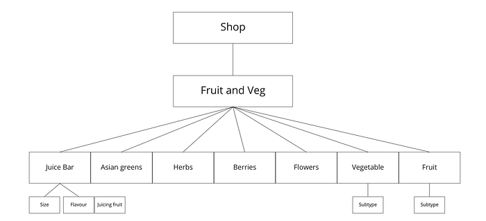
As part of our solution package for Vege Trails™ we needed to take stock of the current mobile site’s hierarchy and placed headings under post-its called “Main Category” and “Subcategories”. After discussions with my team we decided to recruit 5 users to perform a closed card-sort to keep our number of categories to a minimum. Then we redesigned the sitemap.
Key takeaway:
- There were a few ambiguous headings, such as ‘aromatics’ and ‘salads’ categories. These were identified and refined into the seven major produce groups:
Step 4: DELIVER
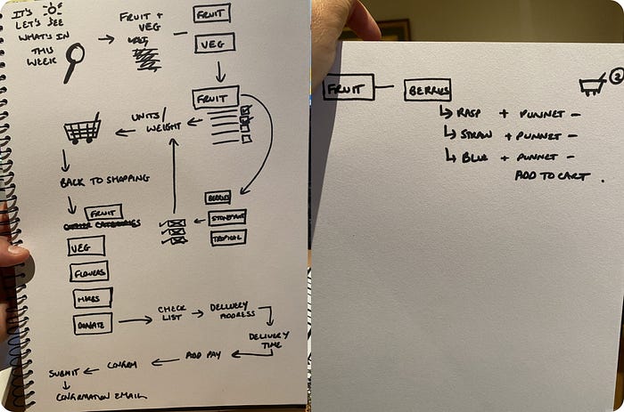
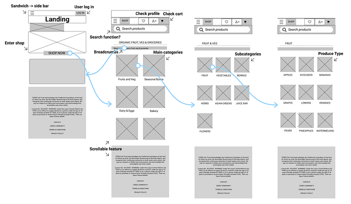
4.1. Grayscale Wireframes
I developed initial lo-fi wireframes to best represent our customer flows, sitemap, and other additional features to be included in Vege Trails™.
Main navigational trail:
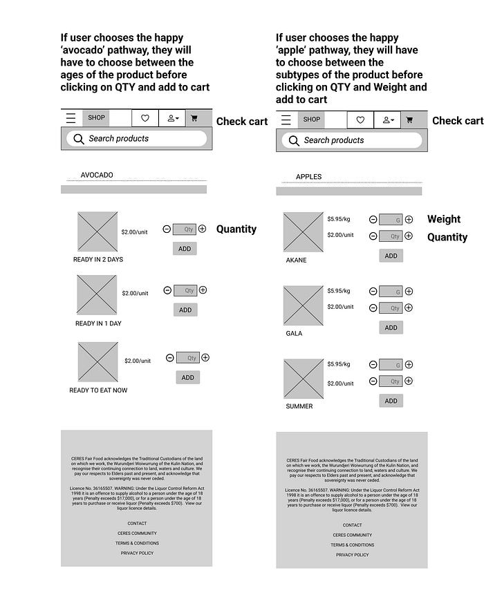
Basically landing page → categories → subcategories → produce type.Crossroad trails:
1. Happy path for Apple selection
2. Happy path for Avocado selection
4.2. Wireflows and Usability
Following the main format I linked up the screens and devised our remote moderated usability test plan.
This was so I could create a clickable mid-fi and test out the simplest shopping functions first, namely:
1. Enter shop
2. Find and select a product subtype e.g. ‘Akane’ apple
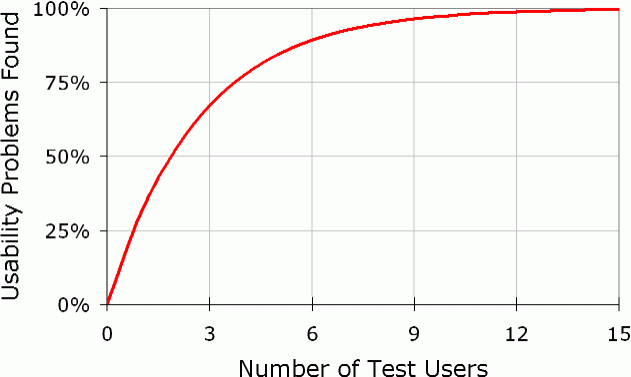
3. Add to cartWith heavy time constraints, we managed to enquire three of our user group members to test try our app. We recognised that the ideal number of participants were 5 (to reach 80% confidence) but also it was prudent to stop at three once very similar overlapping patterns were seen between the users.
Afterwards we determined the major pain points in our specific happy path of purchasing fresh produce. Overall our new app was rated smoother than the previous version.
Some notes from our testers:
- Produce quantity versus kg as units — locations were not logical, plus putting both on the same screen as an option could be quite confusing.
- Minor issues, such as back buttons not working.
4.3. Accessibility Points
As a finishing touch I tested the original mobile site through SiteImprove and found two issues: colour contrast and link visibility.
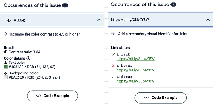
- Link: I have used the Chrome app to identify and removed it from our solution as this was redundant.
- Contrast: I ran it through Adobe Color, and changed the scheme to make contrast greater than 4.5.


4.4. Final Prototype
The main problem to be solved was a matter of seamless experience as soon as Nadia would land on the main mobile page. I refined the frames and produce the entire high-fidelity prototype on Figma, including each component and flow animations to ensure smooth sailing of the app.


The clickable prototype is also available here.
4.5. The Final Stretch
Due to the professional nature of our course and ND issues, I was unable to do obtain direct feedback from CERES Fair Food staff.
We presented as a duo and answered stakeholder questions. Then we proceeded to show off our interactive prototype to demonstrate how we solved the main problem with our navigational package.
Key takeaways from our stakeholder:
“Firstly, let’s acknowledge the amount of work you needed to get through as a pair [while others have three people].”
- The stakeholder commended us whilst losing a teammate early in the project we still pulled through in the quality of presentation and end-to-end research.
- During the presentation, the wireframe screens and prototypes were too small to see — this has now been broken up after case was debriefed.
4.6. Did We Provide Value?
We reflected over the 4 design phases we followed and ticked the following criteria of positive business outcome.
Vege Trails’™ main impacts on the CERES Fair Food mobile site:
- Improved customer experience on our main landing page, shopping page, and entire customer experience.
- Took research and customer personas to provide evidence on most if not all our design decisions.
- Customers now can have multiple clear ways of finding specific products, an efficient way of purchasing products, and an easy checkout process aligned with best practice(s).
- For new visitors: now able to find their way better amongst shopping categories, and therefore enjoy the customer journey.
- For returning visitors, able to order faster and seamlessly.
In future, to gather more quantitative and qualitative metrics, we could conduct further tests to track how Vege Trails™ benefits CERES over time. This is ultimately to improve CERES’ ranking and revenue.
Measuring Future Quantifiable UX Success:
- Tracking Google Analytics in 2022 to see if drop offs have decreased between landing page (i.e. bounce rates) product/shop session, and add to cart functionality.
- Increased conversions and dollar value of cart.
Key Learnings

Being involved in this case had taught me many essential key skills in the world of design, including crisis management, site mapping, project timelining, and to conduct proper business research to ‘test the waters’. I would like to personally thank Enza Soubjaki for being an excellent partner during our case trials and tribulations.
Thank you for your time
Bonus — Disaster Struck!
After our design studio, we found that we were leaning more towards solving for a “customisable boxed produce”. This unintentional scope creep became a wrong fixation since it was based only on one small section of the affinity map (rather than an overall trend).*We panicked a little as we mulled over our potential next steps. Considerations were:
1. We were 3 days prior to the final presentation
2. Any changes to be made might mean redoing previous stages of the design
3. Reminding ourselves that we were already one-man short
In the end we decided to pivot here. I made another glance at our insights, took a higher-level approach and found an overall verdict that sought navigation and also easy to use UI. We proceeded to then amend our persona, problem statements, and HMWs.
I believe we must have redone our Crazy Eights in 4-minutes batches as we were ideating like mad people. In the end, we arrived at another (the current) solution and wireframed, and proved that “when the going gets tough, the tough gets going”.

