A streamlined user flow on the Target app
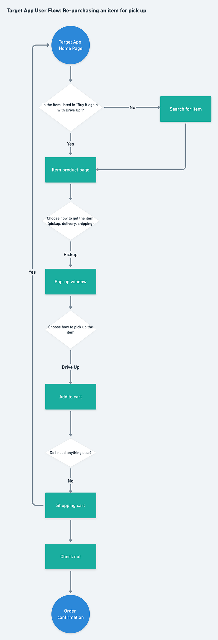
I frequently use the Target iOS app, and I find it so simple and straightforward that I often choose Target over its competitors for this reason. One activity I often perform on the app is to re-order a previously-ordered item for pickup, and so I have created a flow chart outlining the steps involved (or “user flow”).

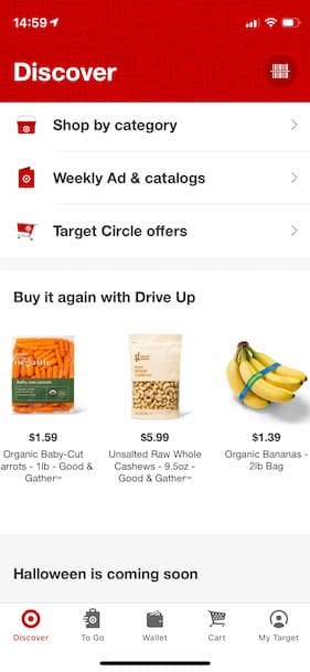
The user’s journey begins at the Target app’s home page. This page contains many elements, such as a search bar, advertisements, coupons, and the ability to shop by category. Scrolling down, there is a section titled “Buy it again with Drive Up”, with pictures, prices, and descriptions of items the user has ordered previously. The items are displayed in borderless cards, and the photos are especially helpful to reinforce the memory of the items.

If the user does not see what they are looking for in this area, they can always go back to the top and search for it. Search uses autocomplete, which is a common time-saving design pattern. However, assuming for a moment that they do see what they want, tapping on the item takes the user to the product page, where they can choose to either pick up the item or have it shipped or delivered. Upon making the decision to pick it up, a pop-up window gives the user the further choice to either go into the store to pick up the order, or have the order brought to the car with Drive Up. Having this second choice as a pop-up window that only appears when needed reduces cognitive load on the product page.
The user chooses Drive Up and adds the item to the shopping cart. If they need anything else, they will complete the same process for each additional item. If not, they use the bottom menu to head to the shopping cart and check out. The “check out” button itself is in a “sticky” bar at the bottom of the screen. This allows the user to check out quickly, without having to scroll through the entire shopping cart page.
The entire process can be easily completed in a few seconds from a mobile device, without requiring a laptop (or even two free hands). Items can be added to the cart and ordered while in the middle of another activity. Target has created a streamlined user flow with common design patterns to make shopping easy.

