A design manager reviews Uizard
Part “2.5” of the Embracing our fear of AI blog series
In the spirit of embracing some of the fear or uncertainty surrounding AI (captured in this blog series, see part 1 and part 2 ), I’ve been playing with AI-assisted design tools. For context, I come from a content design background and I’ve been managing content and product design teams for the last 7 years. This post is about my experiences with the Free and Pro versions of Uizard.io, a “build it yourself” UI/UX design tool.
Getting started with Uizard
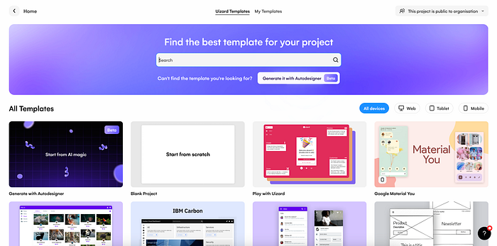
While I was initially drawn to Uizard for the AI “Autodesigner” assistant, I quickly realized upon signing up that the free version doesn’t include this wizardry. The free version instead gives you a series of templates and components to design with, along with some AI features (rather than a full-blown UI generator):

In all of the templates, the onboarding tour points you to basic tasks (adding screens, components, interactions) but without much tailored content about how to customize the template to your needs.
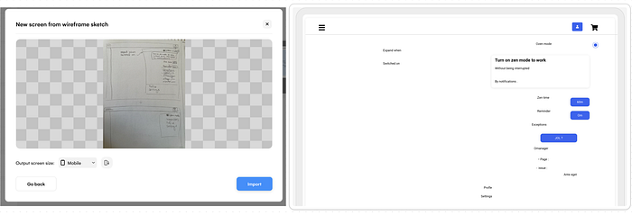
One of the coolest AI features in the free version was the wireframe and screenshot uploader, though I think the wireframe uploader needs some work as this is what became of a pencil sketch I found in an old notebook:

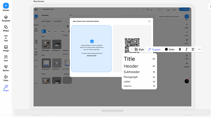
I found that the screenshot uploader worked much more quickly and it was cool to be able to instantly play around with the screenshot components (yes, I went meta and used a screenshot of the Uizard UI to play with Uizard’s UI…):

Overall, I felt like the style and overall vibes were a bit simplistic but I appreciated the low barrier to entry. You can easily jump in and start moving components around, though you definitely need to know some basics of interface design and design systems.
The good:
- Low barrier to entry
- Lots of templates to choose from
- An easy toggle between wireframe and mockup mode (though I think this is more of a “looks cool” feature than anything else)
- Some basic AI features (AI-generated screens from screenshots and hand-drawn wireframes, as well as suggested UI text)
The bad:
- Components fell apart almost immediately after you dragged them onto a screen (I would have expected some basic grouping to keep the component elements together)
- The design area was quite busy overall, especially with onboarding guides/messages that couldn’t be dismissed (my least fave thing when it comes to onboarding)
- There were no credits to trial the Autodesigner functionality and the image/text suggestions (of which you only get 5 free/month) were basic
Using the Autodesigner
I skipped through the free version pretty quickly because I was really after this mysterious Autodesigner AI feature. I currently manage design teams who work on Confluence (Atlassian’s knowledge management and collaboration tool), so I tried experimenting with a prompt related to an onboarding project we’ve been working on:

Without that many controls or examples to look through, I kept my prompt simple and regretted doing so as soon as I saw the tip on the following loading screen:

When the project loaded, you get dropped into the project design space, where you have the option to regenerate another set of screens with the same prompt or generate with a new prompt. Here’s what the Autodesigner created the first time around:

It was good to have so much language about this being a Beta feature because I have to admit I was expecting more. The screens felt like a mishmash of an education management system, a task tracker, and a team directory. I would have loved to have been able to accept/reject the components that didn’t align with my prompt and regenerate specific screens rather than the entire project.
Because I felt like I was stretching the tool with an overly complex prompt, I ended my experimentation time with a simple prompt for good measure:

As with the free version, the output was quite simplistic and I still strongly believe that you need a lot of design education to know what to do next to bring these types of exercises to real life.
The good:
- Autodesigner lets you generate screens in minutes
- If you don’t have an existing design system, this lets you play around with what a common design language might look like
The bad:
- $19/month price tag felt steep for a Beta feature
- Little to no accessibility standards
- No easy way to do bulk edits (e.g. changing colors or border style across the project)
- My inner content designer cringed at the amount of Lorem Ipsum placeholder content (which made the suggested text feature pretty much useless, unless you wanted to generate random words)
The takeaways
At the end of the day, I wanted to experiment with automated screen generation and that’s exactly what Uizard allowed me to do. While I found the tool too simplistic for my team’s needs (I’m sure improvements are coming down the line), it felt like a helpful starter kit for entry-level designers and students.
It’s important to note that AI tools automate only part of the design process. Experienced designers still have a big role to play in how teams shape the right prompts and ensure that automatically generated screens eventually become usable, accessible, and in service of a real user need. Playing with automation still requires creative thinking after all.
So, if you’re a designer or design leader, I’d recommend at least giving the free version of Uizard a try. It might feel like going over to the dark side to play with tools that automate parts of our jobs, but it’s on us to learn how to adapt our roles to work alongside AI tools rather than against them.
Have you experimented with Uizard or other AI-assisted UI/UX tools? Let me know in the comments! If you’re enjoying these posts, follow my Medium account and stay tuned for ✨ Embracing our fear of AI, part 3….coming soon.

