Member-only story
A complete guide to call-to-action design

Call-to-Action (CTA) design could be the essential component across whole design system. Many companies strive to design a better CTA. However, one’s meat is another man’s poison.
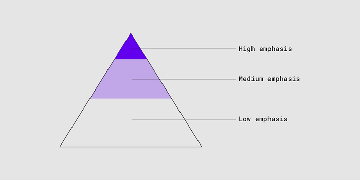
First of all, let’s define what is CTA. In material design, it has defined that buttons are used primarily for actions. We can view buttons as allowing users to take actions and make choices, with a single tap. Following is what material design defined button types and hierarchy.
- Text button (low emphasis)
- Outlined button (medium emphasis)
- Contained button (high emphasis)
- Toggle button
A screen should only have a single, prominent button. And the whole site/app should have the buttons in a consistent location in the interface.

Then, I’ll introduce the CTA design in this order: button color, placement, button size, and button shape.
Button color
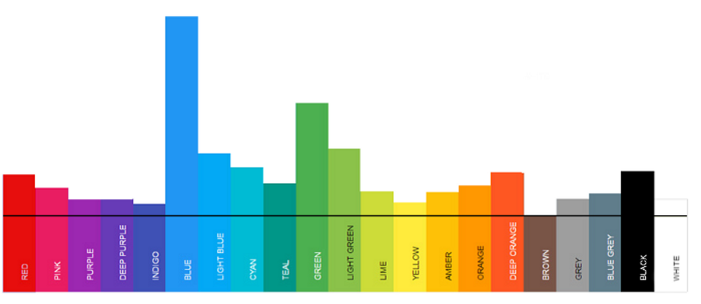
Is there any magic color that drives conversion? The answer is clearly NO. 48 % of brands match their CTA color with their brand color. A review showed that blue is the winner choice. What’s more, Gmail had tested 50 shades of blue for their CTA color and found the highest converting shade.
Von Restorff effect
Von Restorff effect, aka isolation effect. The effect predicts that when multiple homogeneous stimuli are presented, the stimulus that differs from the rest is more likely to be remembered. In order to catch attention in the first glace, the button color should have a stark contrast to the background color. I would suggest using the button color to be an unused color among the interface.


