8 Fonts You Should Use in 2023
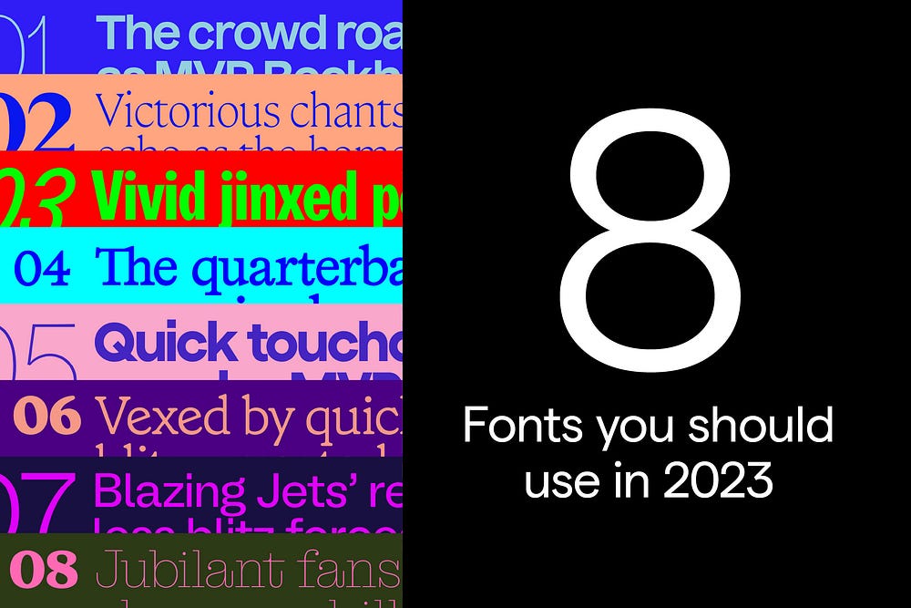
Here are 8 unique, versatile font families for your next project in 2023.
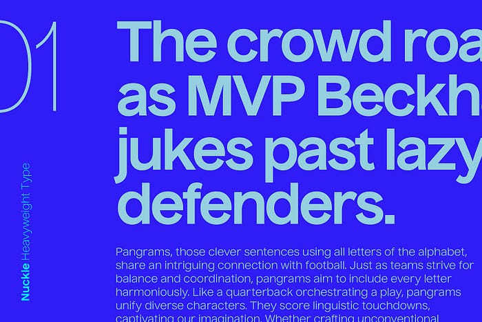
Nuckle by Heavyweight Type Foundry
Nuckle is a sturdy, functional grotesque developed by Filip Matějíček of Heavyweight in 2011. Its high x-height and uniformity make it widely adaptable at different sizes — from large headlines to body copy. I especially appreciate the spurs on the lowercase ‘a’s and ‘t’s, as they take on a sharp angle. I love how the lowercase letterforms jigsaw together when kerning tightly — this beauty is built to go big and bold on a poster. It’s available in eight styles and supports multiple languages, not to mention an extensive glyph set.
Find Nuckle here.
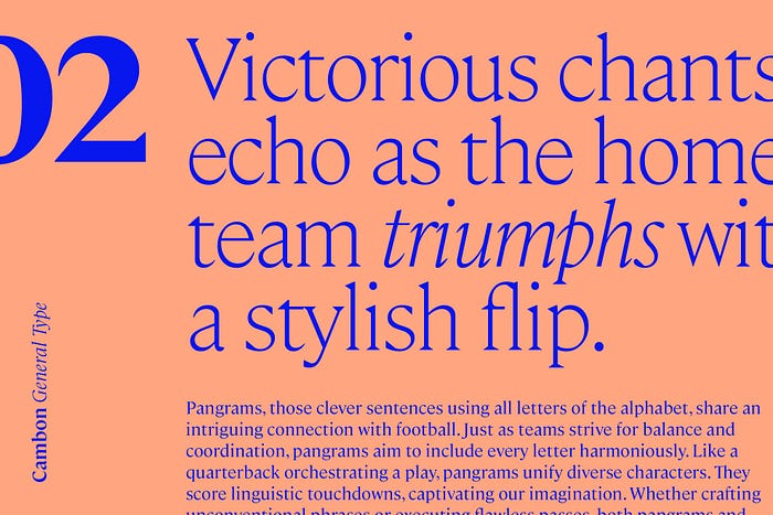
2. Cambon by General Type Studio
Cambon was designed by Stéphane Elbaz from General Type Studio in 2018. It’s a contemporary flared serif with a whopping 18 styles available to license. In its lighter weights, it can appear very elegant, even fragile. And in its heavier weights, it becomes quite distinct with memorable flares and sharp angles. Zeus Jones uses Cambon as one of their brand typefaces, and quite well I might add.
Find Cambon here.
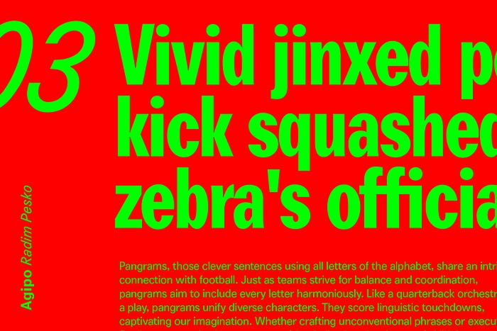
3. Agipo by Radim Pesko
Agipo was developed by Radim Pesko over time from 2011 to 2014. It’s an elementary sans serif typeface; it’s plain character speaks fluently in a diverse range of languages. On the surface, it may look like just another grotesque like Franklin Gothic, but its round tittles (the dots above the ‘i’s and ‘j’s ) give it a much friendlier vibe. There’s also a little bit of funk going on with the tail of the ‘y’ and the bowl of the lowercase ‘a’s — this bad boy has a lot of personality.
Find Agipo here.
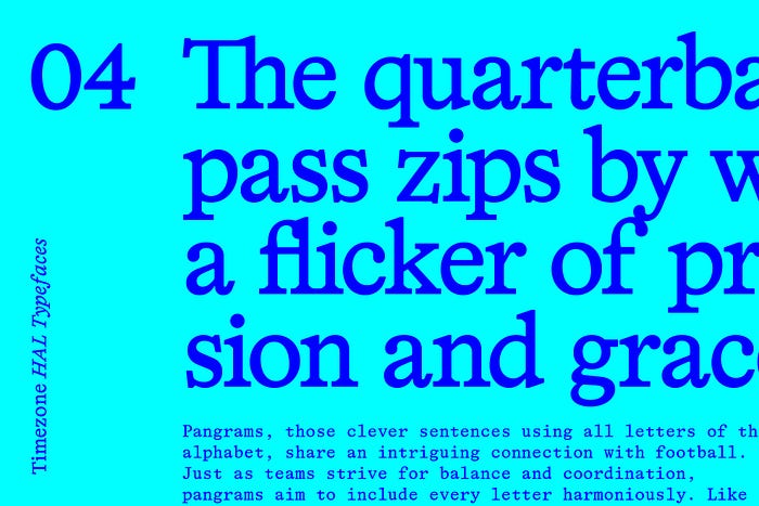
4. HAL Timezone by HAL Typefaces
HAL Timezone is a low-contrast, weighty serif typeface developed by Studio Hanli in 2021 and released by HAL typefaces. Timezone is aesthetically inspired by early digital fonts, freshly transitioned from the phototype era. Think Plantin, but with more angles and a little more chunky. This peach also has some quirky ligatures packed into the glyph set.
Find HAL Timezone here.
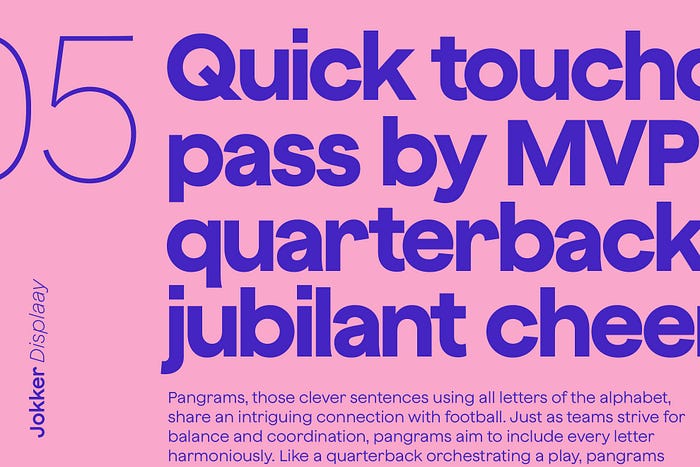
5. Jokker by Displaay Type Foundry
Jokker is a sans serif designed by Martin Vácha of Displaay Type Foundry. Jokker, like Nuckle (no. 1 on the list), has an elevated x-height which makes it very versatile across applications. It differs from Nuckle in its construction — glyphs are constructed with geometrically circular forms and terminals are diagonal and tight. There are some lovely subtle details, like slight ink traps, that give this typeface an extra boost of personality.
Find Jokker here.
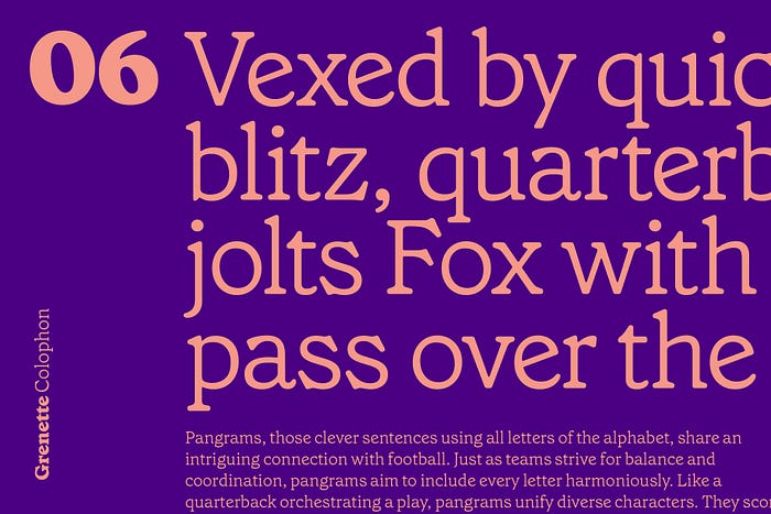
6. Grenette by Colophon
Grenette is a vintage-inspired serif released by Colophon Foundry in 2020. Grenette fuses influence from the typefaces Windsor and Richmond Old Style, hearkening back to rounded wood type from the early 1900s. Grenette’s softer features give it warmth and friendliness, and its five weights provide versatility across character sets. Grenette can be widely seen throughout Sweetgreen’s recent rebrand by Collins.
Find Grenette here.
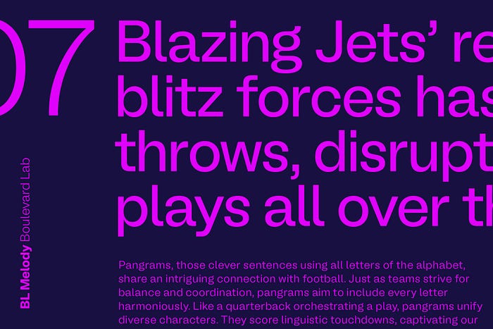
7. BL Melody
BL Melody is a contemporary sans-serif designed by Sam Glen Hughes and released in 2021. Melody is inspired by Swiss typography of the 1960’s — it’s a minimalist workhorse typeface with a distinctive friendly touch. I find Melody to strike a perfect balance between friendly and professional; a difficult equilibrium to reach. Available in 7 Weights, 14 Styles.
Find BL Melody here.

8. Montagu Slab
Montagu Slab is an open-source, slab-serif display typeface designed by Florian Karsten. The typeface draws inspiration from 19th-century classic designs and it is available as a variable font with weight and optical size axes. Think of it as an interesting alternative to Clarendon — the spurs of the lowercase ‘a’s are especially intriguing.
Find Montagu Slab here.
Overview
Noah Mooney is a Designer and Creative Lead with a focus on art direction, graphic design, and branding. Currently working as Head of Design at RP3 in Washington, DC.

