76 features in Figma to know
We will look at each button in Figma’s user interface on the Desktop App, and break down what each feature does. Figma is a collaborative web application for interface design, with additional offline features enabled by desktop applications. We will start with the left panel which houses our layers, the right panel with our design editing selections, our main tools on the top panel, and all the menu options.
Here we can see the full Figma UI with a copy of the PS5 Interactive UI (Community) file created by Jarrett Harris. You can find the original file here.

For the first section I will analyze the left panel of Figma’s UI which contains the Search, Layers, Assets, and Pages.
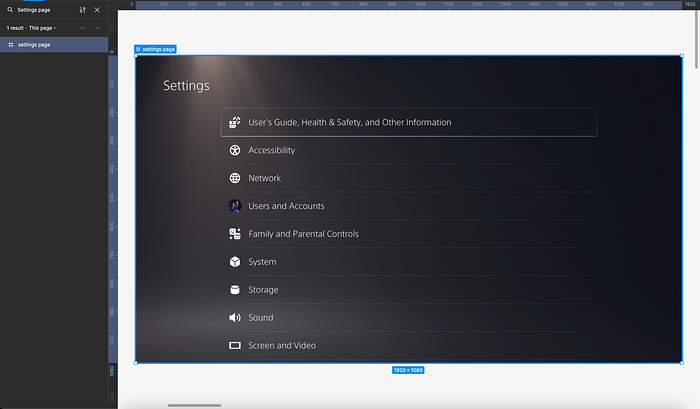
1. Find and replace

This button will allow us to search our full Figma file for specific icons, assets, styling, or frames we have named throughout our file. Here is a blog post from the original Figma designer who worked on this feature.
Find and replace.
Jackie Chui describes these three primary use cases for find and replace in Figma:
1. Text search
2. Quick navigation to pages and top-level frames
3. Layer name search
2. Layers

This button will toggle our layers below. By default, our Figma file should have the layers panel open.

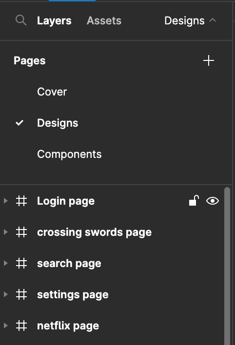
In this screenshot we can see our layers panel with the login screen toggled open. Here we can see that the # symbol in front of our layers indicates that it is a frame. If we double click on the symbol it will bring us directly to that frame/element in our Figma page. We also can see that we have text layers, groups, an image layer, and a rectangle. Here is a blog post that discusses frames and groups in Figma. Frames vs. Groups
3. Hide/Lock layers

We can also hide our layers, or lock them. You can see the lock icon, and the eyeball icon. Clicking on these will toggle them.
4. Assets

When we click on the Assets button, it changes our layers pane into the assets pane. Here we can find all the assets we have used in our file such as components, color styles, typography styles, and icons.

Here is an example of the Assets pane when it is toggled. We can search our assets, and see local components created within our file.

Here is an example of the components I have available to reuse by dragging and dropping from the assets pane. It is a combination of icons, tiles, and graphics. Here is Figma’s documentation on Assets.
5. Show as List/Grid

By default our assets pane will be shown in a grid style. If we toggle this icon then we can view our assets as a list. Once we toggle the list view, then it will change to a grid icon, which allows us to change it back to a grid view.
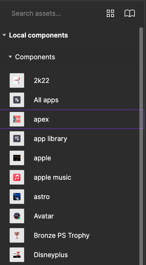
Here is the list view of our assets. Drag and drop to reuse in our designs.

The Show as grid icon we can click to revert to a visual style of viewing our assets.
6. Import libraries

The book icon in our assets pane allows us to import external libraries into our Figma file. A large company will have multiple design systems that you can bring into a single file. There may be a design system for a particular mobile or desktop view, a brand guideline, or different design systems that a company uses across various products.
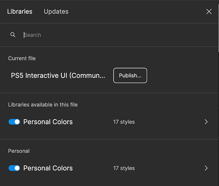
If we click on our library button, it will trigger a popup that allows us to import an external library. In my file I currently have access to one library in my Figma files, which is called ‘Personal colors’. You can see in the popup, that I have Personal colors toggled on which allows me access to all the styles created in that file. (If you have no libraries in your Figma files, it will appear empty)

If we hover on the ‘Personal styles library, it will allow us to open that file.

Above we can see the Personal colors Figma library that has 17 colors. I have access to this library of colors in all of my Figma files.
7. Publish a library

If we have created any styles in our Figma file, we have the ability to publish it as a library for use in any other files. If we publish, it will now be available for import in our other Figma files.
8. Update a library
If we have published a library, and make changes to that library, we will then need to update all external dependencies to automatically make those changes throughout our files. Here I have toggled our Updates panel, and since my file is up to date with ‘Personal colors’, there are no updates. If there were updates, it would automatically change the styles in my file once we updated.

9. Add Pages

If we toggle the Pages tab, it will open up all the pages we have available in our Figma file. We can create an infinite amount of pages.
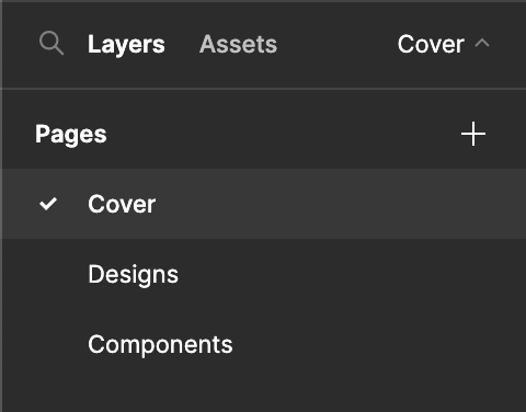
We can see below our list of pages we have.

If we want to add a new page to our project, we have to click on the plus icon. The two main pages of my file are ‘Designs’, and ‘Components’. Here is an image of the components page that has components such as a menu, the Playstation Plus icon, and several tiles. Components will vary from project to project, and these are just PS5 specific.

The right pane features
I will now start reviewing the right pane in Figma. The right pane is where we can access our properties for our designs, prototyping, inspecting, local styles, and we can export our designs.
10. Change the background color of our Figma file
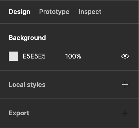
The next feature is the ability to change the background of our Figma file. If we have no frames or elements selected, then we can click on the Background property in the right pane which is currently set to #E5E5E5 by default.

I will change it to a dark color, and we can see the background behind our frames is now black.

11. Align frames, Tidy up, and distribute by vertical or horizontal spacing

If we have a variety of frames on our page, and we want to quickly align our frames we can use the icons to Align left, Horizontal center, Align right, Align top, Align vertical centers, Align bottom, Tidy up, Distribute vertical spacing, or Distribute horizontal spacing.

We can see how our frames are in a staircase pattern. If we tap on Align Horizontal center, then all of our elements will align.

Now our items are aligned horizontally, but there are inconsistencies in the spacing between each card. We can use Tidy up to evenly space them.

Now our frames are evenly distributed, and aligned in our Figma file.
12. Change a frame to a standard size

If we select a frame in our page. We can now select the frame dropdown to select a standard size for our frame.
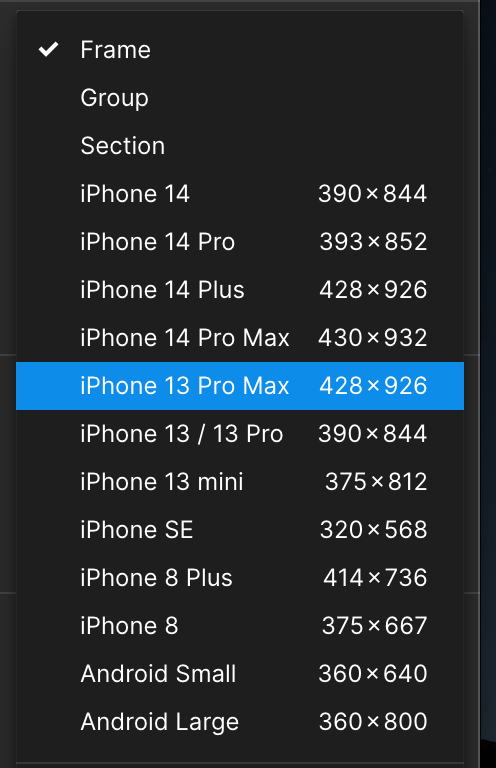
This will automatically change our frame to any standard size, like an iPhone 14 for example. There are many desktop options also available in the dropdown that are not pictured here.
13. Change the orientation of our frame to landscape, portrait, and resize to fit

If we select a frame, we can use the icons to the right of our frame dropdown to change the orientation of our frame based on the Width, Height, or we can resize our frame to fit to the elements within.
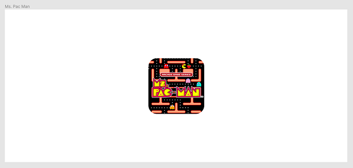
If we select the resize to fit icon, our frame will adjust to the same size as the elements on our frame. Here our frame perfectly fits around our tile.

14. Change the X and Y coordinates of our frames
If we select one of our elements or frames we can view the X and Y coordinates in our right panel. I have selected the Settings page below.

We can see that the current X and Y coordinates are set to 1773, and -4487.

If we set the Y coordinate to -4399, it will align our settings page to the same Y coordinate as the frame next to it.
15. Change the Width and Height of a frame or element

If we select a frame or element in a frame, we will now see the option to change the width, and height.
16. Use math to change the Width and Height of an element or frame

If we click on an element within our frame, and want it to be 3 pixels more in Width, we can type in the width of the element +3, and it will adjust the element based on the math. This works for addition, division, and multiplication as well.
17. Constrain proportions

We can use the constrain proportions if we wanted an element to remain proportional at all times. A use case for this is an icon, or a circle that we want to remain perfect in proportion. (Not turn into an oval) If we click on the icon to constrain proportions, then it will scale automatically in proportion.

18. Change the angle of an element

If we select an element, we will see the ability to change the angle of it. We can either type it in manually, or hover over the angle icon and drag it left, or right to manually change the angle.
19. Change the border radius of an element or frame

We have the ability to adjust the border radius of a selected element. We can type our radius in manually, or by dragging over the border radius icon.

We can see there are additional options on the right of the border radius icon that allow us to set independent corners with a radius. This is great if we want only one side of an element or frame to have rounded corners. Here is the Figma documentation for Corner radius and smoothing.

20. Clip content

This feature allows us to contain elements within our frame. If we have an element that falls outside of our frame, we can click this button to hide everything outside of our frames edges.
21. Apply Autolayout

Autolayout allows us to style our elements in a way that is similar to code. We can dynamically set our elements to be spaced a specific distance away from each other, add padding, and alignment.
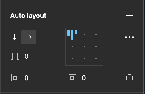
We can set the autolayout to flow vertically, or horizontally, and set independent padding.

These advanced settings allow us to simulate responsive design features using autolayout. If you drag your frame horizontally, autolayout can adjust the content appropriately. This is a great feature to practice in your designs. Here is Figma’s documentation if you want to learn more about Autolayout.

Absolute positioning will appear if you place an autolayout container within another autolayout container. This allows us to simulate the CSS property of absolute positioning in our designs.
22. Apply layout grid

Layout grid allows us to add a measurement system to our design frame. This helps us view our designs in a grid. We can apply a custom grid, columns, or rows to a design. We can also apply multiple layout grids to one composition.

We can apply the size of our grid in pixels, and also change the color and opacity of our overlaying grid.
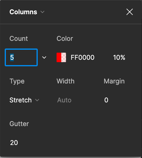
If we click the dropdown menu we can switch to columns or rows for a layout grid. Columns and rows allows us to have more properties to change, like adding gutter between our columns. We can set the Width to Auto, or manually set how wide we want them. We can add margin which simulates the CSS margin property.
23. Apply blend modes

Similar to Photoshop, Figma allows us to apply blend modes to our layers. If we have a layer selected, we will see the element set to Pass through blend mode by default.

If we select the dropdown we will see all of the available blend modes. If you place a layer with color over an image, and play with these settings you will see interesting results.

24. Change the opacity of our layer
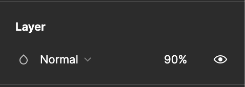
If we change the 100% in our layers panel it will change the opacity of our layer to transparent.
25. Apply a single fill or stack multiple fills

When we select a layer, we can click on the plus icon in our Fill panel in order to add a new fill to our layer.
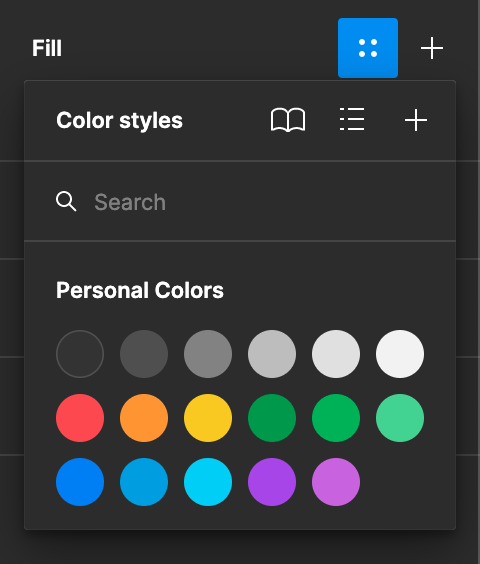
Throughout the Figma panels, we will see the 4 dots icon that is selected above. This is where we can access the styles imported from a library. For example, I can see the color styles imported from ‘Personal Colors’. This four dots icon will appear in our text styles, strokes, and effects as well.

We can also stack multiple fills to a layer. A use case for this is if you want to layer a gradient over a solid or image fill. In the example above, I’ve applied a purple gradient to a tile that had a black fill. The layer is set to 70% opacity, so the black appears as a grey color.

If we select one of our fill layers, and tap on the dropdown, we can see our available options for a fill. Video would add a playable video for a prototype, and image fills our layer with an image of our choice. Radial, Angular, and Diamond are variations of different gradient styles.

26. Edit the properties of our image, or color fills
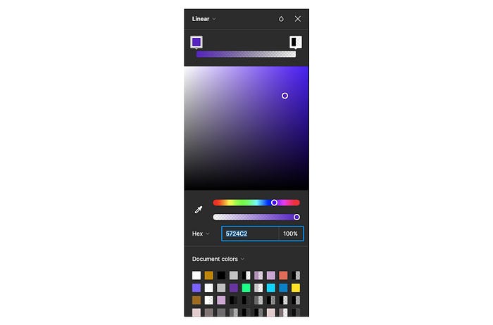
We can change the opacity, add a custom Hex, RGB, CSS, HSL, or HSB value for our colors. We can also use the color picker, and Figma suggested colors from our document or library.

We can see above that we can edit our images Exposure, Contrast, Saturation, Temperature, Tint, Highlights, and Shadows.

We can also edit how our image will fit within our layer. If we are placing a portrait image inside a square layer, we can use the Fill property to make sure the image zooms in to fill the full square. I work on a lot of E-commerce product cards, so I will use the Fit property and Crop to ensure that the product has the proper white space close to the edges.
27. Add a stroke to a layer

When we select a layer, we will have the ability to add a stroke to our elements.

I have added a 5px stroke with a purple to pink gradient around the tile.

We have 3 options of how to apply our stroke. We can apply it with the Center property, which for the 5 px gradient stroke it will place 2.5px Inside, and 2.5px outside. If we select Inside, all 5px will be inside the layer shape. If we select Outside, then all 5px will be outside of the layer fill.
28. Add independent strokes and advanced options

This icon in our stroke panel will allow us to set independent strokes on our layer.

For example if we click on the icon, we can now set a stroke to only one side of our layer fill.

Our 5px stroke set with an independent stroke on the bottom.
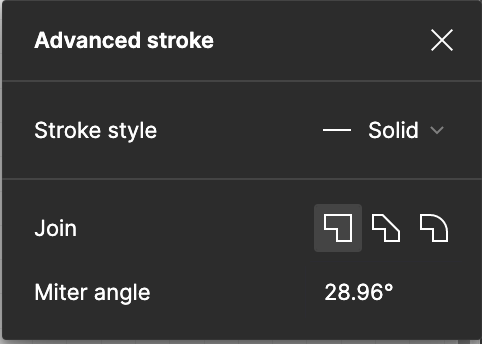
We can also set advanced properties like Stroke style, Join, or Miter angle. Stroke style will allow us to have solid, or dashed lines. Join and Miter angle allow us to change the look of how 2 strokes connect.

If we selected the round icon on the Join property, then our 2 strokes would be rounded at the point they meet. We also have additional options in strokes to add an end point to our stroke like an arrow.
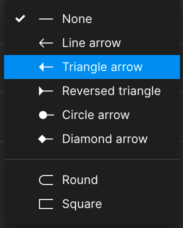
I have selected a Line arrow for each end point of my stroke.

29. Add effects to our layers

If we click the plus icon, we are able to add 4 effects to our layers. Drop shadow, Inner shadow, layer blur, and background blur. You can find Figma’s documentation for shadows here, and for blurs here.

Drop shadow and inner shadow allow us to edit the depth of our shadow on the X and Y axis, the strength of the shadow blur, the color, opacity, and blend modes on our effect. Shadow spread is only supported on rectangles, ellipses, frames, and components.

I’ve added Drop Shadows, and an Inner shadow to the tile.
30. Export our layers

I’m adding in Figma’s documentation for exporting our layers, and we have many options for file formats to export as. A quick tip is to export your file larger than it is to increase resolution. I usually export at 2x or 3x, and recommend developers to do that too when implementing a design. We can export a layer by clicking on it, and clicking on the export button. There are batch export options if we want to export all of our frames at once.

With my Ps Plus tile selected, I have shown the exported PNG file below.

31. Creating a prototype

The first selection I will make is to set a device. For the sake of continuing with the PS Plus tile, I will show how we can see how it looks on an Apple watch.

There are many devices to choose from, and I will show how our tile can adapt to this screen.
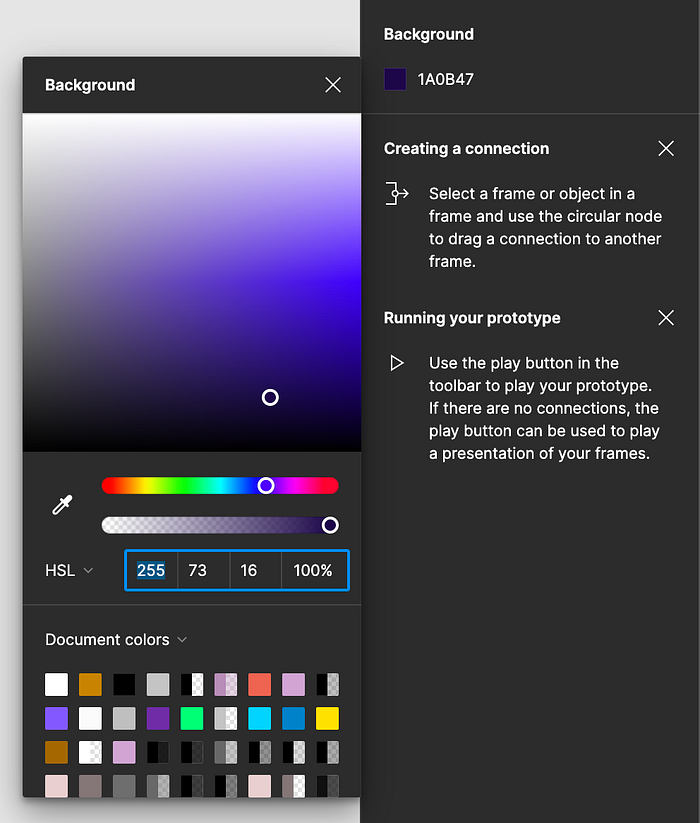
I’ve color picked a color directly from the purple gradient in our tile to set a new background in the prototype play back.

Now if we click on the play button while our tile is selected, it will show our tile in the format of the Apple Watch. (I edited the tile size to fit the new screen)

32. Creating a flow starting point

If we select the tile we can now select our Flow starting point, and name it. We are now ready to add another tile to show how a user can flow through a few tiles on their Apple Watch.
33. Create an interaction

When selecting a frame or layer, we can set up an interaction to happen in our prototype. For example, if we want to tap on the first tile, and land on a new screen.

We can set a tap, drag, hover state, press state, key/gamepad for video game scenarios, mouse enter, mouse leave, touch down, touch up, and after delay. You can read the Figma documentation for prototype triggers here. There is also an Interactive Components Figma file that has plenty of scenarios to play around with. You can find that file here.
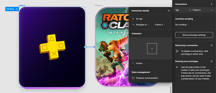
When in our prototyping mode, we can select on our first tile, and then hover near the right edge of the tile to draw a prototyping arrow to our next tile. This will allow us to tap on the tile when we are viewing the prototype, and click through to the next screen.

34. Set overflow scrolling on a prototype

Overflow scrolling allows us to simulate interactions like scrolling vertically on a feed. We can also simulate swiping actions like scrolling horizontally.
35. Smart animate and other animation properties

Figma has advanced options for animations in our prototypes. If we select our interaction, we will get details for how to add animations in our flow. Here is Figma’s documentation for how to add smart animation in our prototype, and which properties it can be applied to. The other properties like Move in, Move out, Push, Slide in, and Slide out can also be applied to our flow. Here is another page of Figma documentation that discusses the other properties we can apply. Push is great for simulating a swipe gesture.
36. Easing our animations and adding spring curves

There are many options we can apply to add subtlety to our animations. We can have the animation speed up, slow down, bounce, or spring. View the full list below.

Figma also allows us to set our own Custom beziers, and Custom springs for our own animation style. Here is the Figma documentation that explains animation settings.

We can also change the duration time of our animation in milliseconds. 1000 milliseconds = 1 second
37. Inspect

This is the best way to share our designs with developers. We don’t need to add measurements and specs, because of the Inspect pane! If you click on any frame or element, Figma will break down the properties, colors, borders, shadows, interactions, and provide code for our developer to start with.

This shows the properties, colors, and borders when the tile is selected on the Inspect pane. Figma allows for a copy feature so I can quickly copy out the specs:
height: 197px;
width: 162px;
left: 2502px;
top: 452px;
border-radius: 16px;

This shows the shadows, interactions, and CSS code for our tile. We can also switch from CSS code to iOS, or Android code.
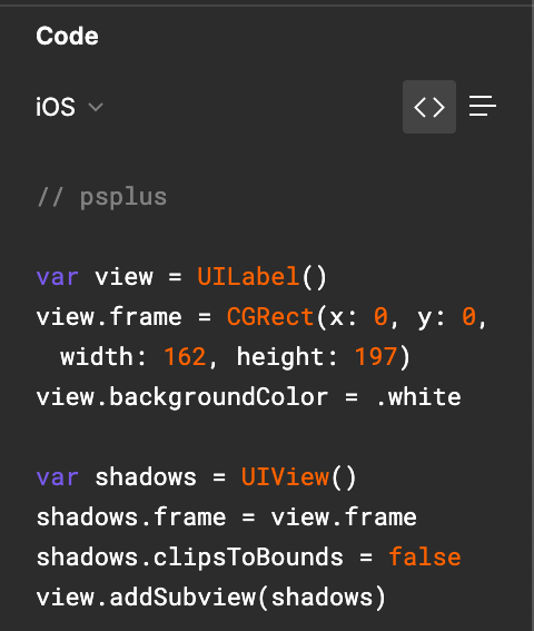
This is not the full iOS code Figma provided for our tile, but a snippet to show the capability.

38. The question mark features
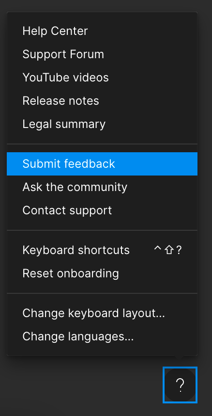
This modal shows Figma cares about users. There is a Help center full of different use cases and answers to every question you might have. There is a Youtube videos selection full of Figma tutorials, an option to submit feedback, or ask questions directly from other Figma users. We can change languages, and view all of the keyboard shortcuts. We can read the latest release notes to see which features Figma is improving, or reset onboarding if we need another refresher on how to use it.
The top pane features
For the next section of this article I will review the top pane features of Figma.

39. The drop down features
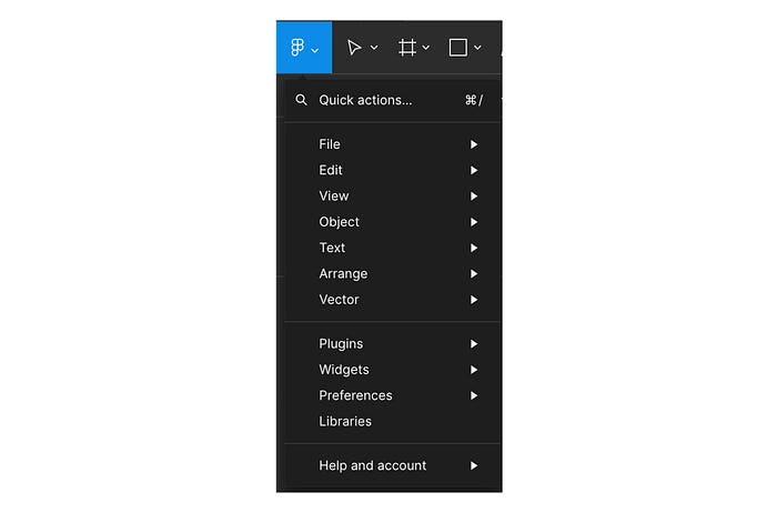
If we toggle the dropdown on the Figma icon, we will get a set of actions in a list format.

Here we can search our Figma UI for any tools we want to use.
A lot of these options are duplicate actions we can take elsewhere in Figma’s UI. For example there is a help center in this drop down, but we will also find the help center in the Menu bar, and the question mark feature. There are a lot of actions we can take here like create a new Figma file, undo an action, pick a color, select all, view a pixel grid, view a layout grid, group a selection, flip our designs, rotate our designs, edit our text, align our text, view plugins, and widgets. There are many more actions here, and I encourage you to explore these settings to learn them all.
40. The move tool

When we select the move tool, we can now move any of our layers, frames, or elements on the page.
41. The scale tool

The scale tool allows us to evenly scale our frames, elements, or layers. If we scale a group of elements, it will proportionally scale all elements together.
42. The frame tool

The frame tool allows us to place a new frame on the Figma page. When we select the tool we can see a list of standard device sizes we can choose for our frame.
43. The section tool

The section tool allows us to organize our Figma file by wrapping frames, layers, or elements together in a section. We can drag our elements into the section tool, or wrap them. You can view the Figma documentation for the section tool here.
44. The slice tool

Slices allow you to specify a specific region of the screen for export, even if they’re not organized into a single group. Just drag a slice around the region you want to export, and add an export setting to the slice object. Find the Figma documentation here.
45. Add a Rectangle, Line, Arrow, Ellipse, Polygon, Star, or Place an Image/Video

This tool allows us to add these primitive shapes to our compositions, and add an Image or Video.
46. The pen tool

The pen tool allows us to create vector based graphics. We can draw point to point, and then fill in our shape layer, or use the shape as a stroke.
47. The pencil tool

The pencil tool allows us to draw organic shapes loosely as a stroke. The shapes made from the pencil tool are rendered as vector graphics.
48. Add text

The add text tool is how we add typography to our compositions. Once we select the tool, we click and drag on our designs, and type to create text. Once we add text, we can see a text editor panel open in the Design panel on the right.
49. Edit text

Our Edit text panel in the Design panel allows us to choose a typeface, font weight, font size, sentence height, kerning, leading, decorations, alignment, paragraph spacing, paragraph indent, casing styles, list styles, and other options as well. If we click into the elipsis menu, we can see the basic, details, and variable options we have. We can edit many aspects of typography including how ligatures, slants, font weights, and other aspects of our text look.
50. The spaces dropdown (Local components, Plugins, and Widgets)

The icon that opens up our local components, plugins, and widgets tabs.

The local components section allows us to search our local file or libraries for components we would like to utilize in our designs.
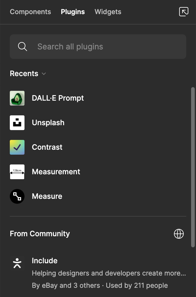
The plugins dropdown allows us to add many tools to our Figma capabilities. We can import plugins to help us create 3d assets, add striking photos, check accessibility contrasts in our designs, measure, add content like user photos, add animation, translations, DALL-E image generators, and many other plugins. If you can think of a feature you wish existed in Figma, you may find someone working on a plugin for it. You can also view the community tab in the Plugins dropdown to browse all the most popular plugins.
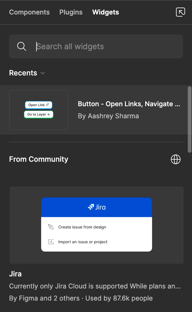
The widgets dropdown is a collection of tools to help us complete small tasks. You can find tools like Simple Vote, a Figjam widget to get votes on your team’s ideas, Font styles manager, Timeline, Photo Booth, and many other tools. You can also view the community tab in the widgets section to see what people are currently using.
51. The hand tool

The hand tool allows us to look around the design file without a worry of accidentally moving anything.
52. The comment tool

The comment tool allows us to add comments throughout a design file to give specific feedback.
53. View our project folder/path

The middle of the top pane shows the path for our project, and shows the title of the file name. If we click on Drafts, it will take us to the drafts folder.
54. Change the file name

If we click on the title of the file name, then we can edit it to something else.
55. Move our project/Create a new team

If we click on the chevron next to the project title it will open a dropdown of actions. If we click on ‘Move to project…’ it will show us options to create a new team, or move our project to an existing team. Here is the Figma docs on teams. I use the teams feature a lot during my work time, as we manage many teams chockfull of projects.
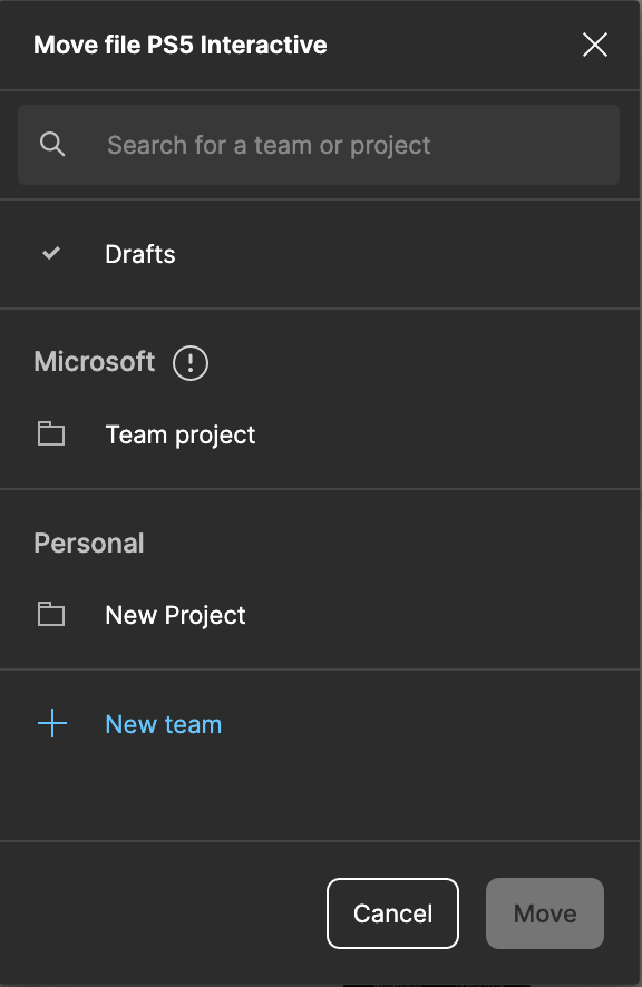
56. The create component tool

Creating a component is the first step to creating a design system. An instance of a component is a reusable element we can automatically update by changing the master component. A series of components can be published as a library. Here is Figma’s docs on components. There are also variations we can make in our components. For example, if we wanted a light and dark mode in our component, we would make a variant. We can also make Boolean, Instance swaps, and Text variants of the same component.

57. Use as mask

The use as mask tool allows us to contain layers within a unique shape we select. Here is Figma’s docs on Masks.
58. Union, Subtract, Intersect, Exclude, and Flatten selection

These boolean operations allow us to combine two illustrations, subtract one illustration shape from another, intersect, or exclude two illustrations. Flatten selection will reduce all layers into one layer. Here are the Figma docs on these actions.
59. Spotlight

If we hover over our avatar in the top right corner, it will open up an option to ‘spotlight’ me. This will now have all viewers in the Figma file follow around your cursor. Here is Figma’s docs for the Spotlight feature.
60. Share

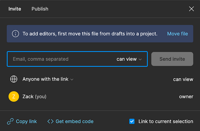
The share feature allows us to set edit access, or copy a link to our project. If we select a frame, and then share it, it will bring viewers directly to the frame we have selected.
61. Play

This icon will start our prototype, or view our selection in playback mode.
62. Zoom

This dropdown allows us to zoom in or zoom out on our Figma designs. We can also use the keyboard shortcuts (Command plus +), or (Command plus -). This dropdown also give us options to turn on or off other grids, rulers, outlines, cursors, and comments.
63. Recently closed files
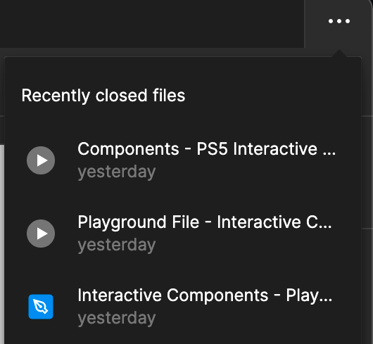
This dropdown allows us to access our most recently closed files quickly while in our current Figma file.
64. The Menu bar

The menu bar will show dropdown menus of most of the actions, settings, and tools we can access throughout Figma.
65. Change the X and Y coordinates of an element in our frame

If we select an element in our frame, we can see that the elements follow the X and Y coordinates of the frame, instead of the global X and Y coordinates that the frames follow. This is helpful if we want to check if our elements align on the X or Y axis.

The app icons above are set on the X axis at 186px from the left, while the music button, title, and paragraph text is set to 175px from the left. We can set the app icons to 175px on the X axis to make sure everything aligns.
66. Add a cover image to a project
I’ve switched onto the cover page from the left pane, and selected the Frames dropdown on the right pane to create a new cover page frame. (1920px x 960px)
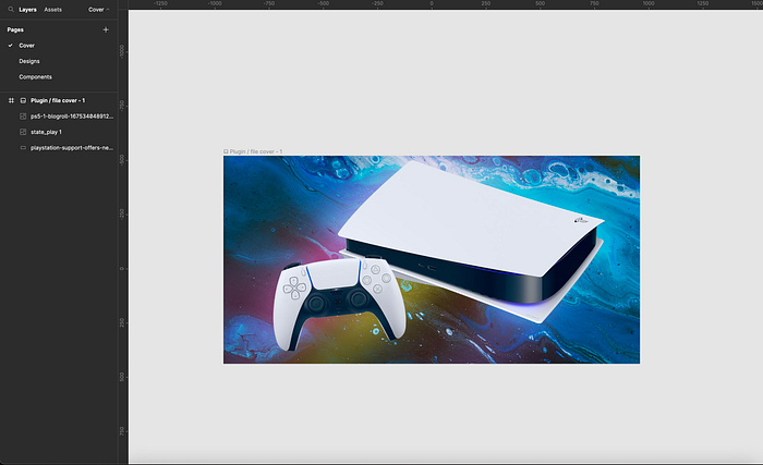
If we right click on our frame title, we will see a menu with a selector for “Set as thumbnail”. If we select this, our project’s thumbnail will now have this image.
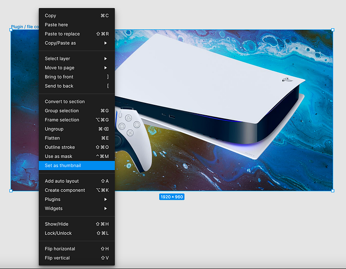
We can now see in our projects list on Figma that our PS5 project has this thumbnail set. This is helpful at work, when there are many projects, and we need to find one quick! Each product on my team has a distinct look to the project covers which makes it easy to scan.

67. Autosave
Autosave is definitely a blessing. Read the Figma documentation on how they worked on that feature here.
68. Version history

Here we can view all of the recent versions that were autosaved by Figma. I use this feature when looking at archived projects to add dates to the cover photos. It is helpful when working on a team with hundreds of design projects to see which one is the latest and greatest for a particular project.
69. Branching
Branching is a way to duplicate the project you are working on, and then make changes before merging it into the original master file. This is a similar workflow as many development environments. For example, Github uses branches, and master branches to help organize code flows. Here is Figma’s docs on branching.
70. View X-ray designs

I use this feature a lot to select individual elements easier. It also helps to view what is happening with the skeleton of the design. If you click (command + Y) on a Mac it will show you the skeleton designs.
71. Add rulers

We can drag ruler lines from the ruler bars on the top, and left of our Figma center pane. I will often utilize rulers as another quick way to gauge the alignments in my designs.
72. Hide the left and right UI panels
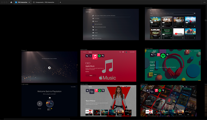
I will often hide the left and right panels to utilize the full width of the center pane when viewing designs. If you click (command + \) on a mac, it will toggle on and off the UI panels.
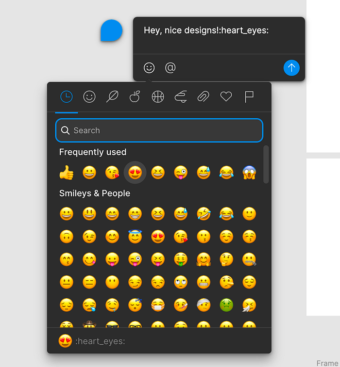
73. Cursor chat

This is a fun feature where if you are working on a file with someone you can chat with them directly in the file through your mouse cursor. Press the ‘/ ‘button on your keyboard to trigger a new cursor chat.
74. Show keyboard shortcuts

We can use a keyboard shortcut to show a list of all of Figma’s keyboard shortcuts (Control + shift + /) on a Mac.

75. Right click options

We also see some of the features we’ve discussed if we right click anywhere in the center pane.

We see a different list when we right click on a frame.
76. Figjam, and other helpful tools

If we exit to Figma’s home screen we will see plenty of additional tools and design files to help in our designer journey.

Congrats for making it to the end of this list. I know it was hefty, and I hope you learned something. Give me feedback, or comment a feature you think I should have discussed more. If you appreciated this content, please give me a clap or a follow for more articles in the future! Thank you!

