7 obvious UX improvements you can make even before any testing
Act on universal design principles; Make immediate fixes without waiting for testing results.
I have been practicing UX testing for over a decade as a UX researcher. Often, my teammates, clients, or stakeholders approach me with their designs and suggest conducting usability or A/B testing.
However, there are instances when the design issues are already glaringly obvious. In such cases, I recommend addressing these obvious issues before proceeding with any testing.
While data-driven approaches are valuable for product development, it is important for designers not to become overly reliant on testing for every design decision. Instead, they should base their decisions on a deep understanding of human behavior and psychology, which can be acquired through experience, learning, and practice.
This expertise empowers designers to save valuable time and effort that would otherwise be wasted on testing an clearly flawed design, thus preventing the gathering of any meaningful results.
To assist in this process, I have compiled seven principles for you to consider. If your design does not align with these principles, I encourage you to consider fixing it immediately, even before conducting any testing.
1. Make an introduction
In every usability testing session, the initial question users seek to answer is “What is this website or app about?”
Internal designers and developers may sometimes assume that people already know their brand and don’t require introductory content. However, even for well-known brands, it is beneficial to establish an initial emotional connection with viewers through well-crafted storytelling.
By doing so, you can capture their attention, build trust, and promote your unique proposition. Users can also gain a clear understanding of the purpose of the product, how to navigate it, and plan their actions to achieve their goals.
Add an “About” section to your website or app to share brand stories, vision, mission, heritage, and, most importantly, to explain why the website or app exists. It doesn’t have to be a separate page if you have limitations; a concise snippet will suffice. This addition is also beneficial for SEO purposes.
2. Do not challenge well-established design elements that users are already familiar with
While creativity is valuable, it’s important to refrain from tampering with widely recognized and understood design elements. Disrupting this familiarity would require users to learn how to navigate your new design, potentially compromising a seamless and intuitive user experience.
Examples of well-established design elements include:
- The hamburger menu, which was controversial 5–10 years ago, has now been widely accepted by mobile users as a navigation tool.
- A top navigation bar and logo placement, with the logo leading to the homepage.
- On popups, users conventionally seek the close button at the top right.
- Users have become accustomed to finding miscellaneous information in the footer.
- A search bar positioned at the top.
- Standardized input form fields.
- Breadcrumbs used for wayfinding.
These elements have become deeply ingrained in user expectations and should be maintained to ensure familiarity and ease of use.
3. Keep the MECE (mutually exclusive, collectively exhaustive) in mind when organizing the main menu
“Mutually exclusive” means that each item should belong to only one category, providing users with clear entry points and minimizing confusion when deciding where to proceed.
“Collectively exhaustive” implies that all items should be accounted for without any overlap or gaps. When the scopes of multiple main menu categories overlap, users may struggle to determine the appropriate section to explore. If there are gaps in the menu structure, users may experience frustration while trying to locate specific items they cannot find.
Now, let’s examine two examples of websites that offer pet products.
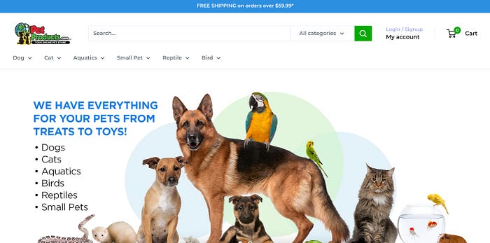
With this structure, you don’t have to think too deeply.
For example, I have one cat. And I would proceed with confidence by simply clicking the ‘Cat’ menu here. Zero hesitation. This demonstrates the power of MECE and how it simplifies navigation decision-making.
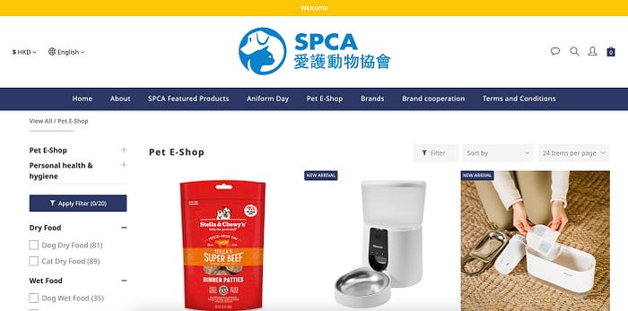
On the other hand, when there are multiple entry points without clear concepts and scopes, you may find yourself having to guess where to start.
For instance, questions may arise such as: What distinguishes “Pet E-Shop” from “SPCA Featured Products”? How does “Brands” differ from “Brand Cooperation”? What exactly is “Aniform Day”?
When the main navigation does not adhere to the MECE rule, it can lead to significant confusion and uncertainty.
4. Do not hide important information
It may seem obvious because no designer would intentionally hide important information.
However, I have witnessed countless cases where essential information is buried deep below the fold, concealed within accordion menus, or positioned outside the visible area of the screen due to vertical scrolling.
Designers need to recognize that users are not always patient and do not meticulously check every corner of a page. In fact, many people do not even bother to scroll, and they may not even interact with vertical scrollbars or attempt to open accordions.
Display important information prominently and clearly above the fold. If everything seems equally important, it is time to ruthlessly prioritize the content.
5. Don’t compromise usability for the sake of aesthetics
Some designers may prefer using smaller font sizes because they believe it looks more aesthetically pleasing. However, if this compromises legibility, it defeats the purpose of the text itself. It is recommended to use a font size of at least 16px or larger to ensure readability.
Make sure your text isn’t too small. The exact dimensions of font sizes can vary depending on the unit used, the size of the viewport (if units are relative), and the pixel density of the device’s screen, but a safe bet would be to use 16px or 1em or 1rem as the smallest size for body type.
Also, many designers use gray for texts and buttons because it provides an elegant and modern feel. However, it is important to note that this color choice conveys a sense of “Not available.”
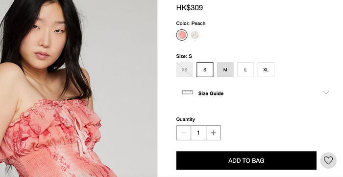
During usability testing of the above ecommerce site, I observed that many participants incorrectly assumed that M, L, and XL sizes were out of stock simply because the frames were displayed in gray.
If your product is excessively prioritizing aesthetics at the expense of usability, promptly address these issues as they are evidently problematic.
6. Make the next action clear and easily predictable
First and foremost, we should foster a goal-oriented mindset. It is crucial to clearly define the direction in which we aim to guide our users, enabling them to understand the necessary actions to achieve their goals.
On every page, ensure that the next action is highly evident and provide relevant information. Utilizing tools such as a progress bar, a checklist, or estimated time of completion can effectively guide users in understanding their journey.
Avoid confusing users with the dotdotdot button (ellipsis). Based on my experiences during usability testing, participants frequently expressed dissatisfaction with the ellipsis and hesitated to click it due to its unpredictable nature.
Unlike the hamburger menu, which is typically used and broadly accepted for primary navigation, the ellipsis is often used haphazardly, giving the impression that everything has been thoughtlessly crammed into it.
Instead, display clearly visible CTAs that enhance the user’s sense of control and empower them to make informed decisions.
7. “Help” helps
Some designers assume that their product is intuitively designed enough, making additional support unnecessary. While this approach may be partially correct, it is important to acknowledge that users’ digital literacy levels can vary significantly.
Although mandatory and lengthy onboarding processes are often disliked by users and often skipped, it is still beneficial to provide comprehensive guidance and support in the event that users face difficulties. I have observed numerous instances where users, when feeling confused or lost, attempted to find guidance by accessing the hamburger menu, app settings, or footers.
Including sections such as “How to Use,” “Support,” and “FAQs” can be valuable additions. Remember well-curated FAQ page is also highly beneficial from an SEO perspective.
Employing chatbots can provide more specific answers to users’ inquiries. The availability of customer support is also advantageous.
When testing your design, it is more productive to prioritize building your hypothesis and identifying fundamental issues, rather than fixating on obviously flawed details that can be swiftly addressed.
I hope this article has inspired you to enhance your design. Now, it’s time to start making changes. Testing can wait until then.

