60–30–10 Rule: How to choose colors for your UI design
Color is an important part of any interface design, and knowing how to choose colors can make or break your project. The 60–30–10 rule will help you do just that!
Good color schemes rely on contrast and harmony. The 60–30–10 rule is a helpful tool for creating balanced interfaces.

Step 1.
60%
This is the dominant color or the primary color. It’s the one that stands out most. When choosing this shade it’s important to know what its meaning is. It should reflect the message of your brand.
Color psychology can help you choose colors more effectively — a resource that might be useful in learning about color psychology is:
https://www.empower-yourself-with-color-psychology.com/cultural-color.html
For example, I consider this color to be the dominant color for a project.

Step 2
After choosing your primary color you can use a color resource to generate the next two colors. Resources for generating colors are plenty, but the ones I use are:
30%
This is the secondary color or complementary color. You’ll use half as much of this color as you did your main hue. This is used on major elements such as text, carousels, and other important features
The secondary color supports the main one but is still different enough to create contrast.
10%
This is the accent color. This color can be used in buttons, pop-ups, highlights, etc.
Bright, vibrant colors are a great way to add visual interest. They can help draw attention to specific areas of a page or make it feel more alive overall.
After choosing a dominant color, I then balanced it with two other colors to produce the final design shown below

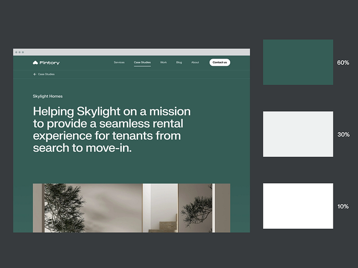
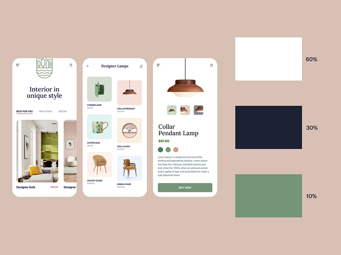
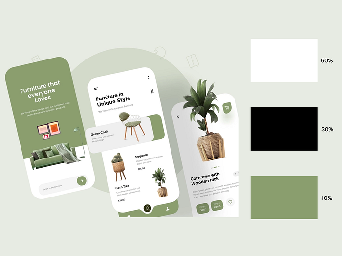
Below are a few examples of how this method is applied:
Conclusion
- Before adding color to your design, focus on the layout and spacing of elements.
- Using color generators can cut down on the time needed to find a good combination of colors.
- You can create a pleasing color scheme with the help of a color wheel.
- You should also consider black and white as colors that have their own significance.
Hopefully, this short guide will help you choose colors for your project.
Hey there 👋 I’m Bryson, your go-to UI designer here on Medium.
If you found this article useful, join my free newsletter! I write about UI design topics and share tips and resources to help you improve your skills as a user interface designer.
You can find me on LinkedIn | Instagram | Dribbble.
Check out my online store on Gumroad.
Thank you for reading;
Bye for now👋
Check out my other articles:

