6 Inspiring B2C UX design examples you need to see
Examples of inspiring, quality UX design in everyday life
By Lara Hocheiser
Good user experience (UX) design is essential for acquiring and retaining users. But an enjoyable, intuitive UX can accomplish much more than simply attracting users. It can also spur them to return to a site or product, keep them engaged longer, inspire them, and even improve their lives.
UX: beyond accessibility and functionality
Sometimes, UX design is seen through the oversimplified lens of improving accessibility, building working buttons and forms, and creating recognizable, branded aesthetics. In this article, we go beyond these basics to dive into UX design with powerful outcomes for users and the companies that designed them. We will also explore some UX design examples that align with Nielsen’s 10 Usability Heuristics for User Interfaces (UI) and other applicable UX design principles.
Below, we look at 6 examples of great UX design from B2C perspectives. In other words, how regular people in non-business settings interact with the software.
1. Grammarly gets writers writing
Grammarly, the typing assistant tool, has exceptional UX design. Once users add the Chrome extension to their browsers, Grammarly reads what they type — in emails, documents, Slack, or anywhere else — and offers suggestions, corrections, and alternatives in a way that is unobtrusive but easy to understand.
UX Design Feature: The Grammarly Circles


Whenever a user types in a document that Grammarly has been invited to, a circle appears at the bottom-right of the screen. When the green circle is displayed, users know Grammarly is active. The circle turns red when there are errors. The number in the circle represents the number of errors that need to be resolved. The errors include spacing, phrasing, and spelling. This feature allows users to find and correct their mistakes easily. The suggestions that it populates are clickable, saving users from having to retype anything.
Grammarly demonstrates the mental model, a UX design principle focused on the user knowing how to navigate without needing complicated instructions or additional knowledge. Most people associate red with a red light or a stop sign. When they see the circle turn red, they know to stop to correct errors. Upon clicking the red circle, the user gets prompted to correct the errors. And when the user sees the circle has turned green, they can infer that green implies go, like a green traffic light.
UX Feature Focus: Emails that Inspire Writing and Improvement Over Time
Each week, users of Grammarly receive an email. Users see the length of their writing streak in weeks, which provides inspiration to keep going. The email also includes several features and metrics designed with a great UX in mind: Badges: The Badges contain an achievement that users receive after a certain number of weeks of continued usage. The badges reward writers for ongoing writing habits. They are a simple way to gamify writing, enticing users to unlock the next badge achievement and continue their app usage.

Productivity: This stat displays the total number of words typed the previous week. Users can compare how much they write to the entire Grammarly community. For those with a competitive side, this can be motivation to write more.
Mastery: This stat allows users to compare how many errors they make in comparison to other users. Awareness of mistakes is a simple way to encourage improvement.

Vocabulary: This stat keeps track of the total number of unique words the user typed the previous week. This feature is a plus for lifelong learners because it nudges users to expand their vocabulary.
Tone: Grammarly recently added a tone detector that provides insight into how our words may be coming off to others. This design feature inspires being mindful and self-aware of the way words impact others. It can also help users consider their tone purposefully.
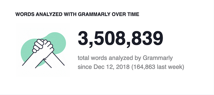
Word Analyzed: Users can see how many of their words Grammarly has analyzed over time. This metric also includes the most recent weekly word count. Therefore, users can understand their current usage in contrast to how long they have been using Grammarly and infer whether their current productivity has increased or decreased.
Grammarly has created many useful and motivating UX design features in both the app and weekly email that writers and nonwriters can use to communicate better.
3. Airbnb makes borrowing property easy and alluring
Airbnb comes up as a leader in UX design discussions frequently. What has so many UX designers fascinated?
Airbnb uses the design principle of context. The premise of context is to narrow the search to provide users with the information they need to book quickly and efficiently.
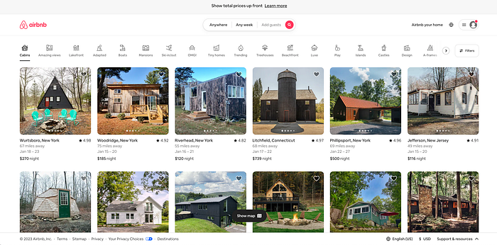
UX design feature: Airbnb’s homepage
The homepage of the Airbnb website has an aesthetically pleasing user interface and excellent user experience design. When looking to book a place, users want transparent pricing and an at-a-glance ability to glean important information. On the top center of the page, “show total prices up front”, is displayed. Users know they are seeing the total price, including cleaning fees and taxes. Hidden fees make consumers cringe, and Airbnb answers their rental questions and builds trust by being upfront about pricing.
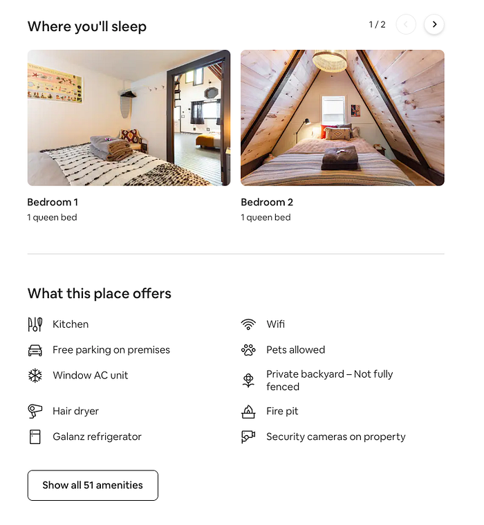
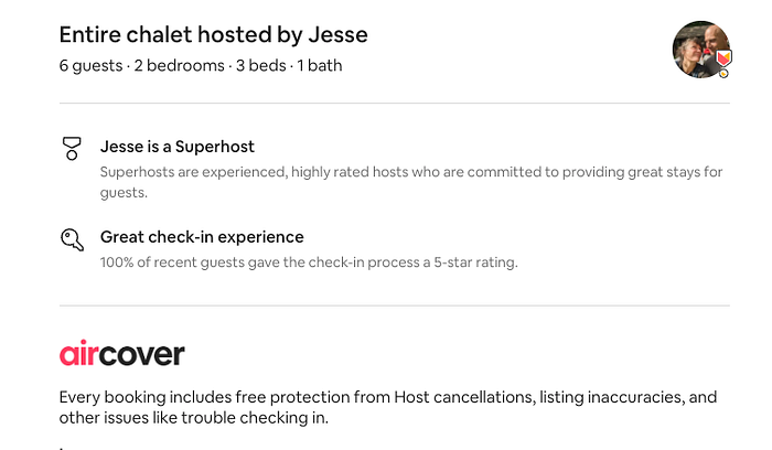
UX design feature: property pages that answer all your questions
When the user clicks a property thumbnail from the homepage, they are led to a detailed landing page for the property. The page shows a gallery of property images, the host’s information and rating, the booking calendar, customer reviews, amenities, and more.
Users can also learn more about the host. They can contact the host immediately and effortlessly to make inquiries.
Finally, Airbnb lets users know if they found a rare deal, such as lower-than-usual pricing or surprising availability of a normally fully booked property.
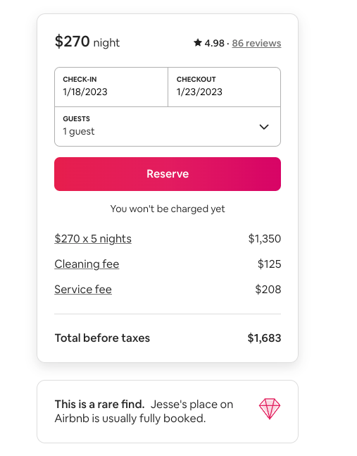
The ease of finding information, making bookings, communicating with hosts, and conveying geographic locations make Airbnb’s UX design powerful, intuitive, and efficient for users.
4. Spotify knows your habits and recommends what you want

Spotify is well-known for its UX design. One great example is #spotifywrapped, a popular aggregate of what users listened to, what they had on repeat, and how long they listened. The app also creates weekly playlists that include a user’s favorite music and other content they are likely to enjoy based on past habits. This wildly popular app sets an example for UX designers worldwide.
Spotify uses machine learning to understand a user’s preferred content and infer what else they may be interested in. They make playlists and great recommendations. It’s the app’s UX personalization that makes it so appealing.
UX design feature: personalization
- Recommendations: Spotify sends music suggestions to users based on their listening behavior.
- Your Top Mixes: Spotify populates six weekly playlists with music and artists users already listen to, as well as a mix of music they are likely to enjoy by similar artists.
- Year Wrapped: Based on a year of listening, the app sends users stats such as minutes listened, whether they listened to an artist more than other fans, their top five songs and podcasts, and a lot more in cute, shareable graphics.
- New Releases From: If users follow an artist, Spotify will notify them when a new release comes out.
- Episodes For You: Machine learning helps again here, suggesting episodes from podcasts a user likes and the ones Spotify thinks they’re likely to enjoy.
- Continue Listening: Users can pick up where they left off on music, podcasts, and other entertainment.
- Liked Music: Spotify allows users to keep a running list of songs they liked and create a playlist.
5. Upwork for freelancers gets users paid faster

Freelancers often struggle to find steady work, get paid promptly, and make ends meet. Many of their pain points disappear when users sign up as freelancers on Upwork.
From helping users find opportunities to apply for relevant jobs to allow them to market projects and services, freelancers can find work opportunities quickly.
Freelancer profiles include a catalog of completed jobs and client reviews so businesses can prescreen applicants. Similarly, freelancers have access to a steady stream of job postings. They can choose which to apply for based on descriptions and prescreen clients based on the reviews other freelancers have left for them.
If it’s a good match, freelancers can work for the clients they find through Upwork for the long term.
UX design feature: honest, informative job postings that include pay rate ranges
Search: On Upwork, job seekers can search by role or keyword to see what is available. This example of the context design principle narrows the focus to a more specific context. They can filter by desired experience level, the number of proposals a client has already received, and other categories that help users find the best jobs for them. Like Airbnb’s homepage, much of the important information is visible on the Find Work page, and when the job posting is clicked, more details are provided.
UpWork has successfully implemented a UX design that enables at-a-glance information discovery and the ability to personalize based on the context the user specifies.
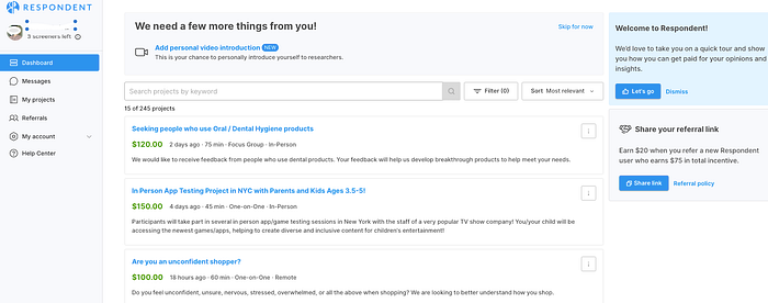
6. Respondent helps would-be study participants find paying studies
Side hustles, the gig economy, supplemental income — these buzzwords have become a reality to make ends meet for many over the past decade. Now more than ever, a broad swathe of people are exploring legit ways to add to their income, with clear and realistic demands on their time.. On Respondent, registered participants can take daily screeners to check their qualifications to participate in paid research studies.
UX design feature: Context
Designers need to be keen on creating useful designs that suit the context of how and where users are using them. -UXDesign.cc
Respondent implements the design principle of Context on user profiles, including details such as professional qualifications, demographic information, headshot, and an optional video introduction of the participant. This context helps researchers understand if the respondents are a good fit for their study, which is a step toward participants finding paying studies.
The UX principle of Context is seen again on the user interface search feature. The easy-to-use filter enables users to find relevant studies. They can filter by remote and/or in-person studies, how much studies pay, or how long they will take to complete.
Respondent also syncs with PayPal. Once a study is complete, the researcher marks it as such. The respondent can skip following up after the study because their PayPal account is already synced, and the payment is automated. The payment arrives in the respondent’s PayPal account shortly thereafter.
UX design feature: One-click referral link
The referral feature is user-friendly for respondents who come to make extra money. Their referral link is copied with a single click so they can easily share it with others.
Summary
UX design improves user interaction with apps and software to make it easier for users to accomplish their goals. Great UX design is worth studying and emulating when designing products. Consideration of user experience is central in product ideation, creation, and iteration.