52 weeks of interaction design — week 5: the live preview
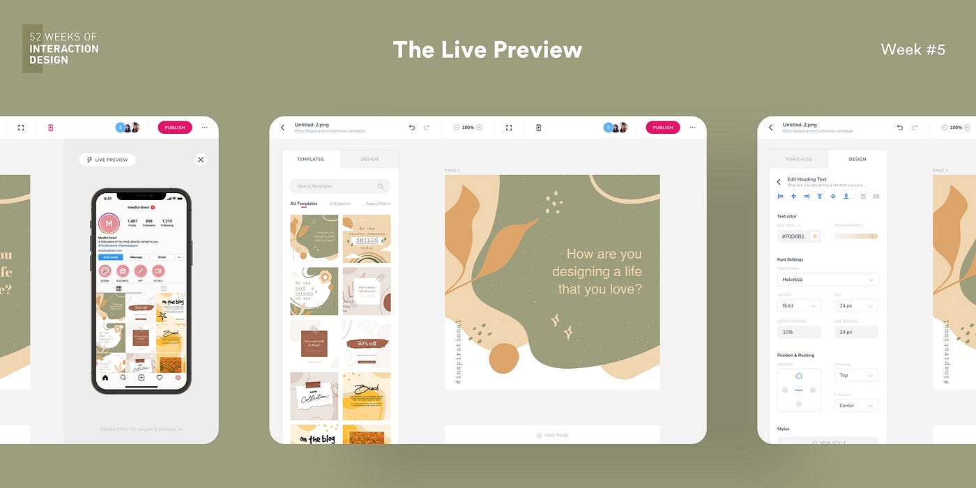
Get a real-time preview of your Instagram profile layout to see how things look on real devices
This mini-article is part 5 of a 52-part series — 52 Weeks of Interaction Design by Saleh Riaz. The series is meant to be a personal project. Read more about it in the introductory article or find all interactions here.
Week 5: The Live Preview
Use case
The user shall preview a live instance of the Instagram feed in a real app to see how the new post looks like. The feature will help users preview custom profile feed layouts to give a delightful branding experience to the user profile.
Understanding the problem — Discovery
Instagram is one of the leading social platforms which has become a necessity for businesses to interact with their audiences and market their products. With the advent of social media marketing and easy advertisements, consumers who increasingly use Instagram are being exposed to all sorts of businesses.
1 Billion + people use Instagram every month
On average, people spend 30 minutes on the Instagram apps
81% use Instagram to explore products and services
50% visit the product/service website after seeing it on Instagram
— Hootsuite Research
To stand out, businesses tend to meticulously craft marketing campaigns that brand their profiles according to their identity so the users find the experience delightful. One way to achieve this is to create attractive-looking Instagram profile layouts. Not only businesses but users who maintain personal profiles and blogs tend to do this as well.

To create and maintain such unique profiles, people need to use design tools that help them with creative posts. There are lots of design tools that people can use but primarily software such as Canva, Adobe Photoshop, Pablo by Buffer, and Adobe Spark dominate the market. I populated this list by asking several marketing managers who have to deal with such marketing for the brands they work with. The most common of these tools that 76% of these people use and almost everyone knew about was Canva which is template-based design software for the web, ios, and android along with mac and windows support.
A very common statement, however, that most of these marketing managers/designers gave was that it becomes really difficult to create layouts with Canva. Since they have to manually create designs and test them out on Instagram mockups to see how the campaign will look like.
“Whenever I am working with posts that span multiple tiles, it becomes kind of difficult to see how the final design will look like keeping the old posts in mind. We have to follow our branding that includes the visual elements that we need to add to most of our posts and to give a seamless vista”
Sarah, Marketing Designer
Competitive audit and ideation for solutions
Keeping the above remarks in mind, I conducted a competitive audit for different design tools that could lead me to find solutions to the aforementioned issue that most designers face. I analyzed Canva, Adobe Spark, and Pablo by Buffer since these were the most used apps for the population set that I interviewed.
Canva for me came out on top for various reasons. The biggest of them was the relatively lesser steep learning curved aided by its great user experience. The advanced options and tools were a plus as support for templates, images, text, audio, elements, charts, frames, videos, emojis, app integration, and so on. A few headlines from the competitive audit are mentioned below:
- Pricing: Free but the premium version costs $12.95/month
- Business size: Caters all sorts of business sizes
- Platforms: Web, iOS, Android, macOS, Windows
- Unique value proposition: Design anything for free
- First Impressions: Easy to use. The web app has an intuitive UI design specially for designers since most designers are already familiar with the pattern of toolboxes and WYSIWYG editors.
- Features: Easy drag-drop and single-click tools. Effects and filters for layers. Wide range of stock and templates. Upload and download capability. Collaboration features.
- Interaction: A really intuitive basic user flow for creating a new document, designing it, and sharing it.
- Accessibility: Basic accessibility is kept in mind
- Navigation: Really easy with search facility for components wherever needed
- Visual Design: The branding is really consistent
- Tone: Extremely friendly and seems really helpful so as to onboard new users
After thoughtful scrutiny of all major tools, the following market gaps were found:
- Ability to live preview the design
- Better pricing for different solutions including a free plan
- Ability to post directly from the web
Prototyping the interaction
Keeping the audit insights and market gaps in mind, I decided to design a web app since most designers use a laptop to manage and market products. The user flow I decided to work on was the live preview feature so the designers can easily see how the designs will look in the real instance of their profile. This can help them take a look at their profile and see how the old and new photos look in the gallery along with the ability to test creative layouts before posting.
The prototype developed has a very intuitive and straightforward flow. The user can get into live preview mode and connect their actual mobile phone and see the changes in real-time as well as see a live instance in the web app itself.
All the changes done to the main design are reflected on the live preview as well as in real-time. This way, the designers can know how the new post looks compared to their profile layout.
Testing
Nielsen’s heuristics were used to design and subsequently test the mockups. I tested the designs on a real laptop device and tablet which are the most common medium used by marketing designers. The prototype was also shared with the marketing managers who are the stakeholders and the original participants of the research phase.
The second research phase included usability studies for the prototype and the participants were asked to think aloud while using the prototype so I could understand the user journey. Feedback from the participants helped me improve the designs to complete this week’s interaction design challenge.
52 weeks of interaction design is a personal project by Saleh who is a product designer. The intention of this project is to create humanizing, unconventional designs since the design must always keep evolving, and creating unique designs is essential to give products a unique identity.
Saleh is a product designer working on digital products, crafting their concepts, interactions, and experiences. Find more about him on Behance, Dribbble, LinkedIn, and Twitter

