52 weeks of interaction design — Week 1: A palpable card fling
This mini-article is part 1 of a 52-part series — 52 Weeks of Interaction Design by Saleh Riaz. The series is meant to be a personal project. Read more about it in the introductory article or find all interactions here.

Week 1 — A Palpable Card Fling
Use case
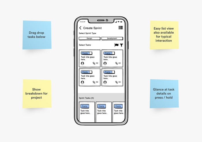
The project manager shall easily select and add tasks to create a new project sprint. The ability to peak a task quickly shall also be present.
Understanding and defining the problem
John, who happens to be a project manager for a valley-based startup called Startup XYZ is managing a small cross-functional team of designers, developers, and testers.
According to John, he takes a ferry every day to work and while sipping his coffee, he has 10–15 free minutes in which he wants to be able to quickly create a weekly sprint before entering the office so every Monday, he can gather the team for a standup meeting and discuss the sprint. The sprint can also be for a single team only.
So the task at hand is to design a user flow for a project management app where the project manager can simply look at the tasks and quickly create a sprint.
Discovering possible options
A small independent ideation workshop was conducted where possible ideas were Quick wireframes were designed first to define a solution space onto which multiple options were prototyped.

Prototyping the interaction
The designs were tested on screen by screen. Hi-fidelity designs were crafted for each idea and the screens were prototyped according to the defined flow. A modern design was created. The projects’ home screen had the active elements and each project had its most important elements up front. The project has a dashboard-like-view to display important information such as task breakdown. Cards were used to represent the task and very human interaction was employed to add them to the sprint — fling. It's a very humanizing interaction because it depicts the activity of sorting or dealing with a deck of cards. The user can glance at the details of the task as well. The final screen is a lovely feedback animation that shows that the sprint has been completed.
All the animations and interactions were paced at 0.4s to follow Doherty’s Law of UX Design. A nice little cubic-bezier function is used as well for smooth transitions.
Testing the design
What design is design without actually testing the product, right? Before sending out the prototype to our stakeholders, I tested the app interactions on a real device myself. There were multiple changes noted and done to improve the usability of the screens.
52 weeks of interaction design is a personal project by Saleh who is a product designer. The intention of this project is to create humanizing, unconventional designs since the design must always keep evolving, and creating unique designs is essential to give products a unique identity.
Saleh is a product designer working on digital products, crafting their concepts, interactions, and experiences. Find more about him on Behance, Dribbble, LinkedIn, and Twitter


