52 weeks of interaction design
This mini-article is part 2 of a 52-part series — 52 Weeks of Interaction Design by Saleh Riaz. The series is meant to be a personal project. Read more about it in the introductory article or find all interactions here.

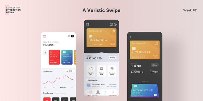
Week 2— A Veristic Swipe
Use case
The user shall swipe through the different cards added in the application to view the details and history.
Defining the interaction
The idea was to define an unconventional, natural, and very delightful interaction. I wanted to work with swiping cards up or down instead of sideways and breaking the typical layout. This interaction gives a more human way of sorting/distributing cards, something that we do in real life a well.
Now, the trick was to experiment with possible solutions so I picked up my gear and started prototyping low-fidelity designs. The best solutions were tested with real users to get feedback on what they considered as the most human interaction.
After testing with 10 people with personas suited for using financial apps, 8 out of 10 preferred bottom to top swipe over top to bottom. All these eight people found this interaction more delighting as they could completely see the card going into the place. Some of these commented that the top to bottom interaction was a little weird because the cards were not placed in the thumb reachable area and had to operate using two hands to get it done for large mobiles. Some of them also pointed out that operating hand/thumb blocks the screen and the succeeding animation. The two who preferred top to bottom gave the reasoning that it was natural for them to swipe down as most of us do to bring down the notification panel of our mobiles.
Designing and Testing
Since the idea was to design something that would be unconventional that breaks the layout (the entire point of the series), Aesthetic Usability Effect was utilized. The law states that:
Users often perceive aesthetically pleasing design as design that’s more usable.
My idea was to create something beautiful. A piece of art — something veristic, if you may. And that is exactly what I did. The key was to design something different that swayed away from the typical design guidelines. Once the screens were designed, the interactions were prototyped and tested on real device with real users who were delighted with the interaction.
52 weeks of interaction design is a personal project by Saleh who is a product designer. The intention of this project is to create humanizing, unconventional designs since the design must always keep evolving, and creating unique designs is essential to give products a unique identity.
Saleh is a product designer working on digital products, crafting their concepts, interactions, and experiences. Find more about him on Behance, Dribbble, LinkedIn, and Twitter

