5 Ways to instantly make your Notion dashboard/template look better & more aesthetic
The truth is, if something looks nice, it makes us want to use it more. Don’t argue with me, argue with the Aesthetic-Usability Effect UX principle. That’s how companies like Apple, Monzo etc have made their millions — they’ve taken the mundane and turned it into an experience through the magic of aesthetics and a little design-thinking.
What is Notion & why is everyone obsessed with it?
Notion is essentially digital LEGO, where you have access to the ‘blocks’ (checkboxes, databases, media embeds etc) to build your dream digital tool/dashboard. Because of this ‘DIY’ aspect, everyone, from parents and students to creatives and start-ups are obsessed with using it to build custom dashboards that grow with them and work for the way they think.
If you’ve never tried Notion, and are looking to add layers of sanity into your life/business, you can explore it here for free — for full disclosure, I’m a Notion Partner, so when you sign up with my link, you also help support me and my content.
How to Make your Notion Look More Aesthetic
As a Certified Notion Consultant with a background in building and managing human/digital products and experiences, I personally take a heavy design-thinking approach to all of my client projects & builds. 80% of my clients in my coaching calls, workshops & consulting custom projects come to me to ‘tidy up’ and makeover their workspace to build seamless experiences in Notion that are nicer to look at and easier to use. You can explore my popular course on how I merge design-thinking with Notion here.
As a Notion beginner, it’s so easy to get carried away with all the features in Notion and build systems and dashboards that are clunky and overwhelming. Or worse, it looks and feels like a spreadsheet. I’ve worked with enough people, brands & businesses to know that before adding anything into your Notion workspace, it’s important to ask a) why you need that feature b) will it scale for ‘future you’ c) will you realistically keep it up-to-date.
Today we’ll focus on the aesthetic side of things — we’ll focus on the usability side of things another day, so follow me if you’re interested!
Here are some quick tips that you can do to make your Notion dashboard/page look more aesthetic today!
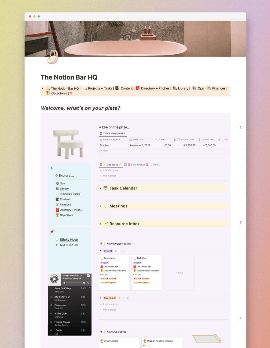
One: Play with Callout Blocks to Visually Group Information

One of my favourite ‘tricks’ to clean up a workspace is to add ‘zoning’ around groups of information/media by dragging those blocks inside callout blocks. This technique adds an *instant* face lift to the page and helps to visually separate information.
In the example below, you can see how Ive used this technique to create visual ‘zones’ in my journal template:
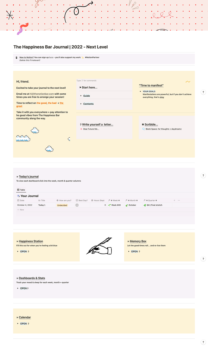
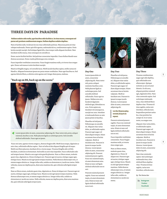
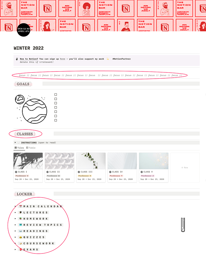
Two: Play with Layout & Columns
Do you miss the days of having beautiful magazine/tabloid layouts? Now that a lot of things have moved to the web, this magic has mostly been lost. There’s something about opening up a piece of print media and flipping through the beautiful asymmetrically-balanced images and text.
Notion lets you have the best of both worlds — beautiful layouts in an easily shareable digital format. This inspired me to create the Notion-Zine - a collection of pre-made 10 zine-style layouts built straight into Notion.
The screenshot below is hands down one of my favourited from the collection:
Three: Play with Font Case & Style
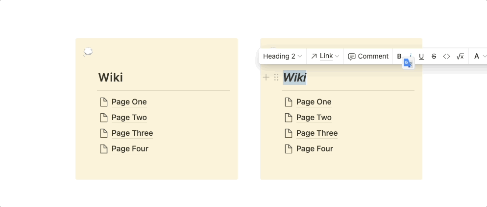
Another quick fix that you can play around with in Notion is playing with whether your copy is lowercase vs uppercase. It really adds some movement to the page! Lowercase text is definitely a strong trend in Gen-Z circles.
Why not go a step further and add some spacing in between the letters like in the screenshot of my student dashboard below:
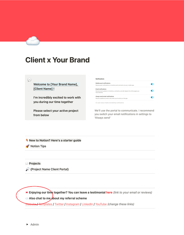
Four: Play with Bullet Points
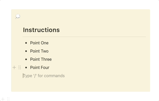
Bullet points are great for making lists in Notion. However, have you ever thought about taking it up a notch?
In situations where your list most likely won’t get bigger (e.g. you create some instructions which might be created once), since you’re not worried about easily adding another bullet point, you can have fun by creating a ‘static’/’fake’ bullet points by using more aesthetically-pleasing emojis or unicode symbols.
You can see an example of this in the screenshot of my client portal template below:
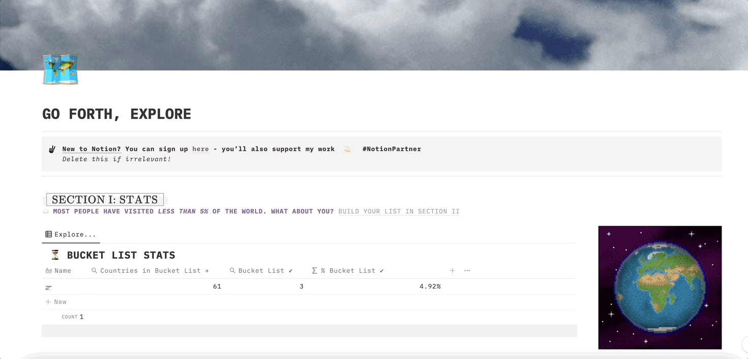
Five: Play with GIFs
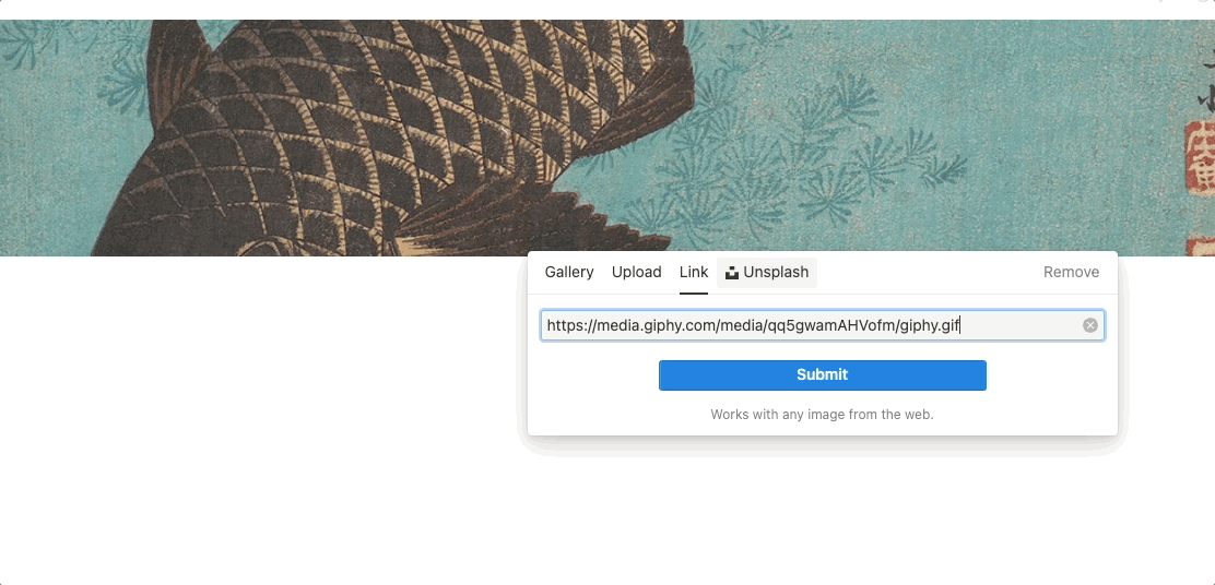
Last but not least, my favourite way to spice up a Notion page is with GIFs! I personally get 98% of my GIFs from GIPHY — the other 2% of the time, I might make them myself in Canva or 3dgifmaker.com
Big sprawling patterns/imagery work great for Notion headers, while transparent GIFs or (GIF stickers in GIPHY), work wonderfully as page/callout icons or even just as page embeds.
You can see an example of how I’ve used GIFs in my travel bucket list template below:
Thanks for sticking with me — I can’t wait for you to dive in and start working on your Notion pages.
Unlock unlimited access to my insights (and thousands of other independent writers on Medium) by becoming a Medium member here for just $5/month. Bonus, you’ll also directly support my work.
If you don’t want unlimited access to insightful independent writing, and are still interested in supporting my work, you’re welcome to Buy Me A Coffee — thanks, in advance
☎️ Book a call with a Certified Notion Consultant (Me!) | 🗞 Join 1.2k+ readers of The Notion Zeitgeist
🪐 Follow The Notion Bar | Popular Notion Course | TikTok | Twitter | Instagram | Medium | YouTube | Website | Templates


