5 ways to establish visual hierarchy

Establishing a visual hierarchy is a way to arrange UI elements according to their importance; it helps guide the eyes to the most important elements first.
It puts emphasis on important content to drive the features/business incentives your product might offer.
Why is it important?
Users scan through the page and decide in seconds whether they want to dive deeper or leave, and a clear visual hierarchy is a way to gain and retain the user attention.
If users have to stop and think, “Where do we start looking?” then it’s probably missing out on an effective visual hierarchy.
A strong hierarchy reduces the effort required to parse through the page, and by making the most important elements the most prominent, it helps the user cut through the noise, in turn providing a smoother experience for the user.
Here are some of the ways an effective visual hierarchy could be established:
1. Size and Scale:

Larger elements on the interface stand out and are more noticeable to the human eye.
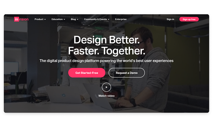
What is the first thing you notice above? Powerful prototypes in minutes. Above is an excellent example of how InVision uses the principle of scale, the eyes are immediately drawn to text about their product, being the most prominent, with a smaller CTA below.
2. Color and Contrast:

Typically, brighter colours attract more attention than dull colours. Brighter colours with a darker background appear closer than the lighter backgrounds. The more important elements could be brighter to grab more attention while the other elements recede to the background.
Here, the Deep Pink colour pops up on the black background, leading the user’s eyes directly to the “Get Started-Free” button.
3. Alignment:

Elements of the interface feel associated when arranged along a path. Scanning through similar content becomes more effortless.
The user feels the sense of alignment and associates them together even without a clear demarcation or borders on the elements.
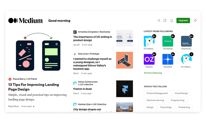
In the example above, we can clearly figure there are 4 columns of content, one below the other.
4. Perspective and Depth:

The parallax effect is added to give a sense of depth and perspective to the elements. It can help bring the focus to the areas of importance. It is employed by setting different scroll speeds for different image layers.
This is particularly useful since it brings life and a 3D effect to a rather flat two-dimensional page.
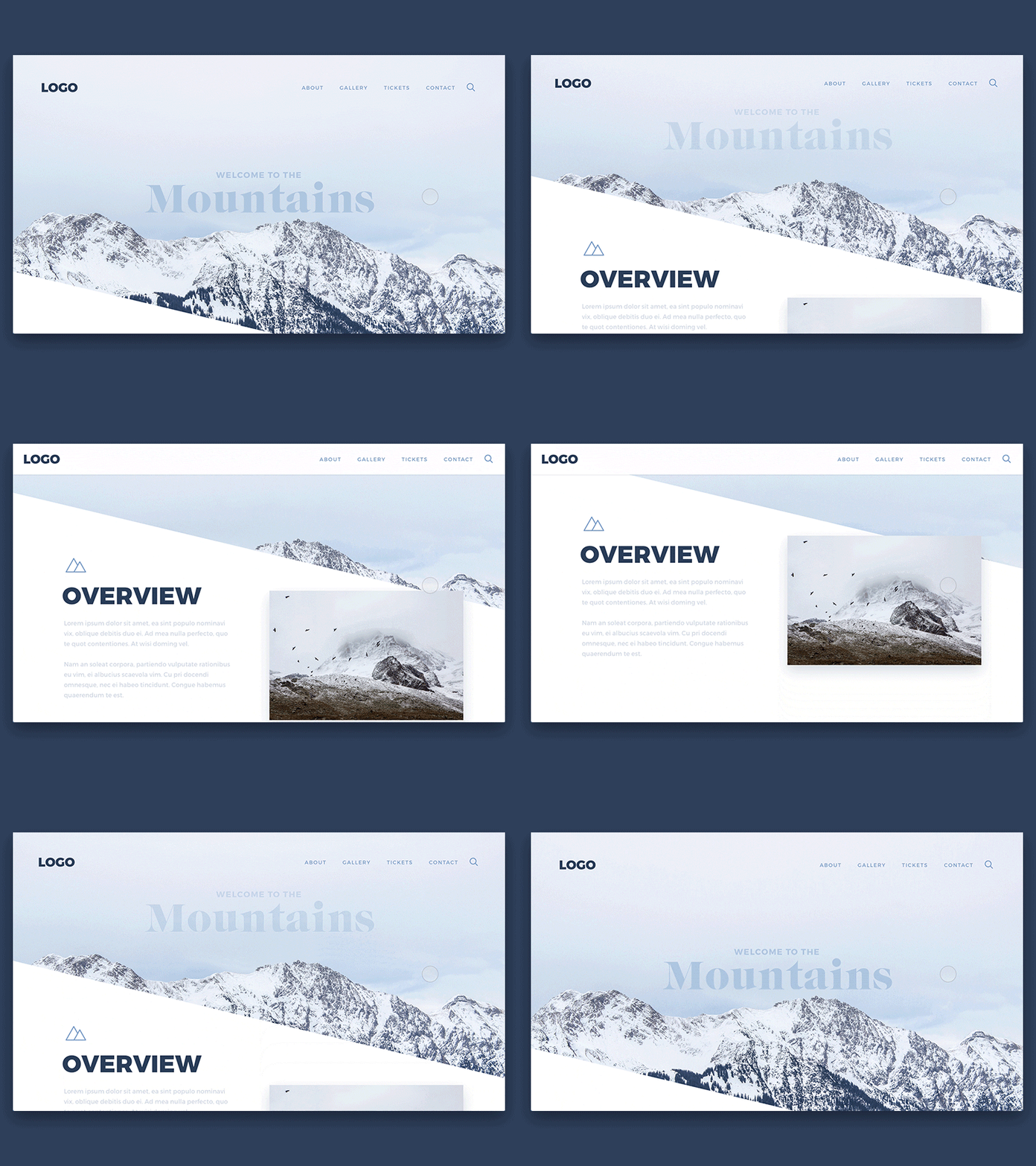
Above is an example of a web page with a parallax motion effect. Putting layers into perspective makes the human eye focus on the foreground first and then the background.
5. Typography:

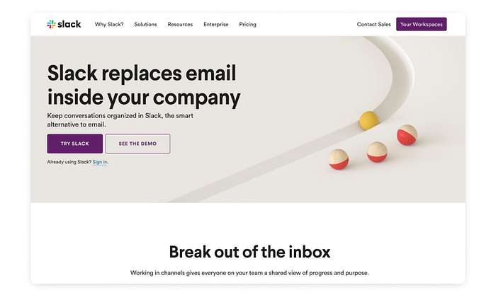
Different typefaces and fonts can draw attention to the main headings and then to the sub-headings in a hierarchical manner.
Various font weights, making the text heavier or lighter, can be experimented with to have a balance. The overall visual weight of the design should have a balance.
Sticking to traditional formatting rules is not a mandatory feature of content in products. Text weight, language structure and voicing can be played around with to make the reading experience more tactile.
For instance, combining 2 typefaces can be interesting for the design.
Thoughts to leave you with
Defining a visual hierarchy is a rudimentary requirement of any good product; without it, your users will simply be lost in the product or, even worse, be left to define what they believe the product’s primary meaning is.
With many notable products out there, you will notice that, despite having clear and focused brand identities, colours schemes, typography and such, the Visual Hierarchy is what leaves the strongest impression on the user. It is the cardinal directions given to the user to process and interact. All designers would be better off if everything sent in for design went through the prism of a well defined visual hierarchy.
The Canvs Editorial team comprises of: Editorial Writer and Researcher- Paridhi Agrawal, the Editor’s Desk- Aalhad Joshi and Debprotim Roy, and Content Operations- Abin Rajan
Follow Canvs on Instagram and LinkedIn. Don’t forget to follow us here on Medium as well for more design-related content.

