5 things to learn from type designers while dealing with visuals

Hello, Designers!
Ever had this thought, “Something is wrong!” while dealing with visuals? If so, you are not alone.
I have worked with different kinds of visuals. Be it a signboard artist, a mural artist, a typeface designer, or even a UI/UX designer — I always had an itch. This itch in my head was that something is wrong with this visual. And I’ve tried to get rid of this thought by learning, observing, and discussing with my peers.
Every designer had a similar thought early in their design career as I did. Some have cracked it, most have not. I cracked it while designing a working Devanagari typeface.
In this article, I want to share my learnings as a typeface designer with designers around the world. For those who are beginners in UI and visual design, it will be helpful, and for those who are experts, it can be a good recap.
Here are 5 things to learn from typeface designers that you may find useful:
1. They don’t use the same size for all.
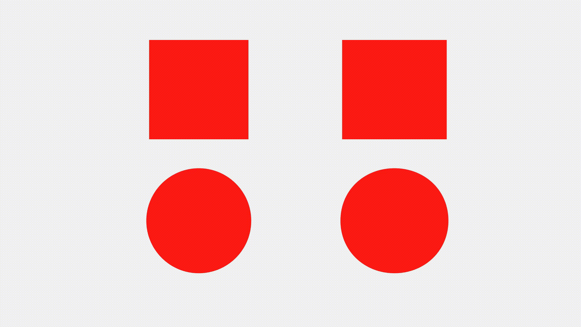
Why an equal size circle looks smaller than the square?
Type designers don’t draw all the alphabets with the same height. They are aware of the peculiarities of human vision so, they use optical tricks to create a harmonious, readable, and well-balanced typeface.

In the above image, a square, a triangle, and a circle are equal geometrically. Yet, our eyes perceive that the triangle and circle are underweight. It is because all three shapes have different areas. Typographically speaking, the amount of black is not equally distributed.
There are two ways to make them equal visually:
A. Calculate the area of both the shapes and keep them equal.
I don’t like and use this method as this works only with simple shapes like triangles, circles, and diamonds. This method is not effective with complex visuals.
B. Making visuals bigger, overshooting, and blurring the shapes is the easiest way to test the visual weight.
● Make non-square shapes bigger (triangles, arrows, dashes, linear icons, etc.)
● Overshoot your circular shapes.
● If your shapes are more or less similar blobs when you blur them, they have the same visual or optical weight. Check the below image to see it practically.

Now you got the idea of why non-square shapes/icons look smaller than the squarish shapes. Let’s see how real icons and UI elements work better using these optical tricks.

When creating a family of icons, it is crucial to make them well-balanced to ensure that no icon sticks out too much or is too insignificant. To create a balance, leave extra space between the squarish icons and the icon area. And allow non-squarish icons to go beyond the icon area.
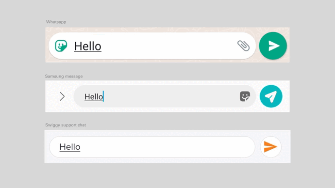
Another example is a rectangular UI element placed together with a round button. If the height of the round button is the same as the rectangular UI element, the round button will look smaller. For optical correction, you need to treat both of these elements differently.
Check the below examples of WhatsApp, Samsung messaging, and Swiggy support chat. Which one of these do you feel is more correct?
2. They can make things more circular than a circle.
What can be even more squarish than a square?
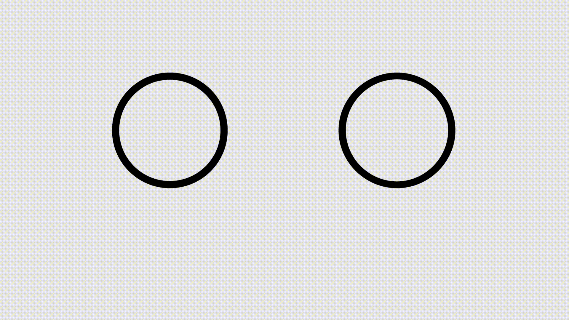
Our eyes have quirky visual perceptions for which we see things differently from reality. Below is a small test about the same. Which circle and square do you feel is more accurate?
Of these ellipses and rectangles, one is a perfect circle, and one is a perfect square. I have modified the right ones and yet they seem more symmetrical. That is because of the vertical-horizontal illusion.
Most geometric fonts are not geometric. Type designers make high-quality fonts by keeping human visual perception in mind. They use optical tricks almost in every letter to make a typeface well balanced.
However, you got the idea from the above test of what I mean. To understand it more, look at the below image. I have placed the letter ‘O’ from the geometric font Futura next to a perfect circle. Which one do you feel looks more symmetric?
You guessed it even before the text appeared, right? The letter ‘O’ from Futura’ is wider than the perfect circle and yet seems more symmetric. The reason is, our eyes tend to see verticals longer than the horizontals, even if they are the same.
Let us see how this illusion appears in the letter ‘T’.
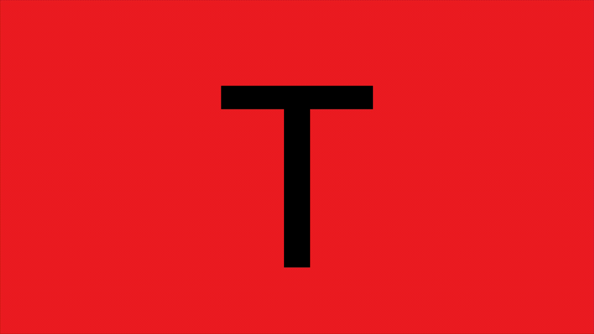
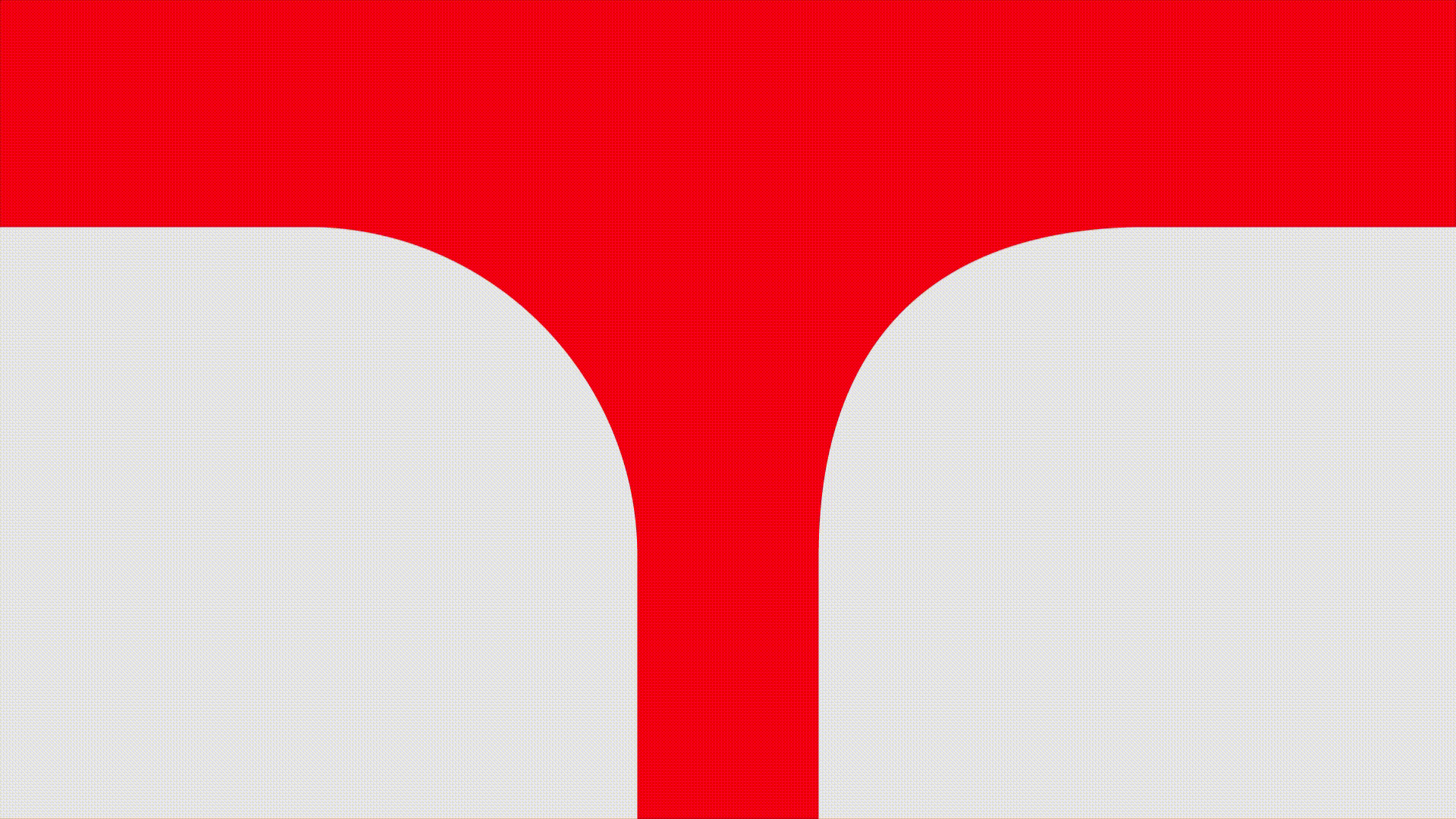
In the above image, the thickness of the horizontal stroke is less than the thickness of the vertical strokes to avoid the illusion. You can use this trick while designing a squarish icon, a squarish background or a frame for a profile picture, etc.
3. They take smooth turns to avoid accidents.
How to drive as smoothly as possible?
Drawing a typeface is like driving a car. While driving a car, we don’t turn the wheel when we are already at the beginning of the curve. We turn naturally a while before we arrive at the curve to avoid accidents. The same logic is used in metro and train tracks engineering for the easement.
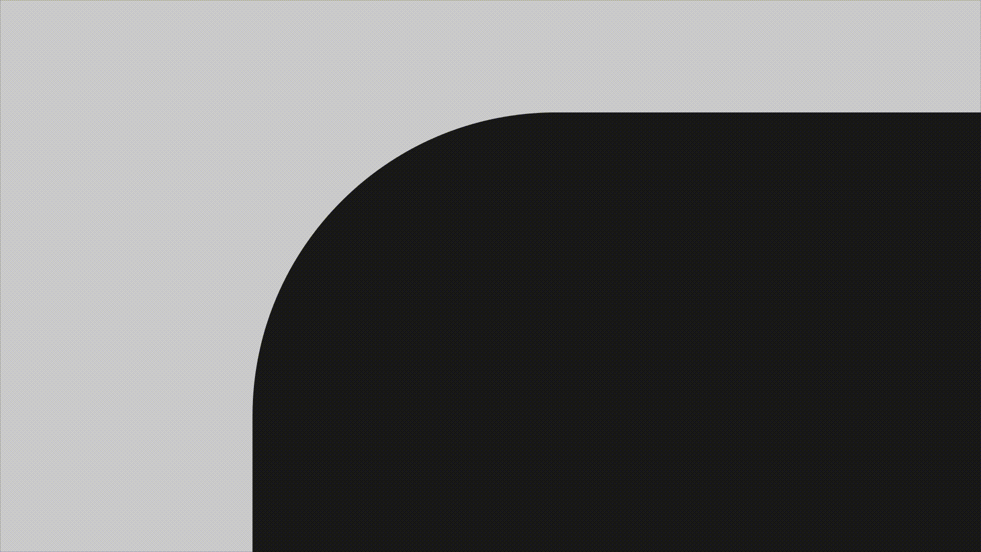
Type designers don’t rely on the embedded rounding feature of graphics editing software. They tweak the curve to make it smooth as they know that the human eye can immediately detect the point where a straight line abruptly turns into a curve.
Let’s have a look at both kinds of rounding: pure geometric and, tweaked. Try to observe which one is bothering your eyes and, which one is smooth.
In UI design let’s see where we can incorporate this learning.
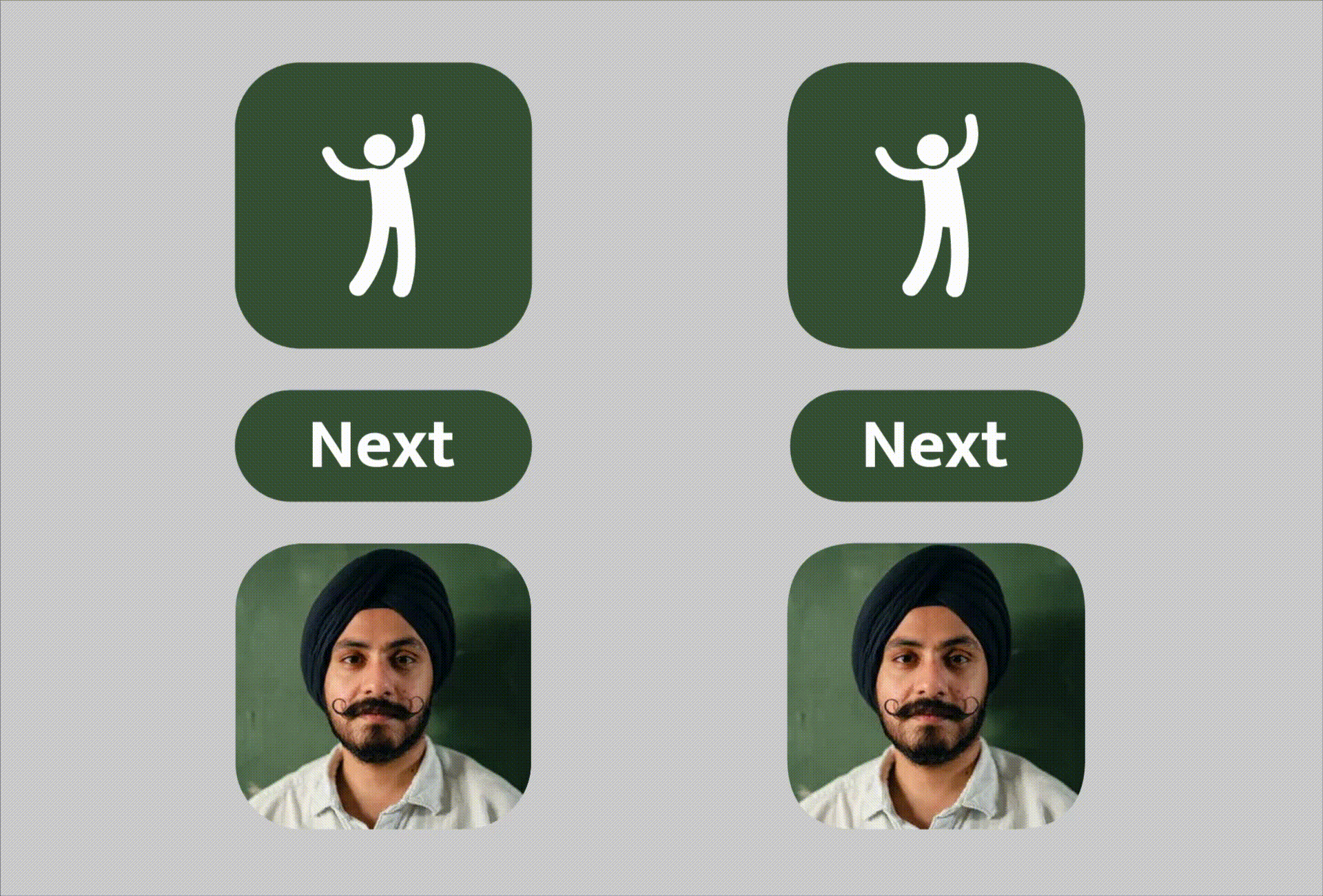
You might have noticed that the buttons, icons, and frames on the right side look more pleasant to the eyes. Whereas the left ones have a weird transition from a straight line to a curve.
How do we fix the curve? While designing, one can enter into the shape editing mode and manually resize the curve handles like the below image.
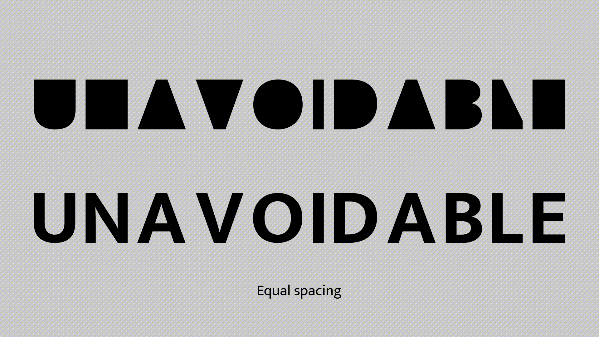
4. They don’t distribute space equally.
Why is eye judgment more important than arithmetic parameters?
Spacing is the most crucial part of designing a typeface. Type designers pair letters based on their shapes and space them differently. For example, letters A and V are triangular and contain more outer white space. So, in case they appear together then the spacing between the two of them would be a little tight to reduce the amount of white space. This helps to make a harmonious font.
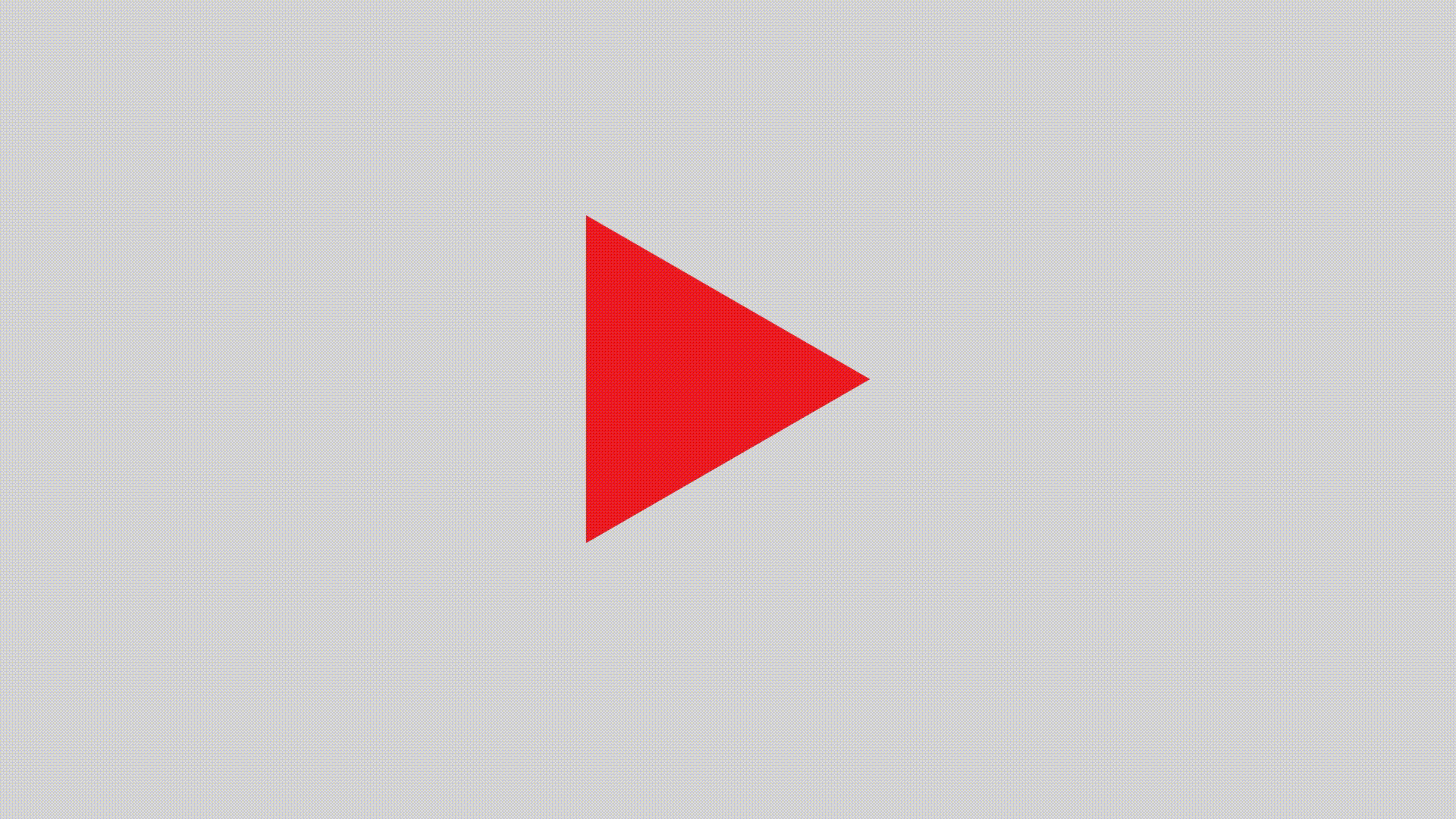
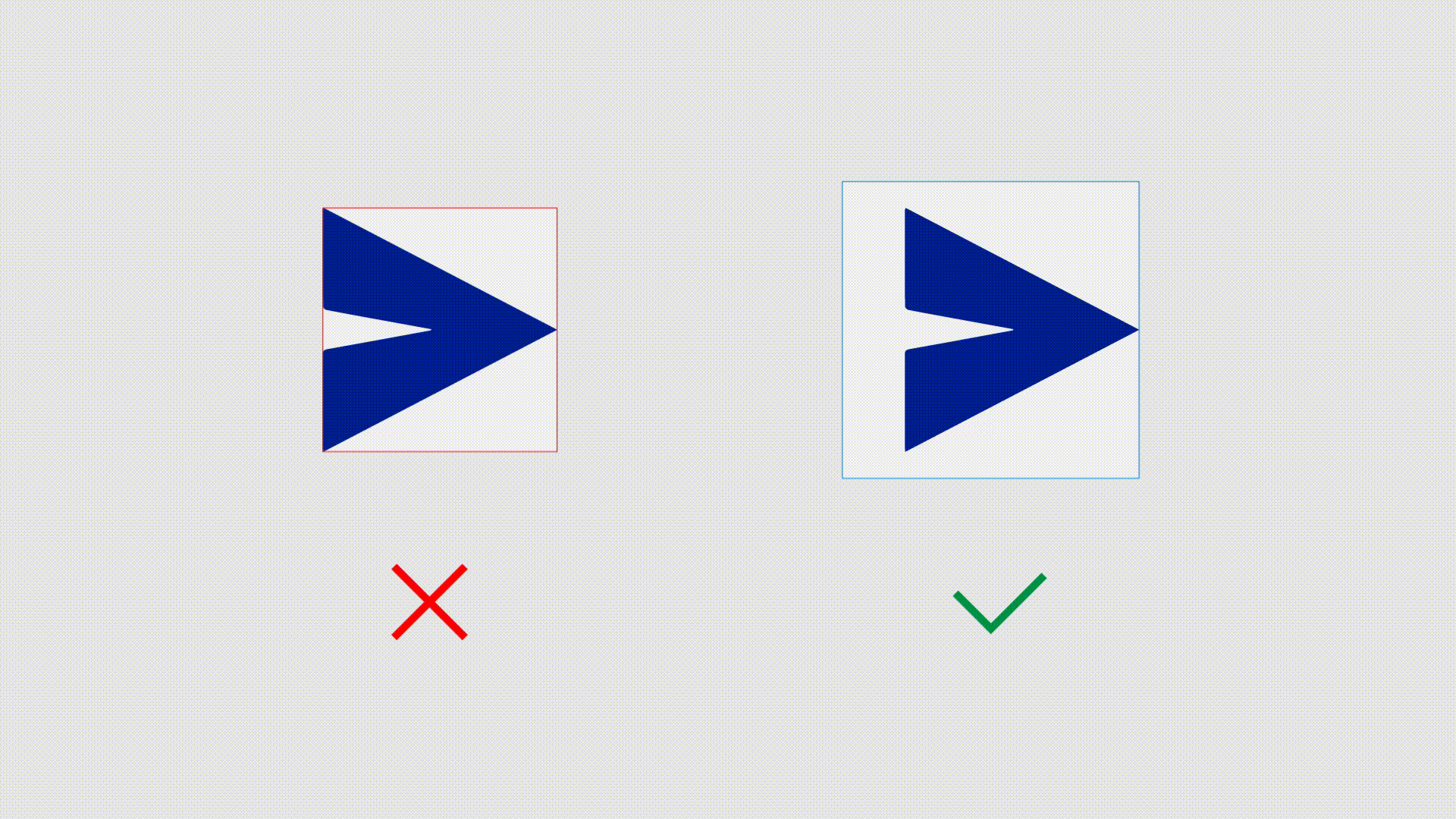
Now, let’s see how can we utilize this learning in other aspects of visual design. You might have noticed that placing a triangular icon (Play and Send icon) within a circular or rectangular container can make the icons appear out of place. That is simply because the area of the triangle is not equal on both sides when mathematically centered in a container. Check the below image to understand it with visual explanations.
To make the triangular shape optically centered within its container, we need to equalize the weight on both sides. For triangular shapes, you can find the centroid and, align it with the center of the container. Nowadays Adobe Illustrator provides a hint for centroid if the triangle is created with the Shape tool.
If you don’t see the centroid hint, don’t worry! Centroid can be located by simply drawing lines from the center of any two sides to their opposite vertex. Check the below image to understand it better.

This method works better with geometric shapes only. For other organic and more complex shapes, you need to rely on your eye judgment than the arithmetic parameters.
Point to remember: If you prepare an asset for the developer, you need to reserve some area around the icon, so that they can center the icon on the background optically right.
Draw a circle around the icon from its centroid to leave the extra area around it.
Let’s check and let me know in the comment who is using the wrong asset among these companies?

5. Their bottoms are heavy. 😉
How to balance?
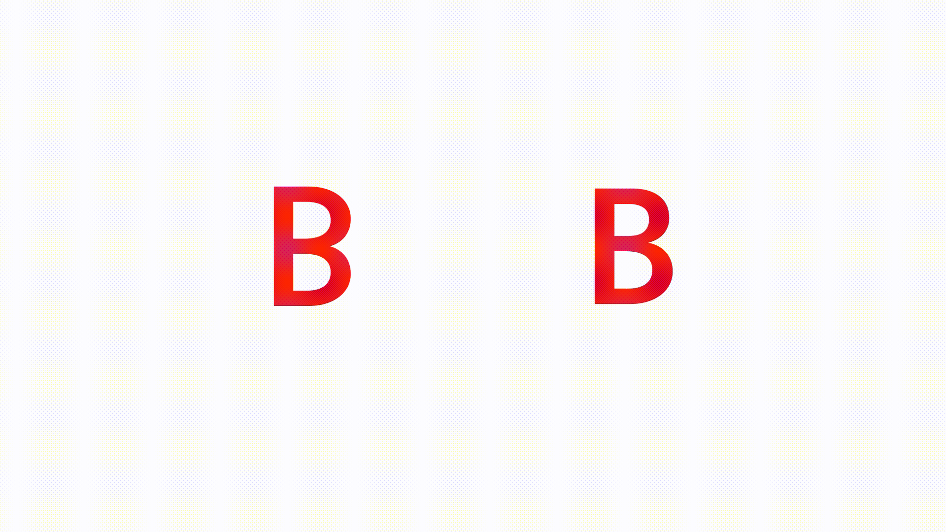
Have you ever noticed the letter ‘B’ closely? The bottom bowl of it is crafted bigger than the top. If we craft both the bowl mathematically equal, it’ll look imbalanced (check the left image above). That is because we are evolved to process the physical world from the concept of ‘perspective’ in which, remote objects appear smaller than those nearby.
In Typography, it means making letterform equally balanced requires drawing it to be heavier at the bottom.
Let’s see the clear difference by flipping the few letters of a typeface.
The same concept applies to other letterforms which are horizontally symmetric and even in the letter ‘H’ crossbar is placed above the actual center to make it look more symmetric.
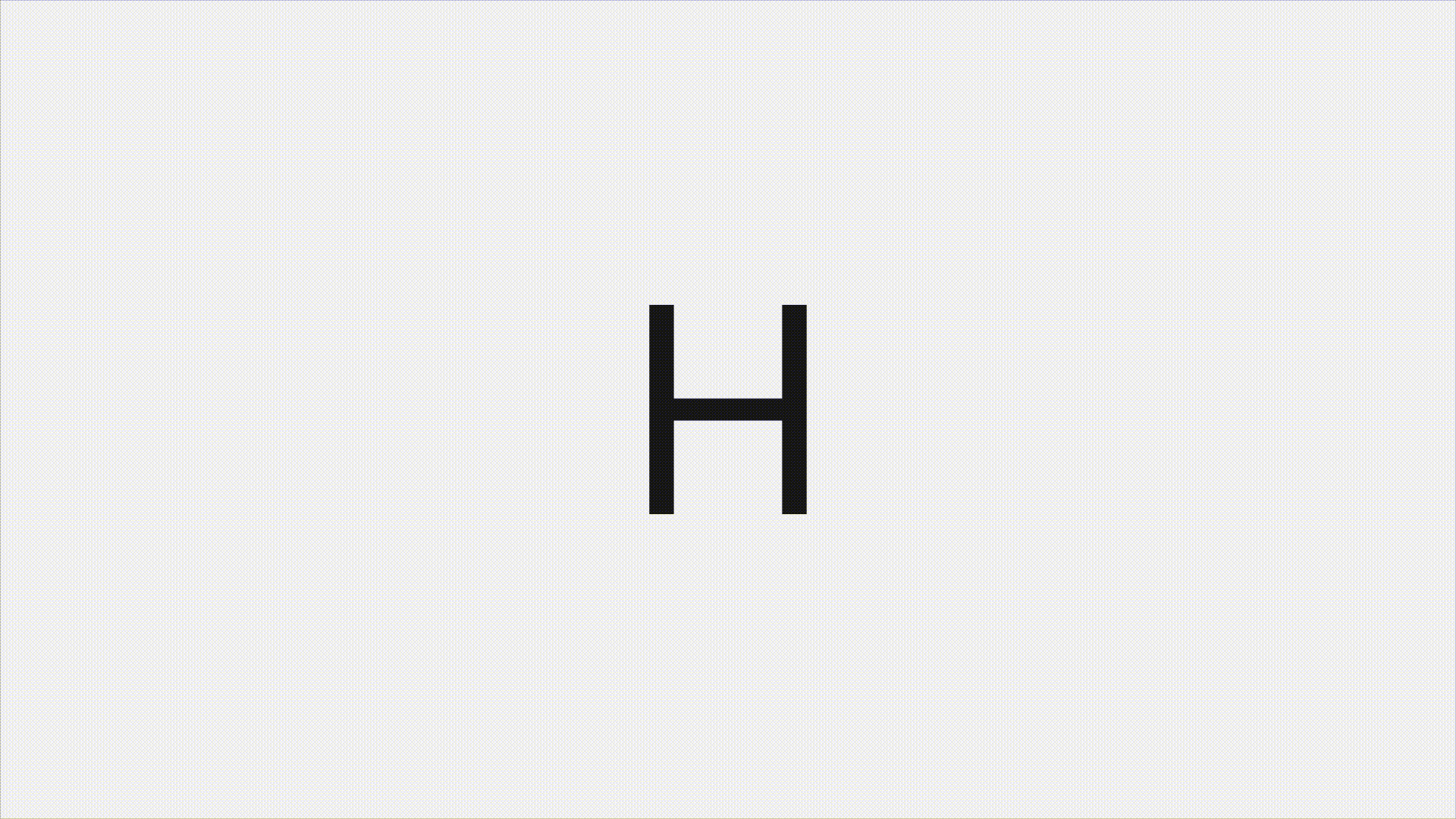
So, next time you design an icon or logo which is horizontally symmetric, use this bottom-heavy technique to make it optically balanced.
—
Bonus: Intersection interrupts the continuity.
This illusion is also called the Poggendorff illusion, it is a strange phenomenon that distorts our perceptions of shapes intersecting on an angle other than 90°. Our mind for some reason finds it difficult to extrapolate a line partially covered by other shapes which results in an interruption in continuity. To understand it practically, look at the left image first in the below example and try to observe which line is continuing, A or B? Then check the right side image in which I reduced the cover line. I hope you got the idea of what I meant.

In Latin typeface, ‘X’ or ‘x’ is the victim of this illusion and needs special treatment to make it look more natural. Type designers slightly offset the diagonals to correct X or x optically.
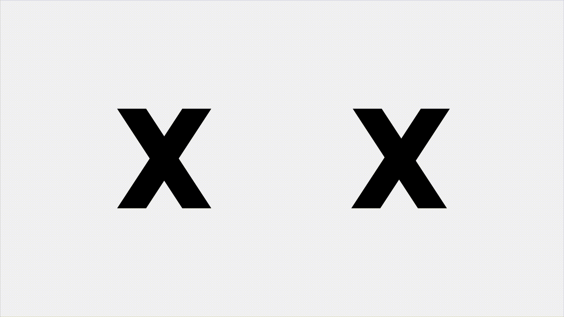
If you face a similar issue while designing typefaces for other languages or while designing an icon set for an app, you can try offsetting the diagonals like it is done in the letter ‘X’.
—
Recommended reading:
This article offers a limited understanding of the domain. If you want to learn more about type design and improve your visual design skill. I would encourage you to keep on exploring and recommend you to read the below list.
● The Anatomy of Type: A Graphic Guide to 100 Typefaces by Stephen Coles
● The Elements of Typographic Style by Robert Bringhurst
● Emotional Design: Why We Love (or Hate) Everyday Things by Donald A. Norman
● Visual Grammar by Christian Leborg
● Visual Design: Ninety-five things you need to know by Jim Krause
● The World in Your Head: A Gestalt View of the Mechanism of Conscious Experience by Steven M. Lehar
● The Visual Display of Quantitative Information by Edward R. Tufte
● Visual Order — Booklet by Mandar Rane
—
Thank you for reading! If you feel this article is helpful and you’ve learnt something new, please give it a 👏🏼. Also if you noticed any mistake or feel that improvements can be made in this article, let me know in the comment box, I would appreciate it.
Reference:
- typeworkshop.com, Type-basics, available at http://www.typeworkshop.com/index.php?id1=type-basics
- webspace.ship.edu, Gestalt psychology, available at
https://webspace.ship.edu/cgboer/gestalt.html - en.wikipedia.org, Vertical–horizontal illusion, available at
https://en.wikipedia.org/wiki/Vertical%E2%80%93horizontal_illusion - en.wikipedia.org, Ponzo illusion, available at https://en.wikipedia.org/wiki/Ponzo_illusion
- en.wikipedia.org, Delboeuf illusion, available at https://en.wikipedia.org/wiki/Delboeuf_illusion
- en.wikipedia.org, Poggendorff illusion, available at https://en.wikipedia.org/wiki/Poggendorff_illusion
- en.wikipedia.org, Centroid, available at https://en.wikipedia.org/wiki/Centroid

