5 common mistakes to avoid while creating a typographic scale in 2021
These are 5 mistakes I made and learnt from while creating the typographic scale for the CallHub marketing website.
Using too many font weights without a variable font
Creating a clear hierarchy for page elements and contrast between elements will require multiple font weights. But if the developer has to install separate font packages for each font weight, as in the case of static fonts, that can reduce page speed. A variable font can provide the flexibility to add multiple font weights by installing a single font file.
Takeaway: If you are not using a variable font, it’s recommended to use a font with multiple weights. But avoid importing all font-weight files in one go. Just bring the minimum number of weights you need so page speed is not negatively impacted. Consider variable fonts like Inter for quicker page loads.
Judging solely by the eye. Use a proportional scale instead
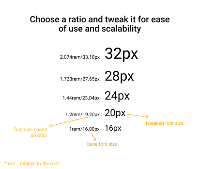
Each combination of font sizes from your type scale, when placed near each other, should have visual harmony. Creating a type scale without a clear pattern for increasing or decreasing size makes it harder to use font sizes together and create a pleasing hierarchy for the eye. You can experiment with multiple ratios (aks patterns) to scale font sizes (see Type Scale by Jeremy Church), but having a pattern makes it easier on the eyes and comes in handy when adding additional font sizes to your typographic scale.
The musical interval, Minor third which uses a ratio of 1.2 is a good example. You might also know the Golden ratio (1.62). Keep in mind that these are not rigid rules. Feel free to experiment. Eg. The Minor third proportions are 1, 1.2, 1.44, 1.728, 2.074 and so on which gives you font sizes with decimal values if you consider 16px as the base font size. But slight tweaks like in the below image makes the font sizes a lot easier to work with.

Takeaway: A lot of proportional ratios already exist in music and in nature that can be used to create harmony between font sizes. Use them as a guide when creating your typographic scale (see Using a typographic scale by Kevin Powell).
Using the same typographic scale across web and mobile
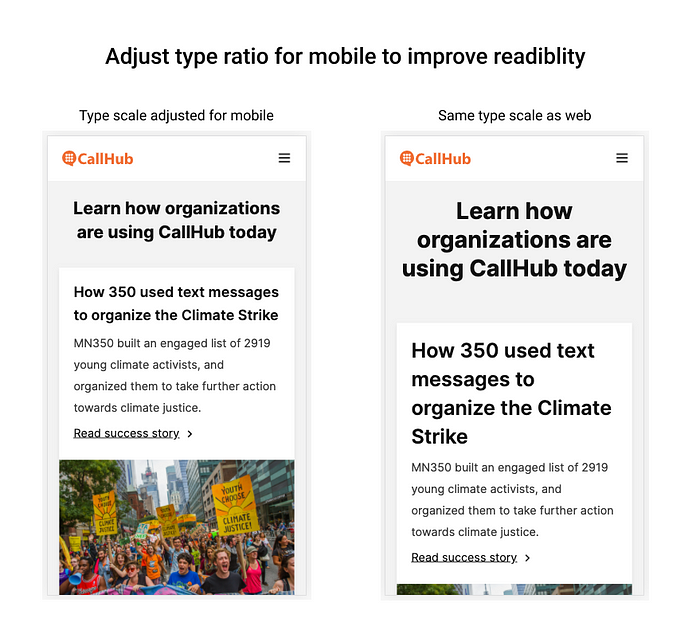
After spending ages figuring out the right type scale, it’s natural to want to just go live and see your type scale in all its glory on your website. But then you discover that your beautifully proportioned font looks out of place or too big on a mobile interface. That H1 title filling up the entire mobile screen is not a pleasing sight. After finalizing the type scale for desktop, it’s worth the little extra effort to consider how they will look in mobile interfaces. You can adopt the same type across web and mobile, by replacing H1’s where H2’s would have appeared and so on if visibility on search engines (SEO) is not a priority. But since search engines like Google look for H1 titles to understand the main context of a page it makes sense to create a scale for mobile as well.

Takeaway: A type scale built for web interfaces might not look good on mobile. Create rules for how the type scale should change for different screen resolutions. You can do that by setting a breakpoint and saying that for screen sizes less than 1024px (for example), the H1 font size should change from 32px to 24px.
Not defining line height and paragraph spacing when deciding font height
This is an area that causes constant strife between developers and designers. The designer would ask for 20px spacing between H1 and H2 fonts. But when it gets developed, the spacing turns out to be 30px. This happens because line-height often doesn’t get taken into consideration when defining spacing between elements. The same can happen with spacing between paragraphs.
Takeaway: Define line heights for each font size in your typography scale and make sure developers are aligned with you on line-height as well as font height.
Treating the same font sizes across different font types equally
If a certain type scale has been working well for you, that doesn’t mean you can interchange the typeface and expect it to work the same way. Eg. Inter at 12px is fairly readable in sentence case. But 12px Roboto, not as much. You might have to change Roboto 12px to UPPERCASE to keep it readable.
Takeaway: When changing the Typeface, make sure to test it across different contexts and make the necessary changes to maintain readability and aesthetic appeal.
Avoid these 5 mistakes as a designer and save yourself the hair-pulling when your type scale goes live. I’ll keep adding to this list the more mistake I make.

