5/6: UI Patterns to power your AI products
Delve into the world of UI patterns in AI driven experiences, exploring how they’re reshaping experiences in modern applications. We’ll look at the rise of intent-based interaction and the various UI patterns emerging in response to AI’s unique demands.
Browse full 6 part series written by Dilip Jagadeesh and Kristina Rakestraw
One of the fundamental shifts we are seeing in user interfaces as AI gets better and better is a shift away from traditional ‘Command and Control’ interactions to ‘Goal and intent’ based interactions (Source). The traditional command-and-control UI patterns, where people mostly toggle controls to achieve desired outcomes, are being challenged by new intent-based interactions. This new paradigm enables people to express what they want using natural language, not how to do it. However in order to do so they must, of course, know what it is that they want. Let’s be honest — most people don’t know how to express what they want.
Imagine typing the following message into your device: “I want to book a flight to Paris”. The next thing you know the tool takes care of the rest — from finding the best flights to booking them with your correct information. This shift opens up a new realm of possibility for designing comprehensive and intuitive experiences. As simple as it sounds, this transition isn’t without hurdles. Modern large language models — while adept at understanding natural language — still place a high cognitive load on people which requires them to articulate their needs in prose text. Designing experiences that facilitate this new form of interaction — while remaining intuitive — is a significant challenge for designers.
In this article, we’ll delve into the world of UI patterns in AI driven experiences, exploring how they’re reshaping experiences in modern applications. We’ll look at the rise of intent-based interaction, its implications for UX design, and the various UI patterns emerging in response to AI’s unique demands. From chatbots to AI-first applications, contextual to invisible workflows, we’ll explore how these patterns are being implemented to enhance experiences.
Make it obvious in the experience
Every business and product has its own philosophy for leveraging AI in user experiences and how it will be perceived by people. For example, it can be perceived as a co-pilot or assistant to something that is invisible yet still makes the experience better. Depending on the unique product approach to adopting AI in the interfaces, it is super important to be transparent about when AI is being leveraged..
Symbology matters
Designers are getting clever with how they introduce generative AI to people through intentional symbols.
Leveraging commonly used symbols can help make these high-tech capabilities more familiar and obvious. For example, a magic wand and sparkles are popping up a lot in Generative IA. Why sparkles? Because this kind of AI can do things that seem magical. It can whip up creative ideas that we’d usually sweat over. Rather than try to reinvent the wheel and create a new innovative symbol, we recommend you lean into the obvious and meet customers where they’re at.
The robot symbol is another go-to symbol for generative AI, hinting that some smart AI technology is working behind the scenes. Creepy and cool, right? While the robot icon is on trend, it may also feel like they are conversing with a cold, unfriendly machine.
We see it as a bit of a balancing act — using the robot icon to show off the power without making people feel like they are chatting with a heartless tin can.
And then there are abstract icons. These are the more enigmatic elements we’ve seen. With their use of basic shapes and lines, they’re less about direct representation and more about sparking curiosity. They invite people to interpret and engage, adding a layer of intrigue. Who doesn’t like a bit of mystery? This approach encourages exploration and personal interpretation, enhancing the AI experience by making them feel more immersive.

Colors have meaning
Colors play a crucial role in how people perceive and interact with generative AI features in applications. Designers often use vibrant colors to make AI elements pop, while others prefer muted tones for a sense of trustworthiness. While we don’t personally believe that color alone can ensure trust, we get it.
Purple is the standout color in AI experiences to date. According to Google Arts & Culture, purple “signifies both the stability of blue and the energy of red. The color purple is generally associated with royalty, luxury, nobility, power, and ambition. Purple is also used to represent creativity, extravagance, dignity, grandeur, independence, pride, peace, mystery, and magic.” (Source). It’s becoming the go-to choice to symbolize Ai’s magic and power, often paired with gradients. Adobe’s insights reveals that the popularity of purple in AI isn’t surprising, given its association with the “magical” aspects of new AI technology. Now, purple is almost synonymous with AI, guiding people to AI-driven experiences.
Choosing colors isn’t just about following trends; it’s about aligning with your brand’s identity. It’s less about ‘to purple or not to purple’ and more about how to make AI recognizable yet true to your brand.
For instance, Notion uses brand-consistent purple icons for their AI capabilities, across the tool, leaning on symbology and descriptive copy to convey AI elements. The essence lies in balancing brand identity with the role of color in enhancing AI features.
Other applications using purple to indicate AI capabilities include Figjam, Canva Magic Edit and Framer
Labeling brings clarity
While designing AI experiences, clear and concise labeling is key, especially for complex generative AI features. These labels act as navigational guides — helping people understand what the features are, how they work, and how to use them effectively.
By demystifying AI functionalities with straightforward labeling, designers can make these advanced features more intuitive. Good labeling transforms the often-intimidating world of AI into an approachable and manageable experience for people, bridging the gap between sophisticated technology and everyday usability.
Location matters
Depending on your product approach, AI capabilities benefit from being contextually available as well as having a global entry point in a persistent and obvious location. If you are leveraging invisible AI to make a recommendation, it is critical that you indicate that within the recommendation.
The role of motion
Motion is playing a critical role in making generative AI features not just more interactive, but also more intuitive and engaging. Designers are increasingly using animation to demystify AI processes, allowing people to visually grasp how it works. This approach transforms complex operations into understandable narratives, making the technology easy to use and less intimidating. Animations that depict data processing or idea generation add a layer of transparency, helping people connect with and trust the system.
Moreover, motion is being employed to infuse a sense of playfulness into interactions. This tactic is particularly effective in making AI approachable for a broader audience, including those who might be new to AI or find it daunting. By integrating playful animations, designers can turn complex AI interactions into enjoyable experiences that enhance engagement and contribute to more user-friendly interactions. This helps make the technology feel less cold and machine-like and more playful and conversational.
The elements of trust
One of the foundational elements of AI driven experiences is ensuring that people have trust in the workflow. Whether it is a simple recommendation or complex data analysis it is critical that people have a way to trust the output of the system. In order to do this, we recommend making some of the unusual data available to people. Let’s explore the elements that help make this possible.
Response confidence indicators
People are often in the dark about how an AI-driven system comes up with predictions and they’re clueless about how sure the system is about its guesses. A simple solution to this is to let the machine ‘speak up’.
For example, adding a confidence indicator is like giving the AI a voice to say, “Hey, I’m pretty sure about this” or “Hmm, I’m not too certain.” This is helpful for people to determine how much they want to rely on what the AI suggests. It’s all about building trust. When people see how confident the AI is, they’re more likely to pitch in with more data, helping the system get even smarter.
Additional reading: How netflix recommendation system works
Explainers
Similar to confidence indicators, when doing advanced data analysis the logic behind the computation can easily get obscured. In order to build trust and have a way to audit the computation, people need a way to understand how the system computes. For example, a clarification of what data was used, how it was filtered and what function was applied to produce the end results.
Tableau AI allows people to query their input in natural language and returns charts and interpretations of the chart. If someone wants to know the logic behind the outcome, they can easily get access behind the curtains.
Disclaimers
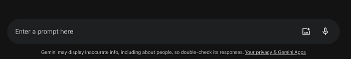
It is not possible to claim that any AI system is always accurate. Being upfront about the shortcomings of the responses and potential hallucination from the model is critical for building trust with people.
For example, Both Bard and Chatgpt have a standing disclaimer next to the input field explaining the potential mistakes these models can make.
Badges to set the expectation
Another approach to encourage people to engage with AI-driven experiences yet help them understand the models are still a work is progress is through the use of badges. A simple “Preview” or “Beta”, helps better set expectations and allows products to fail and learn without losing trust in their overall brand.
For example, when Canva- Magic Design and Adobe-firefly launched their AI design capabilities, they added a “BETA” badge next to features so people could understand it was still in its early days.
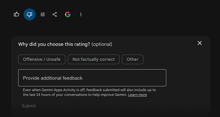
Feedback loop
In order to facilitate continuous learning for AI systems, there needs to be a way to receive feedback on responses. This enables underlying models to learn someone’s preferences and better recognize when the system responses do not meet expectations. Depending on the architecture, models can automatically adjust the response or build a catalog of the feedback which is later analyzed and fine tuned by human intervention to increase accuracy.
Like / Dislike button
One of the most common patterns is a like / dislike button, due to its simplicity. These tend to get higher use because they do not require a lot of motivation to use to express sentiment.
Contextual feedback
Another powerful way to help the system learn is by offering contextual simple-feedback-questionnaires immediately after the response is generated. It is often also paired as the next action after a person responds with like/dislike.
For example Microsoft copilot has a simple contextual feedback form after like/dislike in order to collect context about the expectation gap.
Offer controls to guide users to intent
We believe that to have an intuitive AI-driven experience means to provide controls that offer people guardrails for focusing and understanding what is possible — as well as leveraging common GUI patterns with the context of prompt interfaces. Some example include skill selection, response modifier, multi-modal interaction and suggested prompts.
Skill selection
Some products have started incorporating skill selection in order to narrow down on a person’s intent. This allows people to explicitly mention the type of task they are looking to engage in. For example, Clickup requires people to specify the intent by selecting a skill from a dropdown list before engaging with the prompt.
Similarly, much more robust and open-ended tools such as co-pilot let people choose the conversation style so the model is aware of their intention for how to engage.
Response modifier
Though one would wish it worked like a magician by understanding the person’s intent through one single prompt, we all know that is never the case. AI tools learn to understand a person’s intent and produce good results when there is dialogue between it and the person. In order to achieve this in a more seamless way, some tools have adopted a pattern that enables the person to modify their response by using the initial output as the canvas. What does that mean? Let’s look at Copy.ai as an example.
It is a Gen-AI tool that can create long forms of text and then lets people highlight only the text they want to be rewritten. It also offers the option to choose from alternatives without the person having to prompt “I need you to rewrite this “…”.
Google Bard allows people to modify the response with preset options.
Many image generation tools offer explicit controls over the underlying model, so people can specify the exact style, relevance to reference image, model type, negative prompt and many more.
Multi-modal interaction
As the field is rapidly evolving, the underlying model’s ability to interpret the contents in different formats is getting better. This enables people to upload a file, image or video and give the task intent through text or voice and then run the prompt.
For example, Microsoft co-pilot lets people upload the relevant file and add a prompt through an inline prompt input component.
ChatGPT lets you upload an image and annotate on it to direct it better and ask questions about it.
Adobe firefly uses classic photoshop like annotation tools on an image along with a prompt to accurately understand what needs to be changed in the image.
Suggested prompts
One of the best ways to onboard people and help them discover the capabilities of the AI tools is through showing example prompts. This UI pattern also enables the person who is in the middle of the workflow to get a contextual recommendation on how they can use the AI tool.
Prompt builder
One of the most difficult barriers with writing prompts is learning how to write them effectively. Explanations can create intentional guardrails to help establish some structure for users to define their intent.
Additional reading: NN- group research on articulation barrier
Examples:
Copy.ai has a feature that improves the prompt which gives people a structure to add more details to their original prompt.
Clickup example:
Select the skill you want to engage and fill in the details .
Moving with the shift
As we shift into the new goal and intent based way of interacting, it’s vital to leverage all the tools that make this a more seamless and dynamic experience for people. As humans, we are not very good at nailing our intent and want on the first try so it’s important to lean into this and provide mechanisms for people to get closer to what they are looking for.
—

