4 Examples of user control and freedom in UX design
A quick look at a valuable feature UX designers must remember: giving the user the ability to exit unwanted processes.
It’s true. When you start looking for patterns and flows in UX design, you see them everywhere.
A few weeks ago, I began a course in Usability and User Experience at Arizona State University. This week, I am conducting a heuristic evaluation for a local nonprofit (more to come on that project) using Nielsen’s 10 Usability Heuristics.
As I’ve worked through this analysis, I’ve inevitably begun to see examples of these heuristics in my daily life.

Heuristic #3 is “User control and freedom”, meaning that as designers we must give the user the ability to exit unwanted actions easily.
In the real world, this comes in the form of physical exit signs over an exit door.
In the digital world, this comes in many forms. Pop-up “are you sure?” messages, undo/redo functionality, and cancel buttons are common across the web.
Here are a few examples I’ve seen of how digital products give users control and freedom.
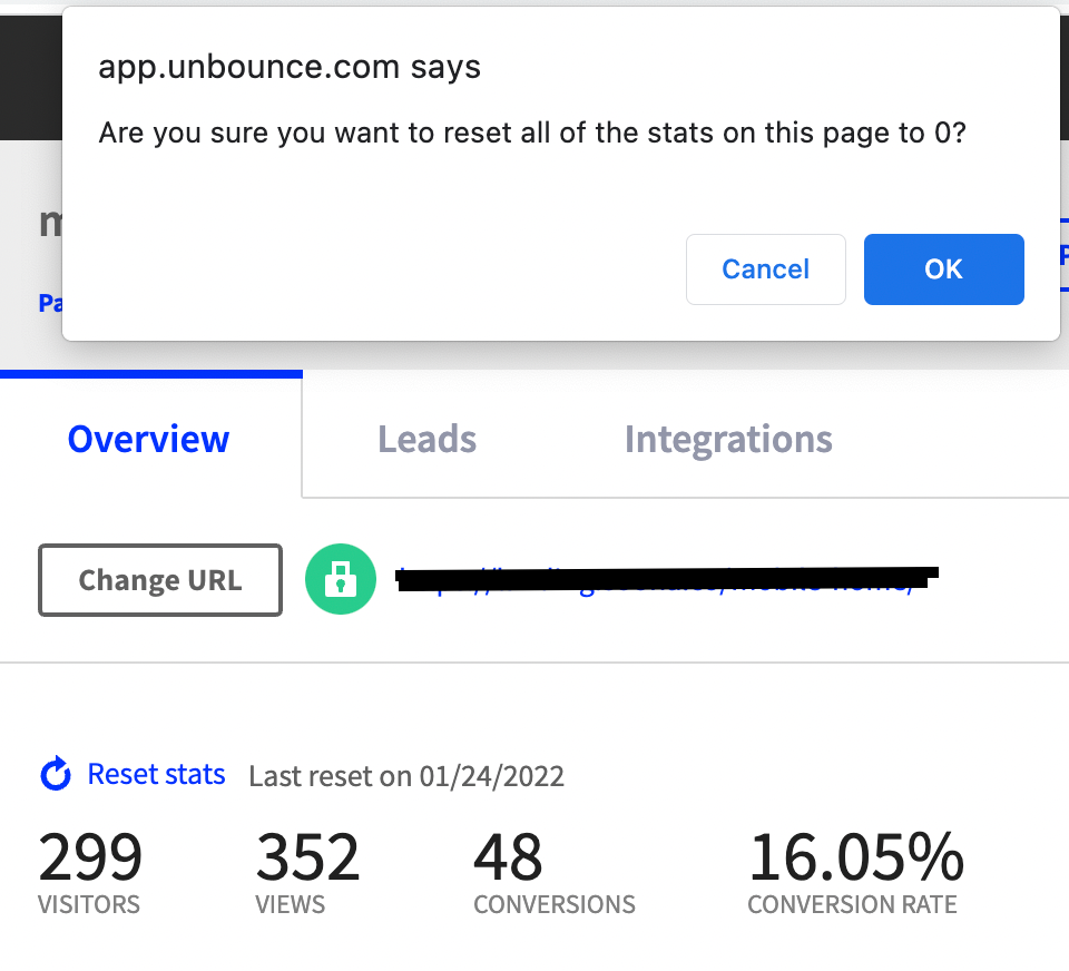
1/ Unbounce’s “Reset stats” confirmation message
Marketing is my current profession. My work involves testing messaging across various ad platforms and media campaigns. One tactic I often use is landing page testing.
Recently, we launched a test using Unbounce – a custom landing page builder that boasts its ability to improve conversion rates.
As a digital marketer, having good data is pivotal to proving what works (or doesn’t work).
I was navigating the platform today and accidentally clicked the ‘Reset stats’ button and immediately freaked out.
This is an active test. Resetting my stats means losing all the data we’ve collected in the last few days. All the measurements collected to prove Unbounce as an effective tool would be gone. But thankfully, the design team at Unbounce thought of that.
Almost immediately I was able to breathe a sigh of relief when the page gave me a pop-up reading “Are you sure you want to reset all of the stats on this page to 0?”. Instantly I hit ‘cancel’ and went back to work.
This pop-up saved me a lot of frustration as a user by allowing me the ability to back out of this action.
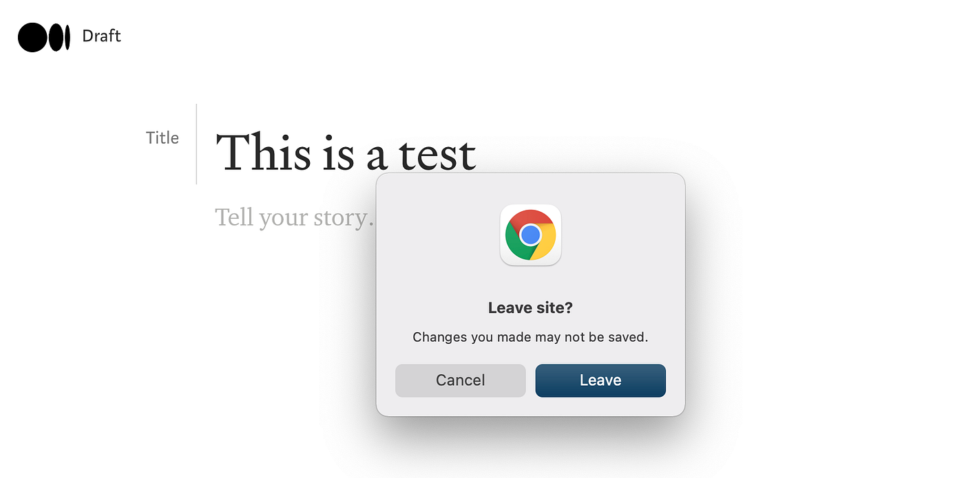
2/ Medium’s “Lost Progress” pop-up Message
Since I started writing on Medium, I’ve been brainstorming new topics for when I’m in a writing slump. Multiple times I have brain-dumped a few sentences into a new article format just to get the thoughts down.
Then, I typically leave the page to continue other work.

One feature I love is the pop-up that appears when I try to leave an article before Medium has had a chance to auto-save.
The quick “Leave site? Changes you made may not be saved.” message gives me a chance to hit ‘cancel’ and exit the option. This prevents lost work for me and creates a great user experience for Medium writers.
Once I exit the action, the platform quickly saves my work and notifies me with the ‘Saved’ text at the top of the page. This is the expected feedback I need to move on and work on other articles.
3/ Spotify Ads’ “Clear Edits” button
Self-serve ad platforms: another interface I regularly use as a performance marketer. Unlike other platforms though, Spotify’s campaign tool provides a fun feature for ad creative creation.
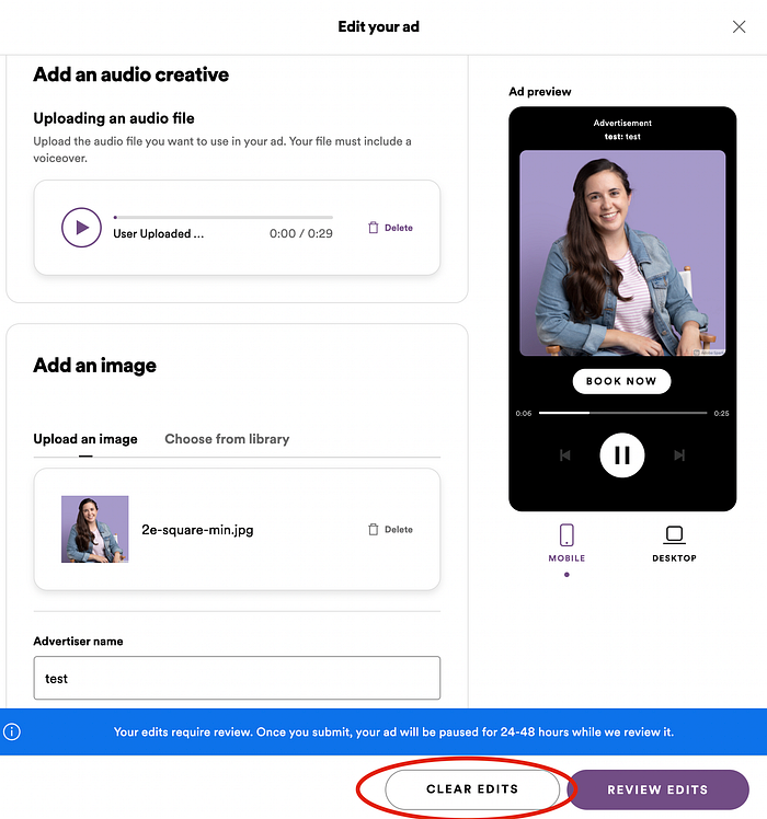
Take this example: my company recently launched audio ads on Spotify. As I create my ad, I’m required to provide an audio file, an image, and other important details.
But what if I want to see how a different image would look? If I used my headshot instead of our brand image, would that look good on the Spotify platform?
Obviously, I don’t want to run an ad with my headshot. In this case, Spotify provides an easy “Clear Edits” option for advertisers.
With the click of a button, I reverted all changes made to our original asset.
As a marketer, this improves the ad creation process significantly. Other ad platforms use a “Discard Draft” message, but the “Clear Edits” button is more clear and easy to understand. The edits I made were reverted quickly, allowing me to go about my day.
4/ Google Docs’ undo/redo buttons
Most text editors have a similar feature: the undo/redo option. This OG example of giving users the freedom to back out of an action is likely the most common one as well. Let’s look at Google Docs as an example.
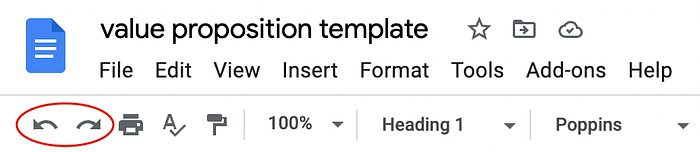
In this screenshot, you can clearly see the curved left and right arrows featured in the menu bar.
Hovering over them with your mouse reveals their meaning and their shortcuts for whichever platform you are using.
The ability to undo or redo an action when working on a document is essential to allowing the user freedom to complete their work. Accidentally delete a passage? Hit ‘undo’. Decide you were right the first time? Delete it again with ‘redo.
The user is free to navigate as they please.
There are many ways to give your users the freedom to cancel or back out of unwanted actions. Whether it’s pop-ups, buttons, or a small ‘X’ to close out a screen, as the designer we get to be creative in this decision.
Just make sure you don’t forget about this important user flow.
What examples of user flow freedom have you seen?


