Comparing 2 Airline Websites UX tests & results
Ux testing and Comparing how two airlines' websites work is quite an experience. In this post, I will share what we learned about a set of UX tests with real participants and how they interacted with two flight ticket purchase platforms: Voegol and LATAM.
Want to know more about this traveling experience? Find details and the outcome of this little “UX trip” below.

Below you will find:
- How we selected UX test participants for our project
- Results of this UX comparative testing
- Screenshots describing the UX issues expressed by users
So before continuing, here is a short intro about the tested websites:
Both airlines compared here are from Latin America. Voegol is a well-known Brazilian airline. LATAM is originally from Chile and is quite popular in the South American region.
This post showcases the results of collaborative UX research that I worked on with a collaborative team for the UX Diploma UTN in
Buenos Aires, Argentina, in 2016. We were a UX team consisting of four members and we conducted UX tests with 10 different participants.

Our Goals with UX testing & research
Our goal was to test and compare user experience between both airlines' websites, Voegol and Latam. We wanted to identify and solve issues with the purchasing experience.
For this, we conducted 10 UX testing interviews with each participant using both websites on a desktop. We split the order in which participants had to use each website to get more insights into each website's learning curve. 5 users tested Voegols website and then Latam. The other 5 users tested Latam first and then Voegol. These tests were conducted in Spanish and using desktop computers, as you can see in the screenshots below.
So now, I will comment on how we selected the participants of these tests, insights obtained from this experience, and some of the UX issues we found on the Voegol and LATAM websites.
Methodology
Before testing, we made an exhaustive analysis of both Latam’s and Voegol’s websites, to detect possible usability problems that users could face.
After this, as said above, we carried out usability tests with an initial sample of 10 users. We ensured that the selected users could be potential customers of these websites.
About the participants of these UX tests
- Ages: 29–64
- 80% of the participants had previously purchased airlines tickets online
- 70% of the participants use the Internet at least 5 hours per day
- 70% of the participants already know LATAM
- 20& of the participants already know VoeGol
Needless to say, as UX researchers, we did not intervene in any of the participant's purchase processes.
UX KPI’s definition
- Efficacy: Conversions.
- Efficiency: The time it takes for users to complete the assigned tasks.
- Detection of UI problems.
- User surveys.
UX testing interviews: what we asked our participants to do
For this set of UX testing interviews, we handed participants the following instructions:
I want to go with a friend to the 2016 Olympic Games in Rio de Janeiro, Brazil, which will take place in August. I need to purchase two roundtrip tickets from Buenos Aires to Rio de Janeiro for my friend and me. We both agreed that we can arrive in Rio between August 3–5 and return to Buenos Aires between August 21–23.
I was told that in LATAM/VOEGOL I can find the best prices.
We also handed participants specific sample information regarding payment methods and IDs, so they could carry out the tasks safely.
So, to complete the tasks users had to:
- Search for the requested flight options
- Select the flight option they found more suitable
- Complete forms with the requested passenger and travel information
- Complete the task by paying for the ticket
Next, I will go through some of the issues we found. After this, you will find a summarized version of our outcome, including the conversion results.
Results of these UX tests
Now, here is a short summary of the results of this UX research experience.
Conversions
- Voegol: 80% (8 out of 10)
- LATAM: 100% (10 out of 10)
Average time in which the user completed the purchase
- Voegol: 20 minutes
- LATAM: 15 minutes
Average clicks for task completion
- Voegol: 139 clicks
- LATAM: 82 clicks
Final survey to participants
After finishing the tests, we asked each participant to tell us about the experience and how they felt about the service offered by each of these airlines. In summary, most of the surveyed users preferred LATAM over Voegol;
- Would recommend LATAM: 10%
- Would recommend LATAM: 80%
As you may see, there is quite a difference in the experiences offered by both websites, with LATAM proving to be more effective than Voegol.
Now let’s go through the specific issues found on both airline's websites.
UX Issues found in Voegol’s website
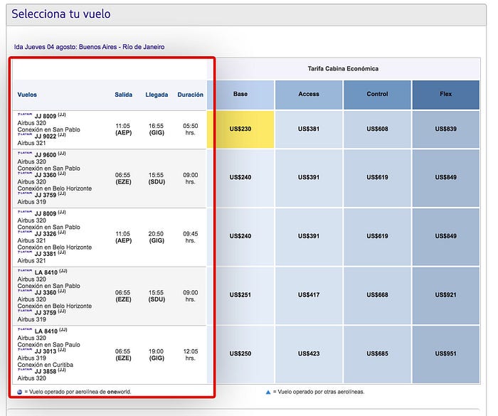
Flights with Stopovers were not clearly indicated

In many cases, users did not realize that they were selecting a flight option that included stopovers. This was due to the interface not highlighting enough that information to users. I most cases, users did not see that information at all.
Cabin seat selection

Forms feedback
When the users selected the seats for a flight, the website did not present clear feedback to them.
In most cases, users did not know that they chose a ticket with flight changes. Did resulted in a confusing experience, as they were not expecting to select seats for the next flights of the selected trip.
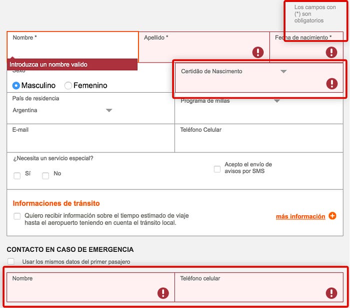
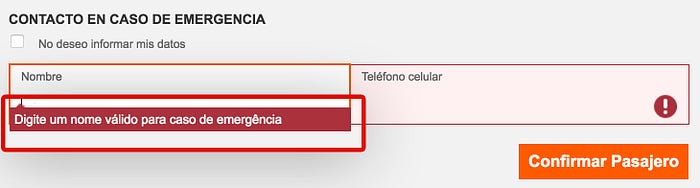
Mandatory fields were not clearly indicated

This issue increased the time of completion of the assigned task in Voegol’s website. In some cases they had to check the complete form information again, looking for the missing information or what to correct.
In all cases, users mentioned that error feedback is not clear or visible at all.
Confusing screen switching
Users also needed to select the flight to go back to their home city. For the roundtrip flight selection, many participants experienced a confusing screen-switching interaction, which they found disorienting users during selection.
This is the first screen that users saw when selecting the roundtrip.
But in the following screen, most users did not perceive they had selected a flight or even changed the screen.
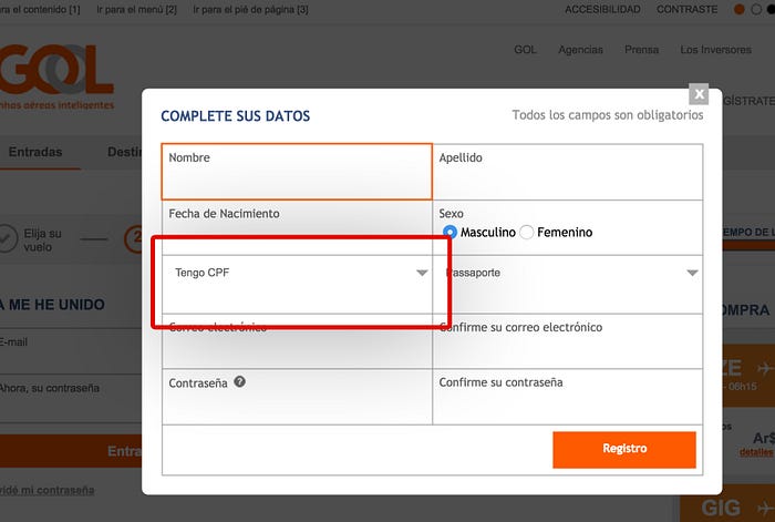
Registration during the purchase process
Website user registration on Voegol’s website was mandatory, something the user did not expect. Also, users expressed they did not quickly understand the “ME HE UNIDO A” screen prompt, which is Spanish for: “You have signed up for…”.

In many cases, when using Voegol’s website users needed some time to recover and figure out how they should continue.
Also, some of the form fields seemed unclear to many users, because these fields were specific for Brazilian travelers.
Problems with language translations
In many user tests on Voegol’s website, error feedback messages appeared in Portuguese. This made it difficult for some of them to correct something that they did not intend to do in the first place.
Error messages should be always expressed in the user’s native language.
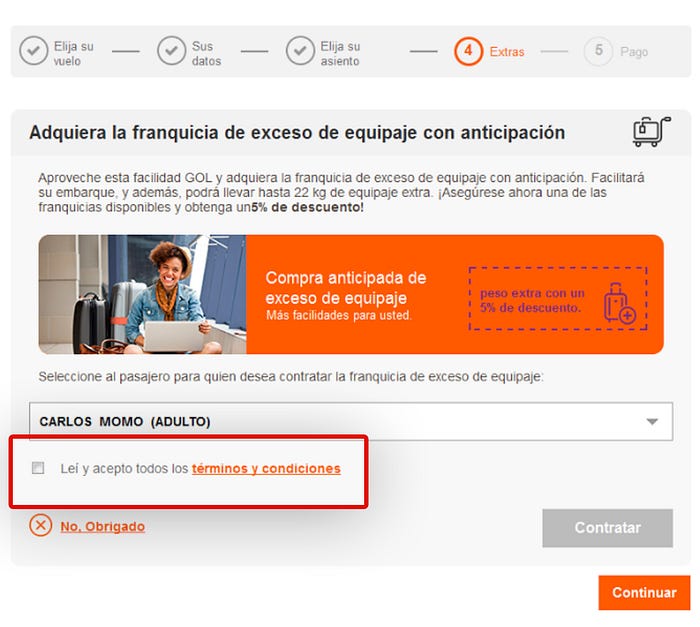
The terms & Conditions check box was difficult to see
When using Voegol’s website, users did not see clearly that they were asked to accept the Terms & Conditions. In all cases, the check box for this during the purchase process was not highlighted properly.
UX Issues found on LATAM’s website
Unclear flight Connections
This issue was similar to what many users experienced with Voegol. The flight connections offered by LATAM’s website were not clear enough. This resulted in users selecting flights with stopovers without being aware that they were selecting the type that option.

This seemed to be a consistent issue, as users did not properly identify which airport they arrive at in the following steps of the purchase process either. Participants expressed that they were finding difficulties in understanding the options that appeared on the screen. Also, in some cases, users looked for references or links to expand information but could not find what they were looking for.
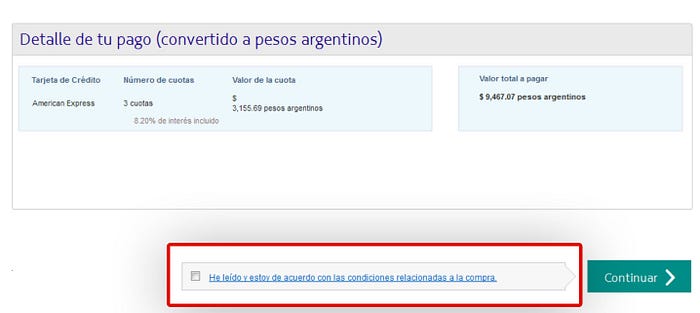
The same as with Voegol, some users did not see the Terms & Conditions checkbox clearly when trying to complete this step. This screen was presented at the beginning of the payment step in LATAM’s website purchase process.
Conclusion
As we can tell from the experiences and what users expressed about both purchase experiences, LATAM’s website did way better than Voegol’s. In some cases, issues with localization made things a little more difficult for the Brazilian airline.
Conversion rates, as well as the time that it took for users to complete the purchase, are also clear indicators that LATAM’s website offered a better UX experience for participants overall.
As an issue with both websites, flights with stopovers and the Terms & Conditions checkbox appeared in most of the tests.
It is also worth noting that simple yet crucial UX features, like clear error feedback in forms, can lead to users directly dropping out of the purchase process and therefore, not converting.
