How I built Figma components that help the team design much faster

As a designer, there’s a unique thrill in opening Figma and getting ready to turn your creative vision into reality. However, the design execution can sometimes be really time-consuming and daunting, particularly when faced with tight deadlines and high expectations. To expedite the process, you need a combination of effective time management, expectation control, and a versatile set of standardized yet customizable design components.
After revamping our Figma component library with auto-layout and component properties last year, my team and I boosted the total insertion of Figma components across our department by over 200% in the second half of 2022. There’s a 48% increase in users saying in the survey that this component library makes their work “much faster”. I’d like to share some insights on building components that may prove beneficial to fellow Figma enthusiasts and your teams.
This article will mainly focus on my thinking process rather than technical details. If you’d like to learn more, please feel free to contact me via mingzhic.design@gmail.com.
Familiarize yourself with your tools
Developing the ideal design system and component library (yep, they are two distinct concepts) can feel like a never-ending task, but embracing the challenge is part of the fun. To me, it’s always important to stay informed about the latest feature update of the tools you are using and keep learning from other designers’ innovative practices in the community.
Maximizing a tool’s potential requires understanding its inner workings. As tools constantly evolve to improve user experience, maintaining a growth mindset and frequently updating your skills and work will prevent an overwhelming backlog of tasks.
For instance, if you are using Figma, it’s important to understand the difference between the 3 common grouping structures: group, frame, and auto-layout, their interchangeability, and when to use each of them. This is particularly useful when building something responsive. Combining these grouping types can also be necessary to achieve the desired effect.
Resources
Here’s a selection of articles that offer detailed insights and clear examples to help you grasp various concepts and proficiently use the tool.
Consider your target users
When designing components, we are playing the roles of both designer and user, which offers an excellent opportunity for us to practice the iterative design process. From a user’s perspective, components should be robust and adaptable to various use cases. That means striking a balance between generalization and customization is critical. If it’s too generic, designers may need extra time for adjustments; if it’s too advanced, they’ll have to scale back and remove features. Including as many common patterns as possible while making advanced settings accessible and toggleable is recommended. Also, don’t forget to ask your design colleagues for feedback and continuously iterate.
The “detach” moment
While using the Figma component, there’s a critical and inevitable moment called “detach”. It’s essential to consider specific scenarios and needs for the pre- and post-detach moments, which will help you better structure the configurability of a certain component.
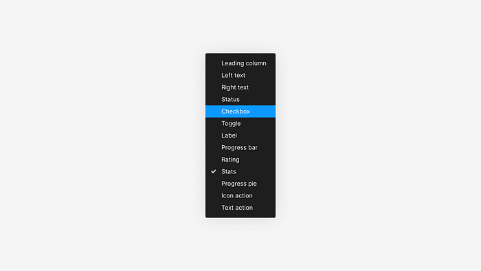
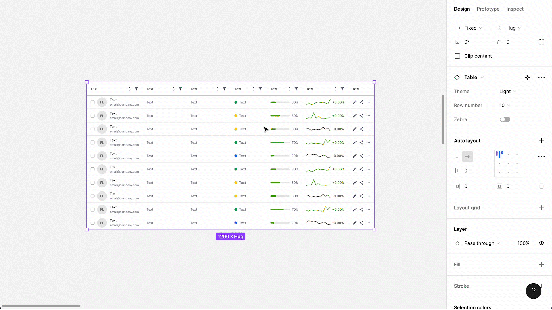
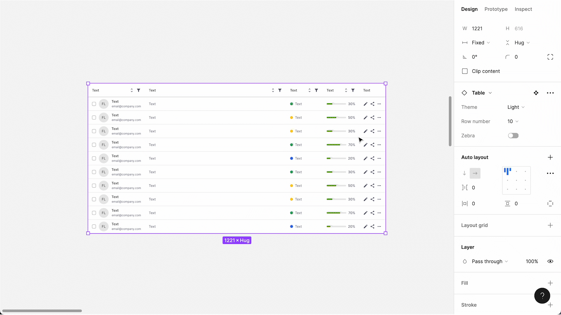
For example, the table component I crafted offers multiple nesting layers of configuration that users can make:
Table > Column > Cell
People tend to detach an outer layer more often than an inner layer. If there are choices you prefer users to make before detaching, you can put them in the outer layer. For instance, I extracted high-level attributes like theme, row number, and pattern to the table component (which is the outer layer compared with the column component), as users usually know their preferences and make the configuration upfront. After detaching the outer component, users can still maintain the table structure and column configuration, while having even more flexibility in reordering the columns. This, in fact, proves the “detach” moment is what you can leverage, not something you necessarily have to avoid.

If you delve into the next layer at the column level, I included a diverse array of column types such as left/right text, stats, checkbox, actions, etc., which typically cover most use cases.
I set the width of some columns to Fill container, making the entire table horizontally responsive even if users delete/hide or unhide a few columns.
Inside each column, Boolean, Text, and Instance-swap properties are widely applied, enabling designers to select multiple cells of the same type and make bulk changes with just a few clicks.
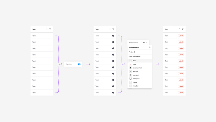
The “slot” method
I accidentally discovered the so-called “slot” method when I was initially playing with the Instance-swap property for icons. As demonstrated below, once you toggle on the right icon property, you see the placeholder icon, which you can swap with any other icon in the library. Surprisingly, you can also swap it for an existing component as long as the auto-layout frame of the component is set to Hug. This creates a world where various combinations of basic utility elements (icon, label, checkbox, arrow, toggle, in-column data viz, etc.) become possible. It allows users to customize the column style according to their specific requirements on their own, and you don’t have to create a long list of variants.
Focus on trial and error, not perfection
With the constantly changing landscape of tools and the design industry, sometimes the “best practices” have yet to be established.
Have no fear of perfection — you’ll never reach it.
— Salvador Dali
So don’t worry about not following the best practice; instead, embrace exploration and experimentation. On days when inspiration seems scarce, simply opening Figma and doodling on the canvas can lead to serendipitous discoveries and ignite fantastic ideas.
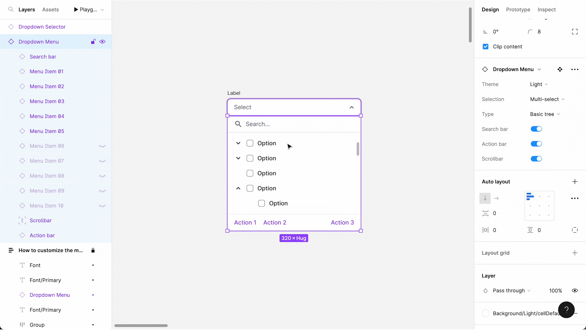
Improving component structure
Here’s a story about how I designed the initial dropdown menu component one year ago when component property features weren’t yet available.
Before component properties were released, I was exploring the structure of a dropdown menu. According to the requirements and the corresponding front-end components, it should have the following attributes:
- Option text
- Description subtext
- 5 tiers of the tree structure hierarchy
- Checkbox
- Caret: up, down
- Right icon
- State: default, hover
I simply listed all the possible variants before realizing that to create a component accommodating all these attributes, 240 variants were needed. That seemed like too large a chunk for further maintenance.

As soon as component properties were released, I eagerly learned how to use them, hoping to achieve a lightweight structure. It turned out only 10 variants were needed to accommodate all 240 versions if Boolean and Instance-swap properties were properly applied.

With this new knowledge, I successfully decreased the size of the components and eventually optimized the entire library while increasing the configurability. However, I couldn’t have come this far without going through all the initial thinking and exploration, which might have seemed directionless at the beginning. As I adopted the properties and simplified the component structure, it also created space for additional attributes that I later added to the components.
In no time, the dropdown menu components gained popularity among our team. Take a look at the demo below to see how quickly you can build a menu.
Provide essential documentation
Last but not least, no matter how outstanding your components may be, they won’t be well-received unless you explain how to use them effectively, as different people have unique ways of understanding and utilizing the tool. Ensure you include sufficient documentation, and assign clear and searchable names to your components and layers. You can always choose to give your team a live demo with a step-by-step tutorial if that works better.
Check out all the components mentioned above on Figma Community. If you are interested in more Figma and component library tips, find me on LinkedIn or ADPList for a chat, or drop me a line at mingzhic.design@gmail.com.

