12–8–4 Column System for Responsive Grids.
A beginner's guide to Adaptive Design.
Prerequisites
Before reading this article, it’s important to have an idea in these fields for easy understanding:
- Figma Basics
- Web design/Development basics
- UI/UX Design Principles.
- ;)A Curious Mind.
Introduction
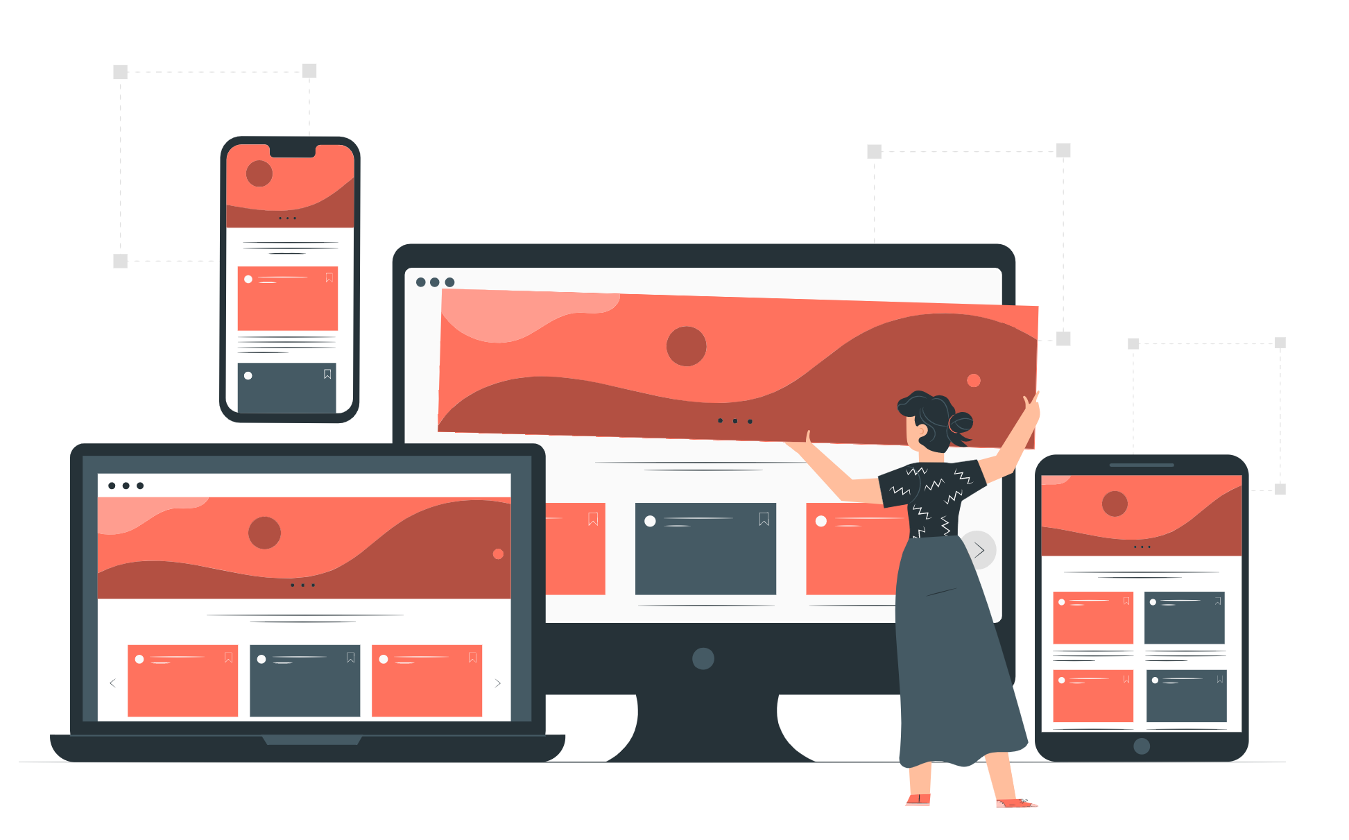
As more and more people access the web through various devices, it’s important for designers to ensure their websites are adaptive and responsive to different screen sizes.
One way of achieving adaptive design is by use of the 12–8–4 column system. In this article, we’ll explore the anatomy of a grid layout and how to use the 12–8–4 column system to design adaptive websites for desktops, tablets, and mobile screens.
What is a layout grid?
A layout grid in UI/UX design is a system of horizontal and vertical lines that are used to position content, such as buttons, text, and images, in a way that is visually appealing and organized.
A layout grid system in UI/UX design offers several benefits to designers including:
- Consistency: Using a grid system will help create a predictable and organized layout which helps improve the user’s experience and understanding of the design.

2. Efficiency: A grid system provides a guide for placing elements which can save designers time and effort. Instead of aligning elements from scratch each time, designers can define a grid in their styles and reuse it across multiple layouts making the process more consistent and efficient.
3. Hierarchy: Using a grid system provides a clear visual hierarchy of contents and a clear sense of order and structure on a page. The hierarchy guides the user in noticing important elements and improves the overall flow of the design.

4. Adaptability: Grids are important tools for responsive design as they can be adapted to fit different screen sizes and device types. By adjusting the grid to fit different screen sizes, designers can ensure their design remains consistent and visually appealing across different devices.
Anatomy of a Layout Grid
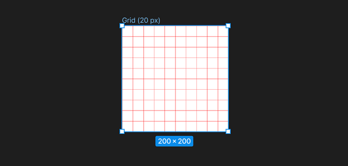
We’re going to go through this using Figma, highlighting the settings of layout grid and their meaning. Please note that the faded red lines in the frames are the layout grid.

1. Grid: A layout grid in Figma consists of intersecting horizontal rows and vertical columns that create a network of squares or rectangles. These rectangles, referred to as modules, provide a framework for aligning and positioning elements on a page or design. By snapping elements to the grid, designers can ensure that each element is properly aligned with other elements, creating a clean and organized layout.
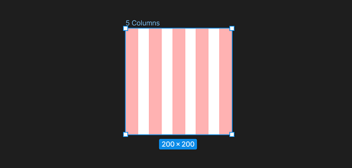
2. Column: Lines in a layout grid that run from top to bottom(The red lines as seen in the image below). They help in the horizontal alignment of elements.
3. Rows: Lines in a layout grid that run from left to right(😉or right to felt). They help in creating consistent spacing and alignment between elements vertically.
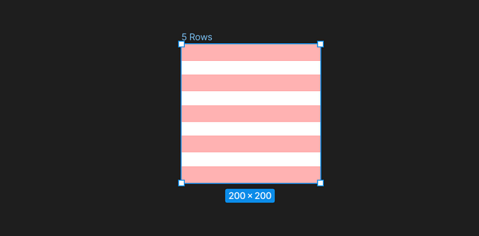
4. Gutter: It’s the spacing between two rows or columns.
5. Width: Thickness of a row or column.
Gutter and width sizes can be adjusted to create different visual effects, from tightly packed elements to more spacious and open designs. By using consistent gutter and width sizes throughout a layout, designers can create a sense of harmony and order that helps users navigate and understand the content.
6. Margin: It’s the distance from the edge of the frame to the first column or row, either from the top and bottom in rows or from the left and right in columns. It provides space between the edge of the frame and the content within it.
7. Count: The total number of columns or Rows in a frame
8. Colour: The color of the grids.
Column Type Settings
Type setting in Figma focuses on the positions of the rows and columns within a frame when it's adjusted. It is important to note that rows and columns are adjusted separately in Figma’s type grid settings.
Figma has four column type grid settings, that is left, right, center, and stretch, that enable designers to achieve specific layouts and alignments. These settings determine how columns are positioned within a frame and how they respond to changes in frame size.

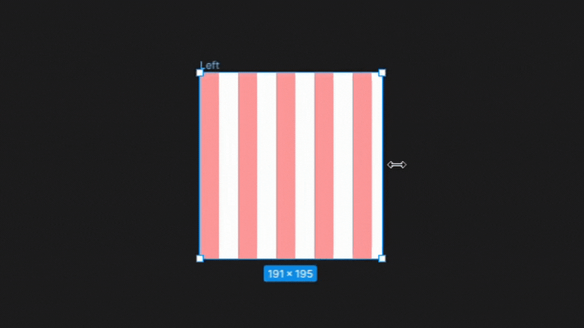
1. Left
In the left column type setting, the columns are anchored to the left side of the frame. There is no change in the gutters or width sizes only changes in the right margin as the frame is adjusted illustrated below.
This setting is best for designs that require a strong left alignment, such as text-heavy layouts like newspapers or magazines.
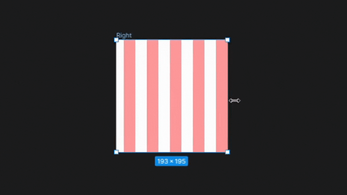
2. Right
Here, the columns are anchored to the right side of the frame. The gutters and width remain unchanged while the margin on the left side of the frame increases equally as the frame is resized.
This setting is best for designs that require a strong right alignment, such as layouts with right-to-left text direction or designs that want to emphasize the right side of the content.
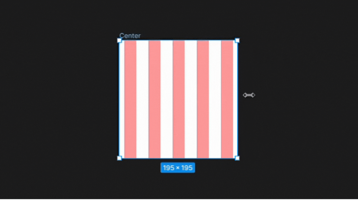
3. Center
In Figma’s center type grid setting, the columns are centered within the frame. While the gutters and width remain unchanged, the margins on both the left and right sides of the frame increase equally as the frame is resized.
This setting is best for designs that require a balanced layout with centered text or elements, such as brochures or posters, or landing pages with centered headlines.
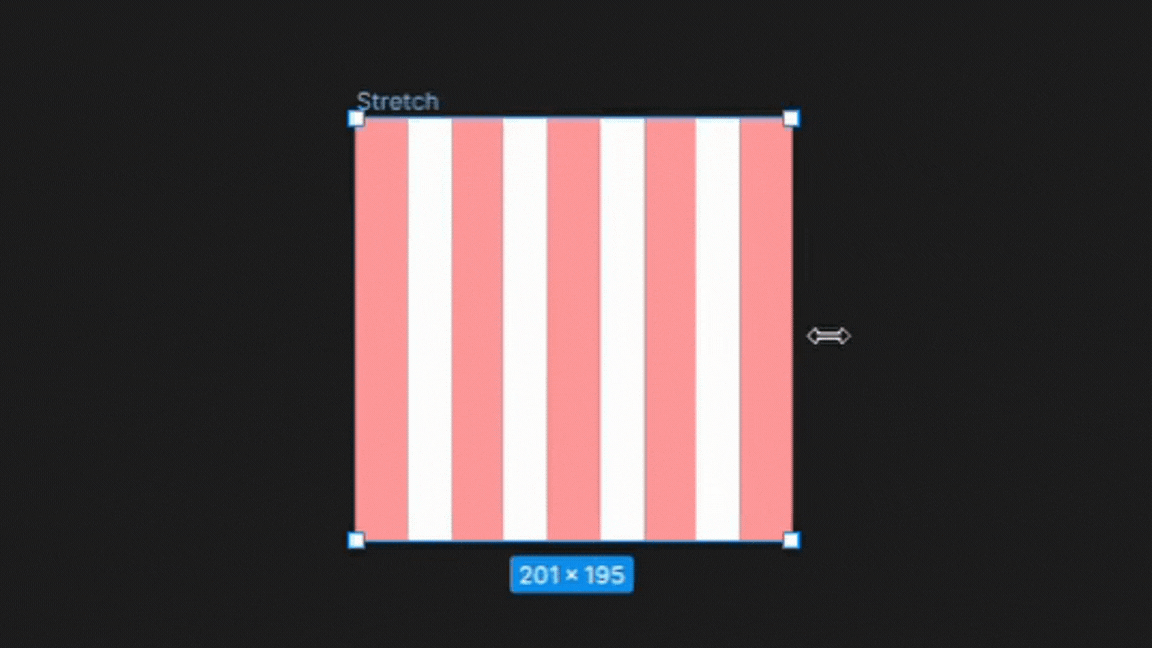
4. Stretch
The stretch type grid setting in Figma allows the columns and gutters to stretch to fill the available space within the frame.
This setting is useful for designs that require flexible layouts that adapt to different screen sizes or aspect ratios, such as responsive web pages or mobile apps.
By using the stretch type grid setting, designers can create layouts that are optimized for different devices and screen sizes while maintaining consistent typography and spacing.
To Note:
By default, the width of columns in Figma’s left, right, and center type grid settings remains fixed regardless of changes to the frame size. However, designers can manually adjust the width of the columns using the type grid settings.
On the other hand, the stretch type grid setting adjusts the width of columns dynamically based on changes to the frame size. The width of columns in the stretch type grid cannot be changed manually in the settings and can only be adjusted by resizing the frame.
This makes the stretch type grid ideal for designs that need to be responsive and adapt to different screen sizes.
12–8–4 Column System
The 12–8–4 column system is commonly used in responsive web design to ensure that the layout adapts well to different screen sizes. The 12 columns are usually used for larger desktop screens, while the 8 and 4 columns are used for smaller tablet and mobile screens, respectively.
Desktops
For Large to medium desktop screen sizes, we make use of 12 columns. Some of the ranges of desktop screens include: Large (1440+dp), Medium (1240–1439dp), and Medium (905–1239dp)
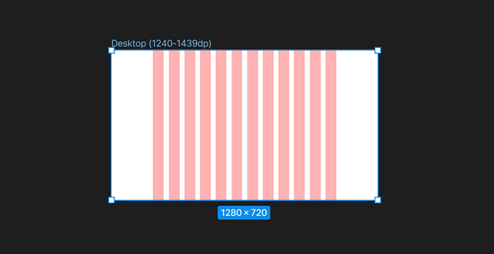
The column settings to achieve a 12 columns layout:
- Count: 12
- Type: Center (for large screens) and Stretch(For Medium Screens)
- Width: 72 px (For Type Center)
- Margin: Dependent on the size of the container
- Gutter: 24 px
Tablets
Tablet sizes typically range between 600–904dp. Tablet screens use 8 columns. The margin and gutter are reduced compared to the desktop screens as the content is going to be smaller hence less space.
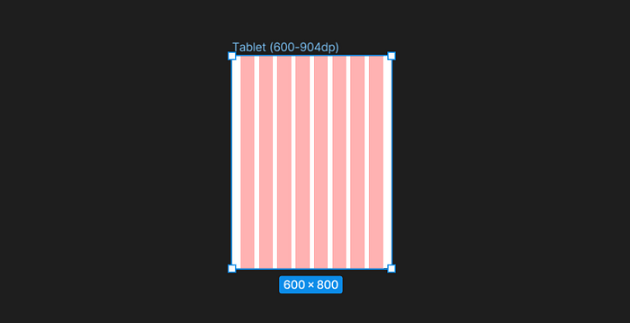
The column settings to achieve an 8 columns layout:
- Count: 12
- Type: Stretch
- Margin: Dependent on the size of the container
- Gutter: 24 px
Mobile
Mobile sizes can range between 0–599dp. Mobile designs use 4 columns. The margin and gutter are reduced even more compared to the desktop and tablet screens as the content is going to be smaller hence less space.
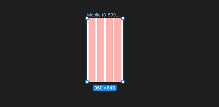
The column settings to achieve a 4-column layout:
- Count: 4
- Type: Stretch
- Margin: 16 px
- Gutter: 16 px
Conclusion
Whether you’re a beginner or a seasoned designer, understanding the 12–8–4 column system can greatly improve your design skills and make your work more accessible to a wider audience. So give it a try and see how it can benefit your next design project.
